Adorn Decorate and Embellish - Panoramic images

Friedrich von Martens - 'La Seine, la rive gauche et l'ile de la Cite' 1845

Louis Daguerre, before he announced his (and Niepce's) invention of the Daguerreotype in 1939, was a decorator, a mirror manufacturer, a painter of stage illusions and the inventor of the Diorama.

Daguerre was a showman and his Diorama was a 24 foot wide revolving painting of a landscape. It would change, sometimes subtly and sometimes dramatically in front of a live paying audience. Before cinema this was a dramatic spectacle for the Parisian public - it was a Victorian IMAX cinema.

Panoramic painting has a long history including -

Panorama of a half section of Night Revels of Han Xizai, 12th century Song Dynasty painting
The death and funeral of Edward the Confessor, Detail of the Bayeux Tapestry 11th Century.
Portable Iconostasis, Moscow 17th Century.


Two different views of James Rosenquist's 'F111' 1965
NYC Subway Graffiti 1970's
Basquite
These images were on a huge scale and designed to tell a story. A panoramic image allows one image to show a greater field of view than the human eye (approximately 160° by 75°).

A photograph allows us to capture more detail in one go that the human eye can. By joining these images together (either as a photomontage, a joiner or within the mechanics of a camera) a huge amount of detail can be shown. This early link between photography and panoramic images would continue up until our own digital age.
In 1843 Joseph Puchberger from Austria created one of the first panoramic cameras which had a 150° field of view with an 8 inch focal length and was operated using a hand crank. It produced Daguerreotype, one of the earliest photographic types, up to 24 inches long.

'Fairmount waterworks' - William Southgate Porter 1848
Eadweard Muybridge - Panoramic Photograph of San Francisco 1877 (click here for a closer look)
Eadweard Muybridge Panoramic - details
Eadweard Muybridge would go on to experiment with taking a sequence of photographs that documented movement. These experiments would be a key element that lead towards the invention of cinema - in fact any moving image.

It is interesting that both Daguerre (who would invent a form of photography) and Muybridge (whose work influenced the invention of cinema) were both drawn to the panorama early in there career. It is their love of the unusual, novel and strange that led to their discoveries. 


Quentin Shih 'The Stranger in the glass box'
Modern photography has the large scale of pre-photographic history paintings. Fashion, advertising and editorial photography all use large scale almost panoramic shots. Quentin Shih's images have this grand epic scale.
Wang Qingsong - 'Follow Me' 2003


Photograph taken with the Sprocket Rocket
Panoramic image taken with the Lomo Spinner 360
The panoramic image taken by the Lomo Spinner distorts and bends the space in the image. It is reminiscent of the distortion in perspective used in German Expressionism. A panoramic image is also a type of joiner and can be created be connecting individual images together. 
Panoramic Multiple Exposure 'Calhoun Square' by Magdalen Solinitzky
This can be done on a Holga - or any old medium format camera (see Matt Adamson's image below and tutorial here) or with digital images using Photoshop (see here).

From their simple find in an junk shop they have built an international business. In this digital age where modern cameras work as invisible technology the interest in analogue technology stays. Having a physical object in your hand, as opposed to a digital images must be part of this appeal.

My Double Exposures experiments using a Box Brownie No2 with 35mm film

Adorn Decorate and Embellish - Book Art


"First they burn books, then people"

Nazi book-burning, Berlin, 1933
What is a book? Why do the two above images seem shocking and wrong? 

"In Russia there is a word for 'thing' with no precise equivalent in English. 'Vesch' means 'a thing with a soul' and it includes momentoes but also anything that resonates or possesses vitality and significance and has become imbued by human attachment with presence and feeling."

Marina Warner 'Things - a spectrum of Photography 1850-2001'

A page from The Book of Kells 6th to 9th Century AD
The beautiful Book of Kells is a one off object with beautiful decorations made by hand. If you visit Trinity College in Dublin you can queue to view a copy of it, briefly, encased behind glass. 
The facsimile copy of the Book of Kells inside a glass case, Trinity College, Dublin.

Modern books are rarely hand made since the invention of the printing press - they are mass produced objects (see the history of books here).

A book is just a material object made of paper, glue, string, material and cardboard. Do we fetishize books - seeing them as mystical objects? (read Geoff Dyer's article here and Julian Barnes article here).

Georgia Russell 'De Bauelaire au Surrealisme' 2007

The idea of the book as a mysterious, precious object is explored in the work of Georgia Russell. Russell shreds and dissects old books with a scalpel and presents them in glass cases like a scientific specimen. The shredded pages resemble hair with occasional letters spared so we can read certain words. Look here for more artists who cut up books.

'There is a simultaneous sense of loss and preservation in each work'
Georgia Russell

Is a book simply a Container for information - like a piece of paper, a record, a tape, a floppy disk or a hard disk drive.
Valerie Belin - Palettes
One of the great scandals of the modern age is "built in obsolescence". A product is no longer designed to be mended or maintained; the consumer is forced to throw it away. Valerie Belin's 'Palettes' series of photographs show how we discard modern technology easily - we don't attach the same value to these containers of information as we do to books. We don't store them and collect them - we dispose of them.

Maybe it is what a book represents. 

In 1962 Joe Orton and Kenneth Halliwell were sentenced to six months in prison for defacing library books. They had cut up, collaged and juxtaposed battered library books together to create bizarre photomontages (see more examples here). 

In 1962 you could be arrested for cutting up library books - it was an act of rebellion.

If the books used are not culturally significant is their destruction less shocking - as in these works made from cheap crime novels.

Thomas Allen has taken an old pulp fiction book and cut into the front cover - creating a three dimensional image. These mini sculptures are then rephotographed from a particular angle for added drama. In this above image one man punches another who then falls backwards. It has all the drama of a pulp novel or film noir. Allen has used a minimum depth of field to blur out the punching man and draw our eyes to the falling man. Are these works book art, sculpture or photography?

Rachel Whiteread "Sequel IV”, 2002, Plaster, polystyrene and steel
The Sculpture Rachel Whiteread gives physical form to the negative space around objects. In her piece 'Sequel IV' she has made a sculpture from the space around a book shelf. 

Anselm Kiefer 'Barren Landscape' 1987- 1989

I went to the British Library in the Summer of 2011
and Everybody was on their laptops

In 2011 ebooks out sold Hardback books in Britain. By reading books on a mass produced screen it makes all novels, visually look alike. This has had a strange effect on book publishers - Books are becoming precious objects again.

"Books you will want to collect and share, admire and hold; books that celebrate the pure pleasure of reading"

Penguin English Library Series 'Readers Editions' press release vis 'Cover me Beatiful' artical in the Guardian.


example of Orell Füssli's "schaubücher"
Presenting Photographs in a sequence is common. You are guided around a gallery in a certain direction, coming across certain images first. A website or slide show on a computer screen is often designed to guide us through the images in order. Arguably the most natural and intimate was to experience photography is in a book. A book designed by photographers to be read in a certain way is know as a Photobook.

Adorn Decorate and Embellish - Album Covers


Jazz album Covers of the 1940's and 1950's seem to reflect the quality of the music. As sounds intertwine so do the visual elements of this album cover. the keys of the keyboard have the repetitive quality as a Paul Klee. The keys create two triangles on both bottom corners making a top, central white triangle where the figure sits. Black and white is used to dramatic effect - the keys create delicate patterns and contrast with the flat black of the figure and the font. See more examples here.
The painting above is by Wassily Kandinsky (1866-1944) 'Transverse Line' 1923. 
Like Klee, Wassily Kandinsky taught at the Bauhaus and his ideas influenced modernist art. He is credited with making the first purly abstract painting.
A Vintage Vanguard album cover

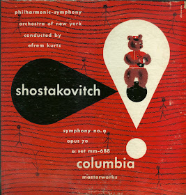
LP designed by Alex Steinweiss

In 1940 23 year old Alexander Steinweiss proposed to Columbia to make a change in the presentation and packaging of the 78 RPM record albums. His idea was to use original artwork (drawings and paintings) on the front of the albums. This new approach was quite a change if compared to the gold or silver imprint of just the nomenclature in a serif or gothic font on the black, brown or beige heavy books.

Alex Steinweiss cover designed in 1938

Steinweiss revolutionary idea would transform the packaging of music - it was no longer just sound but a physical object to be coveted and collected. He designed them as miniature posters, with eye catching graphics, distinctive and vivid colours, and creative, original typography. The key information was still included but was incorporated into the overall design. The large square format was a perfect size for a piece of graphic design. Until the arrive of the CD format in the 1980's the LP would be the main format, and the LP cover the main format for art work.


"If you wanted colour, you had toCgwCOcW_EC7ohIsXdZqtcSVmqxw_vp56ght keyline drawings, and they would break these down into the specific colours. Everything was printed as solid." Steinweiss

The use of simple lines and bold colours was partly due to the limitations of the printing technique but this resulted in a certain visual style.

'The Red Sun' Joan Miro 1948 

Steinweiss was also influenced by wider design. The paintings of ="http://www.google.co.uardian.co.uk/artanddesign/2011/mar/20/joan-miro-life-ladder-escape-tate">Joan Miro, from the same period, has a similar use of of bold colour, abstract forms and delicate line. The abstract nature of the images reflected the abstract nature of music - especially classical and jazz records.

'Sonny Clark Trio' 1958 designed by Reid Miles


1950's record sleeves for the Blue Note label are some of the most iconic designs. During the 1950's and 60's Reid Miles produced over 500 record sleeves for the label. In the two above images the keys of a piano have inspired the design. The top design by Reid Miles has a similar feel to the work of Steinweiss with the flat over lapping colours and the hand drawn illustration. However, Reid's bottom design uses uniform flat black forms contrasted with one out of place key with a photograph embedded. The out of synch key could be a metaphor for new approaches to musical composition. This combination of simple minimal graphic forms, simple typography and photographs are typical of the Blue Note style.

'Grant Green Street of Dreams Session' - Photographed by Blue Note Photographer Francis Wolff

Miles worked closely with photographer Francis Wolff to create the iconic covers. The combination of Wolff's cool black and white photographs and Reid's typography experiments and layouts was the ideal partnership.

Reid would take a black and white image and position the text to work with that image. In the sleeve for Donald Byrd's 'A New Perspective' a photograph of a car has been used as the main image. Over half the composition is dominated by the spherical shape of a car head lamp creating a bold graphic form. Byrd himself can be seen in the distance and placed in the center of the frame. Reid has then placed the text within the negative space (the sky in this case) between Byrd, the car and the edges of the frame. In this way the Typography becomes a central part of the image.

The Beatles 'Sgt Peppers Lonely Heart club Band' designed by Peter Blake

The concept of an album, a collection of songs that work together to form a whole is a relatively new concept. The Jazz artists on Blue Note created albums but most 'Pop' groups released single and compilations. The notion that most bands and artist created albums was made popular in the 1960's by bands such as The Beatles. They wrote their own songs (this was new in itself) and with each album (for example 'Rubber Soul' and 'Revolver) there was a sense of the classic album - a format that future generations would follow.

This approached came to its logical conclusion with the release of 'Sgt Peppers Lonely Heart club Band' in 1967. The whole album was designed as a 'Concept' album with each track being apart of the whole. This approach was carried through into the art work.


The whole packaging was designed by the Pop Artist Peter Blake who used his style through the packaging. Targets, Military paraphernalia, Victoriana, bold colours were all used to created the final product.

The front cover is an elaborate photo-shoot involving the band and a multitude of cardboard figures of famous people. It was an elaborate stage set full of props and has been mimicked many times.


Different views of the 1967 Vinyl released of The Beatles 'Sgt Peppers Lonely Heart club Band'

The other key element is the gatefold sleeve - meaning the sleeve opened up like a book. It even had a pull out cut out inner sleeve - designed by Blake. This was very much an object - not just a piece of music made from plastic.

An IPod showing mp3/mp4 in Cover Flow

Vinyl records due to their size were the ideal medium for cover art. The physicality of a vinyl record made it a sought after treasured item - when they were first released and for future collectors. The CD used a similar square format but on a much smaller and less effective scale. 

Is the album sleeve dead? In the age of digital music downloads the music industry itself is changing and evolving. The way we consume music will move on. The format of the album could also be dying. Recorded music in a physical package (a wax cylinder, Vinyl, 8 track, tape, or CD) had a very brief lifespan and that physicality has been replaced by another object. A smooth, glowing modern piece of consumer technology - the ipod.

However, even the ipod copies the square album cover format. 'Cover Flow' on ITunes allows you to browse through little square album covers. This emulates Vinyl record covers in the same way modern digital cameras emulate the sound of an analogue film camera (see this article on 'Retromania' by Simon Reynolds).

As the music industry will have to evolve so to will the way visuals interact with music. As video become more omnipresent (via the internet and Youtube) still images and photographs could be coming to the end of their visual dominance. Some bands are using these uncertain times to be creative with how you experience their music like this interactive site for Arcade Fire.