A Utopia is an idealised world - a perfect community or society. Eden, Heaven, Nirvana, Shangri-La etc.
However, one persons idea of Heaven could be another persons Hell.
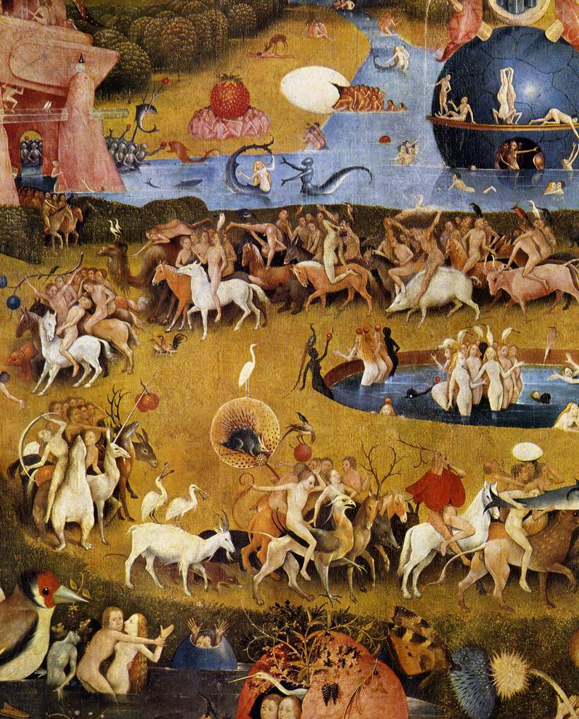
The triptych above is by Hieronymus Bosch and depicts both ideas of Utopias and Dystopias.
'The Garden of Eden (left panel)
The Garden of Earthly Delights (center panel)
Hell (right panel)
Above are a close up sections from each panel. The work is immense with lots of small scenes coming together to create a whole. When you see the complete triptych it has a unity and a rhythmic quality. However, the work can be viewed in detail with many smaller scenes depicting mini dramas. Bosch used many signs and symbols that are lost on us now. For example, to us, an owl is a sign of wisdom. This image is full of owls but in Bosch's time the owl was a creature of the night - and night equaled Death.
To our eyes Bosch seems modern and he was admired by the surrealist. In the detail from Hell we see a half man half tree creature that looks like and image by Salvador Dali. To the figures left is a strange object made by combining a pair of ears and a knife. We could see Bosch as being a subversive Surrealist artist but we would be in danger of seeing him through our modern eyes.
A scene from 'The Book of the Dead'
Many cultures and religions believe in an afterlife. This is a scene from an Egyptian Book of the Dead, a collection of spells designed to guide the deceased through the dangers of the underworld and ensure everlasting life. Egyptians lived 35 years on average. Their obsession with the afterlife was a response to that reality. And in their desire to perpetuate existence, they demonstrated their passion for the world. They loved life and wanted it to go on forever.
a scene from 'Orpee' by Jean Cocteau
The idea of traveling from one world to another is found in religions, myths and literature. In 'Orphee' (1950) Jean Cocteau's retells the Greek myth 'Orpheus and Eurydic' -
Orpheus was a beautiful musician who loved a nymph called Eurydice. They married and were very happy. Eurydice spent hours wandering and playing in the fields and woodlands. One day she trod on a deadly snake and died. She went to the underworld.
Orpheus was so unhappy, he would not eat or drink and his friends thought that he must die. He took his lyre and went to visit Hades the god of the underworld, to plead for her life. He played his lyre and charmed Charon the ferry man into crossing the river Styx.
Orpheus played his lyre to charm Hades, and eventually Hades relented and told him that Eurydice could follow him out of Hades, but only if he did not look back and see her. Orpheus made his way carefully and slowly back to Charon, but then with only a tiny way to go he looked back. As he did so Eurydice faded, she was pulled back into Hades...gone forever. A very unhappy Orpheus journeyed back over the river to come out of Hades. He had lost his true love forever.
In Cocteau's version Orpheus is a poet who has to travel to the underworld. Cocteau uses the visual device of a mirror as a gateway to the underworld. Throughout the film there are visual reference to mirrors and reflections.
Rodin 'Orpheus and Eurydice', probably modeled before 1887, executed 1893
Still's from Jean Cocteau’s 'Orphee'
In this famous scene, Ophee (Jean Marais) enters a new world by penetrating the surface of a mirror. By editing several scenes together (see Photomontage) Cocteau creates the illusion that Orphee passes through the mirror. At the key moment the camera cuts to the actors hands going into a vat of mercury - as if the mirror has turned to liquid.
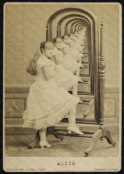
'Alice Through the Looking Glass' by Kenneth Rougeau
This seemingly old image is actually modern. Rougeau has created a Droste effect - a particular type of repetitive image. It depicts 'Alice' from Lewis Carol's 'Through the Looking-Glass, and What Alice Found There' (1971). Alice goes through the mirror into a fantasy world populated by peculiar anthropomorphic creatures.
Scene from 'Alice in Wonderland' 1903
Jan Svankmajer 'Alice' 1988
This is the follow up to Carol's 'Alice's adventures in Wonderland' (1865) - which was one of the most famous stories that involves a portal to another world. This initial work involved Alice following the white rabbit down a rabbit hole into Wonderland and has become part of popular culture from cinema (The Matrix) to music (Jefferson Airplane). Carol was also a photographer whose real name was Charles Dodgson.
The Yellow Brick Road from 'The Wizard of Oz' 1939 - Technicolour
NASA space colony project from the 1970's
Even if today isn't great there is always tomorrow. It is human nature to dream of a better future and artists have often explored this ideas in images and created Futuristic Utopia's. From Science Fiction to genuine NASA space colony plans different ages have imagined a future that shows that times hopes and beliefs.
Still from 'Avatar' 2009
Roger Dean 'Blue Desert'
Roger Dean is an artist, architect and designer (his “retrait pod” is featured in Clockwork Orange) whose work mostly deals with fantasy and sci-fi. Mostly known for the covers he made for progressive rock bands such as YES and ASIA always featuring fantastic landscapes and creatures and crazy type work, he also did most of the covers for the video game development house Psygnosis (responsible for Barbarian, Shadow of the Beast and many other classics) and of course their logo. These images now seem kitsch and are reminiscent of the work of Salvador Dali. A lot of modern photoshop art seems to a similar kitsch feel.
PAUL CITROEN, 1896-1983 Metropolis, 1922 Gelatin
PAUL CITROEN, 1896-1983 Metropolis, 1922 Gelatin
'Metropolis' fritz Lang 1927
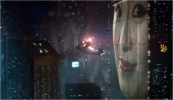
'Blade Runner' Ridley Scott 1982
Ron Herron 'Walking City' 1964 (proposal in an Archigram pamphlet)
'The Plug In City' Peter Cook
ARCHIGRAM dominated the architectural avant garde in the 1960s and early 1970s with its playful, pop-inspired visions of a technocratic future after its formation in 1961 by a group of young London architects – Warren Chalk, Peter Cook, Dennis Crompton, David Greene, Ron Herron and Michael Webb.
“A new generation of architecture must arise with forms and spaces which seems to reject the precepts of ‘Modern’ yet in fact retains those precepts. We have chosen to by pass the decaying Bauhaus image which is an insult to functionalism. You can roll out steel – any length. You can blow up a balloon – any size. You can mould plastic – any shape. Blokes that built the Forth Bridge – they didn’t worry.”
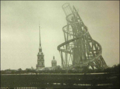
In 1919 Vladimir Talin designed his tower. The tower was a Utopian project designed at the dawn of a new era in Russian history (see the section on Russia under Photomontage). It was intended to Stand 400m high (dwarfing the Eiffel Tower). It was never built and remained a dream.
Tatlin's Constructivist tower was to be built from industrial materials: iron, glass and steel. In materials, shape, and function, it was envisaged as a towering symbol of modernity. The tower's main form was a twin helix which spiraled up to 400 m in height, which visitors would be transported around with the aid of various mechanical devices. The main framework would contain four large suspended geometric structures. These structures would rotate at different rates of speed. At the base of the structure was a cube which was designed as a venue for lectures, conferences and legislative meetings, and this would complete a rotation in the span of one year. Above the cube would be a smaller pyramid housing executive activities and completing a rotation once a month. Further up would be a cylinder, which was to house an information centre, issuing news bulletins and manifestos via telegraph, radio and loudspeaker, and would complete a rotation once a day. At the top, there would be a hemisphere for radio equipment. There were also plans to install a gigantic open-air screen on the cylinder, and a further projector which would be able to cast messages across the clouds on any overcast day.
Tatlin's - Letatlin human-powered flying machine
Tatlin also designed a human powered flying machine called the Letatlin. Like his tower is was made out economic materials - it was designed for everybody. Letatlin - A play on the artist’s surname and the Russian verb “to fly” (letat’), the Letatlin was assembled during a period (1930-1932) when Tatlin’s Constructivist approach to art and architecture had fallen into disfavor with Communist Party officials. By the time that the full-scale model for the Letatlin was complete in 1932 the Stalinist assault on Soviet culture and the arts was beginning in earnest. That same year, Josef Stalin promulgated a decree “On the Reconstruction of Literary and Artistic Organizations” which banned all independent studios, workshops, and groups. In their place the Party established official artistic and creative “unions” — bureaucratic mechanisms that would enable the Party to control artistic content and production throughout the country. A ambitious naive Utopia turns - darkly - into a Dystopia.
'The Tower of Babel' 1563 Pieter The Elder Bruegel
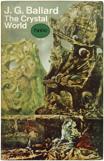
Max Ernst 'The Eye of Silence'
Decalcomania
Max Ernst's 'The eye of Silence' used as a book cover
In this image Irving Penn has used a minimum depth of field to blur out the background. He has focused on the glass bottle and so it is in sharp focus. However, the background is blurred – we can see a woman about to smoke a cigarette but it is fuzzy and atmospheric. Penn has guided the viewer’s eyes towards the glass and the sharp focus of the glass is contrasted against the blurred figure in the background. The glass is working as a lens – just like the lens used to create the image.
Still from Alfred Hitchcock's - 'Champagne' 1928 - shot through the bottom of a wine glass.
This is a strange still from an early silent Alfred Hitchcock film. It is taken from his 1928 film 'Champagne' were he experimented with a camera lens placed inside a giant champagne glass. The glass fills with liquid and is tipped as if we, the viewer, are drinking from it and seeing through it. We can just make out a crowd and couple dancing.
Still from Hitchcock's 'The Ring' 1927 - a moving reflection in a stream
During the filming of Hitchcock's early silent film The Ring (1927) he experimented with trick photography. In the above still we see a reflection of a couple in a stream. When the water ripples the image itself ripples and the figure go in and out of abstraction.
Stills from Hitchcock's 'The Ring' 1927 - seen from the viewpoint of a drunk man
In these two scenes we see what a drunk sees and the world appears distorted. This could emulate the effect of drink but also be a metaphor for viewing the world through the bottom of a glass. Dancers distort until they are unrecognizable. Hitchcock uses blurring and mirrors to distort the image and create a sense of disorientation. The keys of a piano appear elongated as if seen through a fairground mirror. This visual experimentation is a key aspect of Hitchcock's Cinematic style.
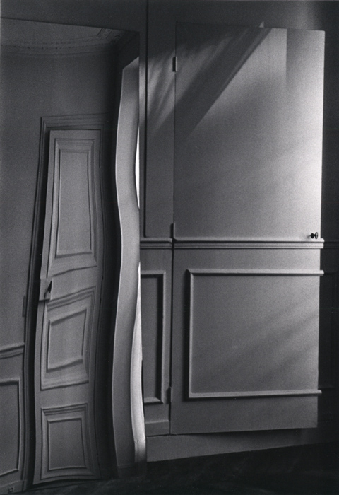
Andre Kertesz - Paris, Door Distortion, July 29, 1984
Andre Kertesz ‘Distortion 144, Paris’ 1933
Andre Kertesz ‘Distortion 147, Paris' 1933
These strange distorted images are by André Kertesz. ‘Distortions’ (1933) is a series of photographs of women reflected in distorting carnival mirrors that transform them into dreamlike creatures.
Salvador Dali 'Soft Construction With Boiled Beans (Premonition of Civil War)',1936, oil on canvas.
The deformed melting figures of Dali's painting mirrors the distortions that appear in Kertesz's photographs. This painting is one of only a handful in which Dalí turned his attention to the tragedy that beset his homeland on July 17, 1936, when General Francisco Franco led a military coup d'état against the democratically elected Popular Front government. The artist's savage vision of his country as a decomposing figure tearing itself apart preceded the outbreak of the Spanish Civil War and thus prophetically foretold the atrocities committed during this bloody conflict. Other artists who have focused on the Spanish Civil War are Picasso (Guernica), Guillermo del Toro (Pan's Labyrinth) and, during the earlier civil war, Goya (Disasters of War). Dada Photomontage distorted the human form immediately after the first world war. As well as having surreal qualities these images, like the Dada Photomontages could be a reaction to the human horrors of the first world war and the rise of 1930's fascism.
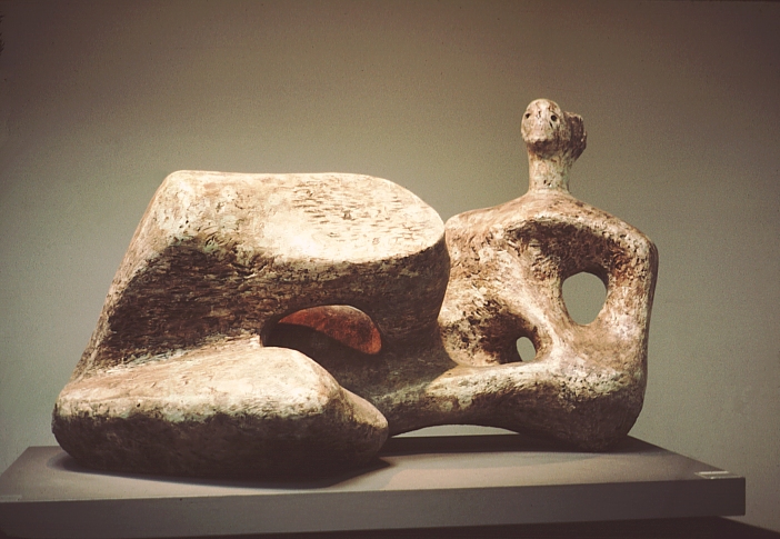
Henry Moore. Working Model for Reclining Figure, 1957. Bronze.
Henry Moore emerged in the 1920s as a radical, experimental and avant-garde figure and was rapidly established as the leading British sculptor of his generation. His principal and enduring subject was the human body, through which he believed ‘one can express more completely one’s feelings about the world than in any other way’. Moore also reflected in his work his reaction to two world wars. The smooth quality of these images are similar to the effect of melting ice and how is distorts as it transforms back into liquid.
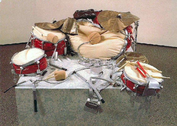
Claes Oldenburg 'Giant Soft Drum Set 1'
Graham Sutherland 'The city: a fallen lift shaft' 1941
This painting is by Moores contemporary Graham Sutherland. These bomb damaged buildings were in an area just north of St Paul's cathedral. Described by Sutherland as an eerie, foul-smelling, deserted wasteland, it was one which he explored with growing confidence during the Blitz, although occasionally buildings would spontaneously collapse around him. Amid this barren scene, Sutherland has animated the twisted structure, creating a presence that both threatens new life and yet also implies its possibility.
Pablo Picasso - 'Guernica' 1937
Pacasso was not a political artist. 'Guernica' is Pablo Picasso response to the bombing of Guernica, Basque Country, by German and Italian warplanes at the behest of the Spanish Nationalist forces, on 26 April 1937, during the Spanish Civil War. Picasso's style changed throughout his career but certain stylised cubist element can be seen in this epic painting. Picasso's Bull motif appears along with distorted images of screaming faces and limbs. The monochrome image is broken up by abstract flat planes and figurative elements. A sole light hangs in the centre like an all seeing eye - viewing the atrocities humans are capable of.
'What do you think an artist is? An imbecile who has only eyes if he is a painter, or ears if he is a musician, or a lyre in every chamber of his heart if he is a poet, or even, if he is a boxer, just his muscles? Far, far from it: at the same time, he is also a political being, constantly aware of the heartbreaking, passionate, or delightful things that happen in the world, shaping himself completely in their image. How could it be possible to feel no interest in other people, and with a cool indifference to detach yourself from the very life which they bring to you so abundantly? No, painting is not done to decorate apartments. It is an instrument of war'
Pablo Picasso
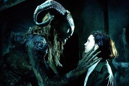
Still from 'Pan's Labyrinth' Guillermo Del Toro's 2006
'Pan's Labyrinth' is a fanciful and chilling story set against the backdrop of a fascist regime in 1944 rural Spain. It is a bold juxtaposition of real and unreal worlds - mixing visually inventive fantasy with the menace of Franco-ite Spain. The film centers on Ofelia, a lonely and dreamy child living with her mother and adoptive father; a military officer tasked with ridding the area of rebels. In her loneliness, Ofelia creates a world filled with fantastical creatures and secret destinies. With post-war repression at its height, Ofelia must come to terms with her world through a fable of her own creation.”. Del Toro's has cited Goya as an influence on the visual elements of his films.
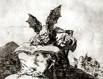
'Contrary to the General Interest' (The Disasters of War) Goya
Goya - plates from 'The Disasters of War' 1810-1820
Francisco Goya:Saturn Devouring His Children (c.1819-21)
Saturn Devouring His Son is the name given to a painting by Spanish artist Francisco Goya. It depicts the Greek myth of the Titan Cronus (in the title Romanised to Saturn), who, fearing that his children would overthrow him, ate each one upon their birth. It is one of the series of Black Paintings that Goya painted directly onto the walls of his house sometime between 1819 and 1823.
The work was transferred to canvas after Goya's death and now resides in the Museo del Prado in Madrid. The grainy warm colours are similar to the tones in 'Pan's Labyrinth'. In the film Del Toro jumps between warm orangy hues and cool blue monochromes. Goya also created 'The Disasters of War' 1810-1820 showing what people are capable of in times of war.
The top image is by Goya and created almost 200 years ago. The bottom image was allegedly taken at Abu Ghraib in 2003 by soldiers. The image is now know as "The Man behind the Hood" - It could be from Goya's series. These images are now part of our modern consciousness and raise ethical questions.
Goya - plates from 'The Disasters of War' 1810-1820
The Disasters of War are some of the most graphic images to come out of the brutal guerrilla war in the Peninsular War . Be warned, however, they may disturb some people as they contain disturbing scenes of horror, brutality, torture and the savagery of war.
Jake and Dinos Chapman 'Insult to Injury' (detail) 2003
Francisco de Goya "Disasters of War" portfolio of 80 etchings, reworked and improved
Jake and Dinos Chapman came to prominence with Damien Hirst and Tracey Emin in the early 1990's. The show 'Sensation', put together by Charles Saatchi, made many of these artists (known as the YBA's - Young British Artists) house hold names. It was not a movement as such but they shared certain characteristics. There was an element of populism, energy and shock - you would want to look away but you would be compelled to stare (as with the Chapman's or Hirst's shark). In many ways it was a reaction against the more serious work of the 1980's and the artists who dominated the British art scene (Tony Cragg, Howard Hodgkins etc). It seemed fresh and exciting while often seeming closer to advertising - The visual equivalent of shouting.
Jake and Dino Chapman could be described as the most shocking artists - above is their example of an 'improved' Goya. They bought an original Goya print and painted clown faces on top (reminiscent of Ronald McDonald). This seems like a childish act and a form of destruction. However there is a long tradition of appropriating the work of others (see Rauschenburg and De Kooning) and it gets us to question the preciousness of art. If this type of art seems shallow, ironic, greedy, vacuous, disrespectful remember - Societies often get the art they deserve.
Jake and Dinos Chapman 'Hell' (1999)
A detail from the brothers' critically acclaimed installation 'Hell' - featuring a series of miniature landscapes, showing thousands of model Nazi soldiers committing atrocities - which was the centrepiece of the RA's Apocalypse exhibition in 2000. This work was lost in a Ware house fire. Most people seemed over joyed that a lot of art had been destroyed as they felt no connection with contemporary art. This can be seen in several ways. On the one hand contemporary art leaves many feeling lost and disconnected. Should art be for the masses or the few? However, the tabloid gloating over the destruction of art seems dark. In the same way that the burning of books has dark connotations the destruction of any art shouldn't be celebrated. Dinos Chapman is reported to have shrugged off the loss, saying, "We will just make it again... It is only art."
Jake and Dino's Chapman

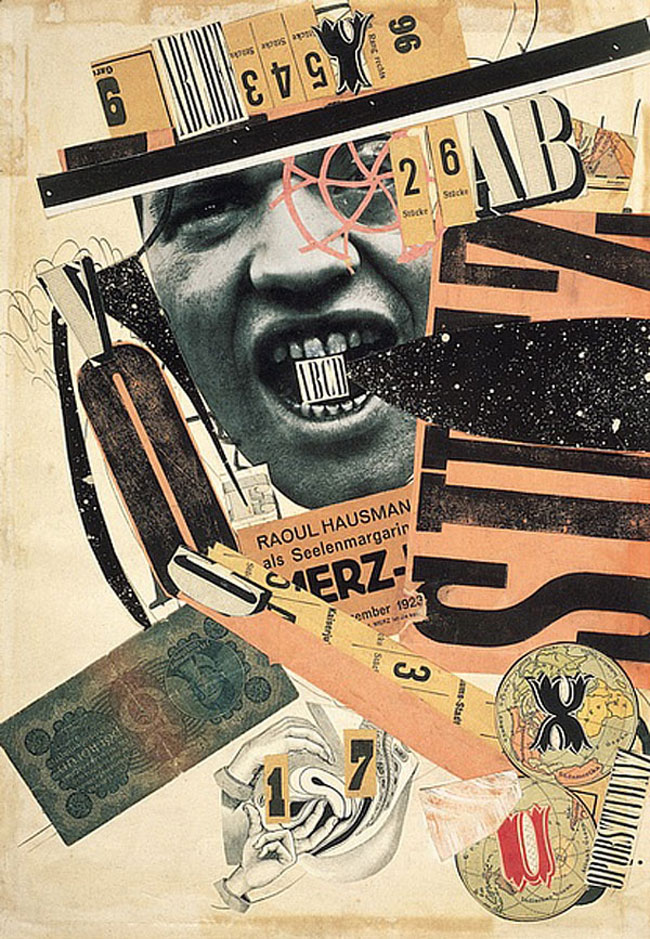
This image is by one of Dada's founding members, Raoul Hausmann, who claimed he invented Photomontage. The top image is actually a collage that mixes different printed emphemeria to create a jarring image. This image was created almost a hundred years ago and to Hausmann's contemporarys would have seemed raw and ugly. This busy, hectic visual language is common place today but it would not exist without the experiments of these early 20th century artists. Dada began under the shadow of the first world war - a generation of young men returning from the front line disfigured and broken. These horrors were captured delicately by the firstworld war artist Henry Tonks.
archimboldo
Robot face
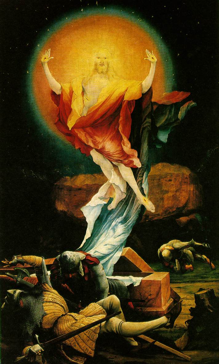
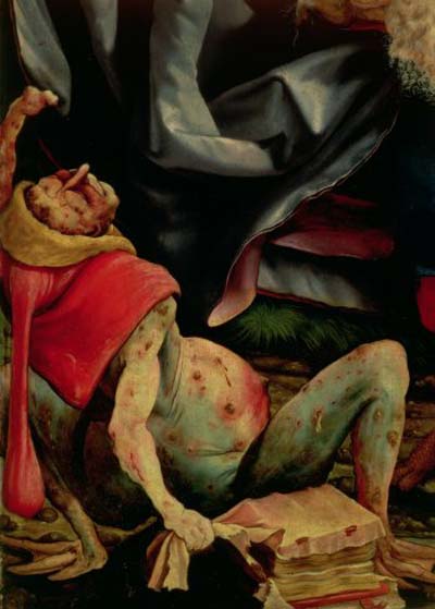
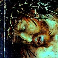
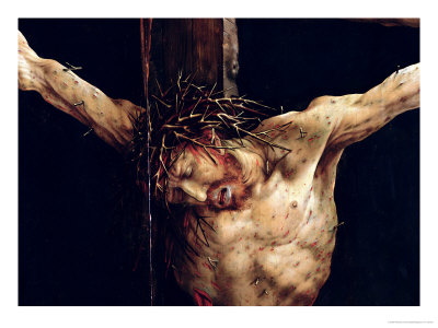
Matthias Grunewald - 'Isenheim Altarpiece' detail of Christ's
Isenheim Altarpiece painted by Matthias Grunewald's 1515
It is the 16th Century and you are a patient at a hospital for Plague victims. Your skin is discoloured and is covered in boils, scars and lesions. You have come to chapel to pray and you look up at the altarpiece and you see Christ before you.
Detail of Christ's hand
Detail - Christ's foot
The Crucifixion has never been so grotesque. Christ has livid green flesh - he is dyeing and he is suffering - he is almost human. You know his pain and he knows yours. It is a gruesome scene full of decay, blood and rotting flesh - a contemporary equivalent might be a Zombie - the living dead.
Still from 'Dawn of the Dead' 1978 by George A. Romero
Matthias Grunewald - 'Isenheim Altarpiece' detail of Christ's head
Why did Matthias Grunewald paint such a dark image. Grunewald lived in dark times and over the previous few hundred years The Black Death, followed by famine, had wiped out a third of the population. In this world the role of the artist wasn't to create beauty but to console (why we are fascinated by the grotesques I do not know). The altarpiece was in sections (each section was made up of various images) and different sections would have been seen at different times of the year. This section, the first section, shows Christ's death. This was made for the prays of patients at the hospital. These images said - Christ suffered like you - but don't give up hope. Pray to the image and you can be saved.
In the first panel Christ is dying.
In the second panel Christ is resurrected - his arms are raised and his skin is pure. He is reborn and the whole scene speaks of hope and redemption. The image says to the viewer that this is the power of Prayer. Before he had livid green flesh but now his skin glows. To our contemporary eyes it is like an advert for a miracle skin product.
We once had belief and prayer. We now have surgery and debt. We once wanted redemption we now want the celebrity look. Grunewald stand between the new world of the renaissance and the old world of
medieval piety and the gothic style. Ultimately the people win out and the old wold of myth, demons and ghouls wins out.
'Throughout history, the vast majority have labelled each age, an ”unquiet age”. Social nostalgia for times gone by has become almost obsessive. Does this spring from a growing sense of anxiety, of unease and dislocation? Has the world grown so complex that the mind and the passions shrink in terror and tremble not only at the future, but at the present? It seems apparent that the most complex societies in the history of humankind are also the most neurotic'.
"The past is a foreign country - they do things differently there"
L.P. Hartley
Nostalgia is the idea of looking at the past with affection. Often people can long for a past that never was - they long for the idea.
Many Photographers will draw on things that they think will be more interesting in the future.
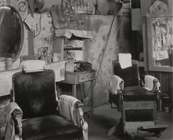
Walker Evans 'Barber Shop Interior, Atlanta' 1936
Walker Evans is one of the key photographers of the twentieth century. His keen, objective images have had a substantial effect on the medium. He captured crisp images of subjects that most photographers wouldn't look at - An old sign, an open door, a shop window. He originally wanted to be a writer and his images seem like descriptions from literature e.g.. an Interior of an old barber shop.
Evans would photograph things that at the time seemed everyday but he knew in the future would be of interest. This image of a petrol pump station seems intriguing today with its combination of hand painted signs and old fashioned looking petrol pumps. If the the pumps were around today they would be antique and photography has that ability to freeze time. Every photography is tinged with nostalgia.
Walker Evans, "Joe’s Auto Graveyard, Pennsylvania," 1936
Walker Evans Polaroid from 1970's
Evans was aware an old object discarded would have worth when viewed in the future. Cars are designed to be used and, like chairs, when they are abandoned they seem sad. They almost have human qualities - we can almost make out faces in their features.
Signs Collected by Walker Evans 1970-75
Evans also collected objects - trash, signs, bottle tops. He collected objects in the same way as he collected photographs - as if the camera has the ability to capture a piece of the world with a click of a button.
'Signs, New York' 1928–30 Walker Evans
Is there a huge difference between taking a photograph of a sign and collecting one off the street. In both cases you end up 'owning' it.
Evans was also aware of how a photograph or a sign preserves a passed society - and more time passes the more exotic the photograph or object can become. A photograph is a moment in time but it can also contain years, decades.
Arman 'Accumulation of electric razors embedded in plexiglas' 1968
Arman was a European pop artist who collected the same type of object and placed them inside glass containers. This act of taking what seems to be rubbish is exactly what is do in Museums - by taking an object out of its original context and placing it in a cabinet the viewer sees that object in a new way. Arman's objects seem to be relic's from another age and as we get further away (in time) from
Arman's work the objects seem stranger and more unusual. The second world war had still left scars on Europe and Arman started by going through the ruble of derelict building to collect these everyday objects. In many ways they are both relics but also an example of the everyday amassed and becoming strange.
Irving Penn 1975
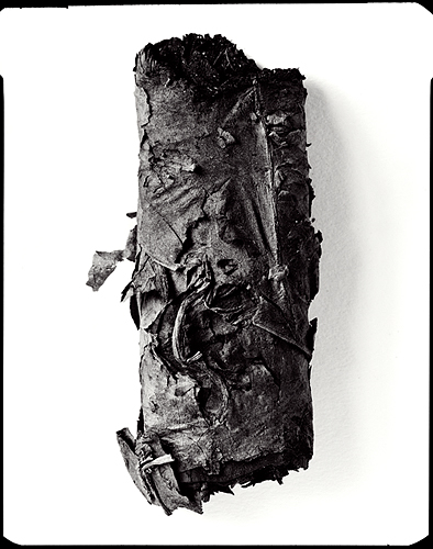
Irving Penn 'Cigarette 17' New York, 1972
Fragment of a mixing bowl -Greek, South Italian, Late Classical Period, about 380–370 B.C.

Irving Penn - New York 1972
Irving Penn is mainly famous as a top fashion photographer and his images are the height of style and elegance. However, he also managed to create a wide range of images and amongst the most curious are his images of New York rubbish. Close up shots of Cigarette butts and empty carton's are reduced to pure black and white, with a white background and in fine detail. A lot can be learnt from the remnants and artifacts of a society. These are ours - magnified.
'Cigar Stub #1', Graeme Mitchell 2008
trash and photo reference
JMW Turner 'Tintern Abbey, looking towards the east window' (1794)
Artist and photographers have been drawn to ruins - buildings where nature has reclaimed the work of previous cultures.
J.M.W. Turner 'Tintern Abbey' England (watercolour) 1795
This watercolour by JMW Turner shows this tradition. Here he has captured the details of the famous ruins of this twelfth-century Cistercian Abbey in Monmouthshire, which he visited in 1792, and again in 1793. Tourists of the time were as much impressed by the way that nature had reclaimed the monument as by the scale and grandeur of the buildings. Turner's blue-green washes over the abbey's far wall blend stone and leaf together, and on the near arch the spiralling creepers seem to make the wind and light tangible.
Detroit by Yves Marchand and Romain Meffre
Detroit is known as Motor city and is famous for car manufacture and music (see Motown - Motor City). Detroit became prosperous but has been in rapid decline. Many of its grandest buildings are derelict and create a faded grandeur. French photographers Yves Marchand and Romain Meffre have documented Detroit's beautiful, horrible decline. The image above is 'Lee Plaza Hotel' - Once one of the most luxurious residential hotels in Detroit, Lee Plaza closed in the 1990s.
Yves Marchand and Romain Meffre - Plant
Luxury-auto maker Packard produced its last car here in 1956. On their website, the photographers write -
"Ruins are the visible symbols and landmarks of our societies and their changes ... the volatile result of the change of eras and the fall of empires. This fragility leads us to watch them one very last time: to be dismayed, or to admire, it makes us wonder about the permanence of things."
This is a photograph of a photograph and the illusion is broken by the tear in the paper. The photographers have focussed on the wall showing the effect of time and nature on a once prosperous city. The same drive to document this decay is same need that Turner had when painting Tintern Abbey.
Walker Evans 'Torn Movie Poster' 1931
Here is a photograph of a torn movie poster by Walker Evans. Evans would often appropriate the work of others and take a photograph of a photograph. Layers of life and culture build up only to be replaced by the latest trend. These images are ephemeral - destined to be lost and Evans has captured it forever. These images have the look of Decollage.
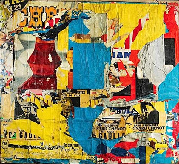
In the early 1950s, Mimmo Rotella began to rip posters away from the walls of outdoor hoardings in Rome, and used them to create elaborate collages. Many of these were film posters but he also used advertisements for appliances and other goods, so that his works became a commentary on the post-war consumer boom. In the studio he would mount the poster fragments onto canvas, rearranging the pieces into new compositions but also stripping away further layers to accentuate their distressed appearance.
Mimmo Rotella
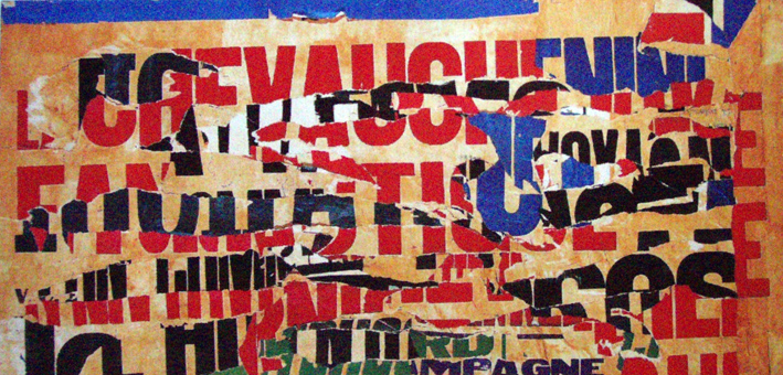
This is an example of Decollage (a French word meaning literally to unstick). The term is generally associated with the Nouveau Réalisme (new realism) movement. Nouveau Realism often found beauty in the everyday and was a poetic recycling of reality. In the context of Nouveau Réalisme it meant making art works from posters ripped from walls, exhibiting them as aesthetic objects and social documents.
Jacques VILLEGLÉ
Jacques Villegle is another key decollage artist. Found objects, ripped posters, radical collages are all used in the New Realism movement of the early 1960s. Décollage is the opposite of collage; instead of an image being built up of all or parts of existing images, it is created by cutting, tearing away or otherwise removing, pieces of an original image.
De-coll/age was a term invented by Wolf Vostell after he saw (a version of) it used in a newspaper article to describe the crash of an airplane that had taken place at takeoff.
Howard Bond - 'Car Hood I, Ontario', 1984
Howard Bond - Car Hood III, Ontario, 1984
Howard Bond’s black-and-white photographs abstract the rusted metal, peeling paint, and torn vinyl of weathered cars into elegant formal designs. Selective framing that eliminates context and relatively flat picture planes make his subjects sometimes resemble color field paintings, sometimes landscapes, but they always bear witness to the beauty that can be found even in unlikely places. Pared down to essentials, these striking pictures are nonetheless rich with texture and fine detail that reward a closer look.
Brett Weston - 'Cracked Paint' 1955
Brett Weston - 'Peeling Paint, Japanese Characters' 1970
'As the master Boticelli stated, such a study is useful because just by throwing a sponge soaked with various colors against a wall to make a stain, one can find a beautiful landscape. If it is true that in this stain various inventions can be discerned, or rather what one wants to find in it, such as battles, reefs, seas, clouds, forests and other similar things, then surely, this is like the ringing of bells in which one can understand whatever one wants to. But, even though these smears of color provide you with inventions, they also show you that they do not come to represent anything in particular.
LEONARDO DA VINCI - from the "Treatise on Painting"
In this quote Leonardo Da Vinci considers the stains and marks to be found in walls - like the flames of a fire or the clouds in the sky we can what we choose. It also shows that a wall, stain or mark is never what it seems.
Alec Soth 'Bonnie with a portrait of an angle'
In this Image Alec Soth's subject believes she can see an angle in a photograph of a cloud.
Brett Weston 'Broken Window with Figures'
Brett Weston has seen a figure in these broken window frames.
Brett Weston
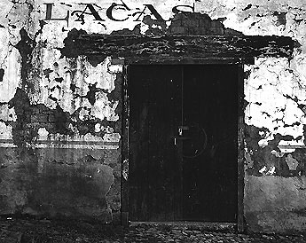
Peeling paint, a worn surface, the effect of nature on the man made - these are all element of Brett Westons work. Brett Weston was the son Of Edward Weston - one of the most famous photographers in the history of photography. Brett Weston's work does owe a debt to his fathers - the use of crisp black and white, creating abstraction out of the everyday. However, there is a simple beauty to these images and they show a sensitivity to the visceral pleasure to be had by the eye. To see beauty in the old and decayed isn't new to photographers - but photography allows us to capture these sections of the world in a way that seems more poetic than paint. A similar beauty can be found in faded renaissance frescoes where the pigment, painted directly onto the wall, has faded and flaked creating a pastel effect.
Piero della Francesca - 'Madonna del Parto' in Monterchi, Sansepolcro. 1467.
Brett Weston 'Doorway, Mexico' 1970
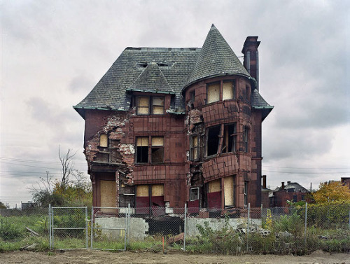
Yves Marchand and Romain Meffre 'Livingstone House'
Constructed in 1893 in the once elegant Brush Park neighborhood, this home, designed by architect Albert Kahn, was moved from its original location several years ago by preservationists who hoped to maintain it. It was demolished a year later.
The House from Alfred Hitchcock's 'Psycho'
Walker Evans 'Billboards and Houses in Atlanta' (Georgia, 1936).
Evans was fascinated by the everyday. Things that were taken for granted in their day become strange portholes to another time. Evans had an eye for what would be interesting in the future. There is so much detail captured in this image - houses that have probably long since been demolished and movies no one remembers or watches anymore.
Walker Evans 'Movie theatre on Saint Charles Street, Liberty Theater
These image were taken during the great depression for the FSA (Farm Security Administration) to show America how many of the poorest lived.
As well as the outside of buildings Evans photographed the inside.
Walker Evans 'Interior Detail, West Virginia Coal Miner's House'
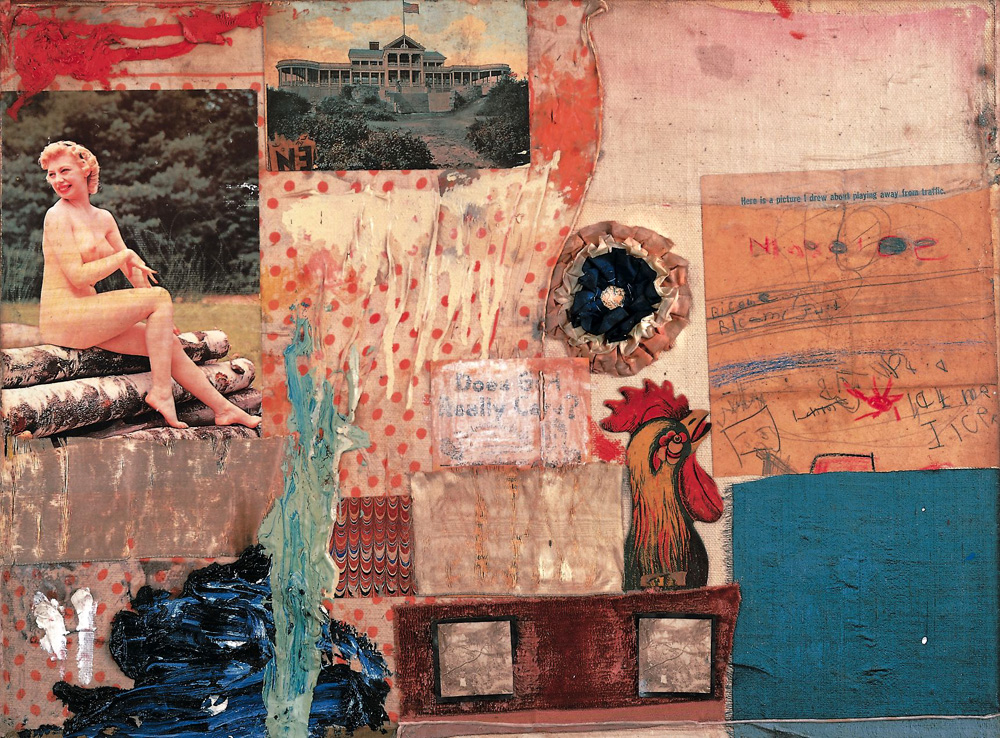
This image above is a found collage. Did the occupant use card board on the wall as cheap insulation or decoration. Maybe there is element of both. Evans noticed this aesthetic quality. It is reminiscent of the the Collage and Photomontage work of Robert Rauschenberg.
Robert Rauschenberg 'Retroactive I' 1964
Robert Rauschenberg
Robert Rauschenberg
In these images you can see Rauschenberg is finding strange juxtapositions, unusual compositions, found collages and using photography as tool for his paintings. They almost have an anti-atheistic and a sense of a dystopia or broken society. Rauschenberg comments that for him photography is “a kind of archaeology in time only, forcing one to see whatever the light of the darkness touches and care”.
abandoned obsolete technologies
We can have Utopian moments - a moment of calm, a favorite song, visual pleasure or a habitual cup of coffee. Minor everyday routines can send us somewhere else.
Malevich, Black Square, 1915 (New Tretyakov Gallery)
Malevich's 'Black Square' is considered as the first, truly non-representational painting, and therefore holds a significant place in history. What do we believe in now? As a society we are mainly secular and we are fairly apolitical. Art seems to mirror this state - maybe advertising is the true expression of where we are now. However, we did once believe - In Colour, form and ideas. Modernist artists truly believed in progression and that with each work they where moving forward. One aspect of modernism was an economy of materials - concrete and steel in architecture, house hold paints in painting and everyday objects in all areas (painting, sculpture, installation etc). Using untraditional materials questioned what went before and what art could be. However, these materials were not designed to last (and arguably this is not arts job). Modernism was a utopia and each time I see a cracked painting, a yellowed montage and weathered car park I am reminded of this - A faded forgotten vision that comes from another time.
compare architecture before and after
offerton estate forms

















_-_Sleep_of_Reason.jpg)






+5.jpg)

