Examples of the work of Karl Blossfeldt (1865 to 1932)
The need to collect, gather, document and record is part of human nature. A collection of photographs serves the same need - to document and record - and when you look closely and compare their are difference between things that seem the same. These differences can be found in nature.
Sculptor & art teacher Karl Blossfeldt is best known for his beautiful photographs of plants forms. The close up images help us see, through the cameras lens, images we wouldn't see with our eyes. Seed, leaves and stems appear as figures or alien creatures. Strange sculptural objects and forms are found in nature. A systematic objective approach that seems to show us the real world actually abstracts it and makes it strange.
Originally, the photographs were intended to be used as teaching aids - subjects for art students to work from,. However, the images became popular when a selection of his photographs were published in the book Urformen der Kunst (Archetypes of Art) in 1928. The book created a sensation in the photographic world & Blossfeldt was rushed to the fore in the German post World War I movement to abandon the soft focus, impressionistic style in favor of a direct lighting & sharp focus approach. His direct objective approach towards photography and his methodical use of a system predicted the way many modern photographers work.

Suren Manvelyan 'Your Beautiful Eye'
These images by Suran Manvelyan uses a macro lens to show the human eye in detail. They look like planets, craters, rivers and mountain ranges. Like Blossfeldt the hyper real approach actually has the opposite effect - the seem alien to us. These images have been described as beautiful, which on one level they are, but they are also ugly and terrifying.
Sam Taylor Wood - 'A Little Death' 2002
Jan Lievens (Dutch, 1607–1674), 'Still Life with Books', ca. 1627–1628.
Sam Taylor Wood 'Still Life' 2001
Sam Taylor Wood is an artist, photographer and film maker. Her 2001 Film/animation ‘Still Life’ has the visual look of a 17th Century Dutch still life. Sequences of still photographs are taken over a period of time to show the fruit slowly decaying. This is shown as a piece of video art in a gallery space - it is almost displayed like a painting on the wall. It is similar to time lapse photography used to capture the growth of a plant - who move at a completely different pace to ourselves.
Brian Eno - 'Four Seasons'
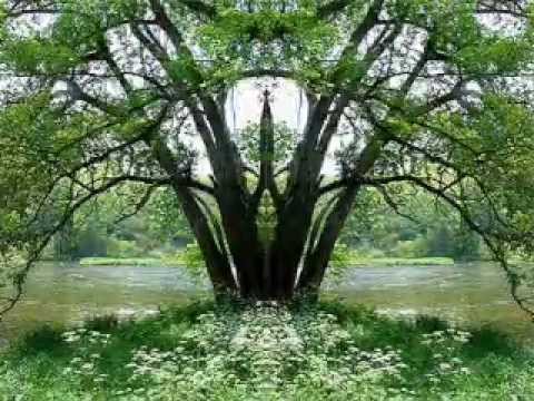
In this work Brian Eno has filmed a single tree through the seasons. Time, decay, nighttime, daytime and the seasons are part of nature and our existence.
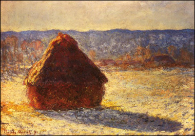
Claude Monet’s haystack.
A group of Monet's Haystacks
Claude Monet was a impressionist painter who was fascinated by light. The warmth of the early morning light, the strong contrast of midday, the golden hour when the sun begins to set, twilight or the diffused light on a cloudy day. When he visited London he didn't see dullness, instead he was amazed by all the different shades of grey and white. During the harvest season of 1890 -91 he returned to the same hay stacks and painted them on site. The same ordinary subject is transformed by observing how the light changes at different times of day and year. Although technically a series of images there is a sense of time passing and the images seem to follow a natural sequence.
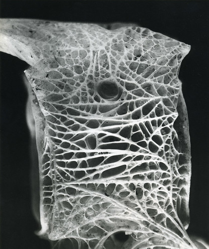
Andreas Feininger's 'Chambered Nautilus Shell' (top image) shows a closer section of this phenomenon. Feininger produced a series of work called 'Structures of Nature' that looked at how forms in nature have influenced human design.
This is a cyanotype by the botanist Anna Atkins circa 1850's. traditionally botanists made intricate, precise and delicate drawings so they could document different species for scientific records. She is the first photographer to publish a book with photographic images. Cyanotype are exposed to sun and developed in water. If exposed correctly they create rich blue image with subtle details and it can still be bought here.
Michael Landy etching from his Nourishment portfolio 2002
The etchings are all meticulous, life-sized studies of individual weeds the artist found growing in the street. Landy has described why he was drawn to these ‘street flowers’. He has said, ‘they are marvellous, optimistic things that you find in inner London ... They occupy an urban landscape which is very hostile and they have to be adaptable and find little bits of soil to prosper’ (quoted in Buck). Weeds are hardy, thriving in often inhospitable conditions with very little soil, water or direct sunlight. They grow between paving stones or on waste ground in the city, tenaciously asserting themselves despite being overlooked by the majority of passers-by. Landy collected a number of these plants and took them back to his studio where he potted and tended them, making studies of their structures including detailed renderings of roots, leaves and flowers.
William Morris - Wallpaper Design
William Morris was a leading member of the Arts and Crafts Movement. He is best known for his pattern designs, particularly on fabrics and wallpapers. His vision in linking art to industry by applying the values of fine art to the production of commercial design was a key stage in the evolution of design as we know it today.
William Morris was an artist, designer, printer, typographer, bookbinder, craftsman, poet, writer and champion of socialist ideals. He believed that a designer should have a working knowledge of any media that he used and as a result he spent a lot of time teaching himself a wide variety of techniques. Like many designers of his time, Morris was skilled in a wide range of arts and crafts. In the age of the industrial revolution Morris championed the hand made over the machine made.
Celtic bronze disc from the pre Christian period
William Morris - 'Tulip and Willow'
Pencil and Watercolour sketch for print design, 1873
Morris was influenced by Celtic, medieval and Islamic design with their stylization of the natural world. However, as well as being nostalgic Morris was revolutionary and pre-empted many aspects of the 20th century - Socialist ideas and the development of art schools (see the Bauhaus). Morris is also thought to have influenced Art Nouveau.
Alphonse Muncha
Art Nouveau (which literally means 'New Art") spread across Europe in the 1890's. The fascination with stylised nature, nostalgia, swirling designs reflect the work of Morris.
Katsushika Hokusai 'Mount Fuji seen below a Wave at Kanagawa' 1831
Along with William Morris Art Nouveau was also influenced by Non Western art that was being imported into Europe. Simple use of line, flat areas of colour, pattern and a flat use of the picture frame were all refreshing to the western artists eye. In this wood block by Hokusai a giant wave manages to be both beautiful and terrifying.
Clifford Ross - from the 'Hurricane' series
Nature is a great source for swirling patterns from hair, to smoke, to waves. Water is transformed into a stationary solid form and has been frozen in time. The rich black obliterates the sea and sky creating a solid area of negative space to contrast with the white textured area. Clifford Ross' images seem to be a heightened form of the real world - these are waves but they seem to be perfect solid waves.
Gustav Klimt 'The Kiss' 1907-08
Art Nouveau took on different manifestations in different countries. In Germany and Austria Gustav Klimt showed his heritage (he was the son of a gold and silver engraver) and this influence can be seen in his craftsmanship, and his extensive use of gold. He was also influenced by Mosaics (seen in Churches of Ravenna). This is evident in the rich ornamentation and intricately small areas in his pictures which are linked to form complex patterns. Against an enormous golden sky a man embraces a woman. The mans head is garland and the woman's red hair adorned with star like flowers; his cloak is decorated with strong vertical rectangles and hers with circular flower forms.
Antoni Gaudi 'Casa Batllo' Barcelona 1904-06
In Spain Antoni Gaudi created his own unique building that seems to come from a fairy tale. Art Nouveau was primary a style of architecture and interior decoration - Gaudi's building seem the physical form of the swirls found in drawings.
Antoni Gaudi 'Sagrada Familia' 1882 to the present day
Gaudi's master piece 'La Sagrada Familia' is still being built due to the scale and ambition of the project.
To design the spires of La Sagrada Familia, Gaudi placed weights on string that he then observed through a mirror. Gaudi used string with bags of varying numbers of shot pellets in them to represent varying weights of the building materials tied to the string at regular intervals. This very closely represents the finite element method in a physical way. A calculation of this type is actually faster than the fastest computer calculation, because the laws of physics, primarily gravity and strength of materials would recalculate the shape of the spire immediately if the ends of the strings or weights in the bags were changed. This natural, immediate, and error free method of calculation is something we tend to overlook these days, where if we can’t figure out how to do it on a computer, we think it can’t be done at all.
In Paris the most famous manifestation of Art Nouveau can be found on the streets. Guimard designed the iconic metro entrances made out of iron in swirling organic forms. Guimard was influenced by Victor Horta - whose finest work was seen in his usage of iron and how it could be used to mould pillars and beams into ‘living’ curves. Horta would study plants and flowers and look to replicate them ornamentally with his usage of iron and glass.
In Britain Charles Rennie Mackintosh create his more geometric form of Art Nouveau. In some designs there are still swirls but the whole feel is harder and more modern. He designed furniture, architecture and graphic design with The Glasgow School of art being on of his most famous designs.
Banknote by Muncha - Money as art
Alphonse Muncha 'JOB' 1896
In Prague Alphonse Muncha turned advertising, packaging and Banknotes into mini romantic masterpieces. Hair, material and smoke has a life of its own and figures are framed in geometric patterned shapes. (Watch a documentary here).
Henry van de Velde 'Tropon' 1898
William H Bradley 'The Chap-Book' 1895
Peter Bradley 'The Kiss' 1898
Art Nouveau would eventually go out of fashion and be replaced by the harder edges of modernism. However, modernism owed a debt to key individuals like William Morris and Charles Rennie Mackintosh. The swirling patterns and stylised figures would reappear and dominate the look of another key decade.
Wes Wilson Concert Poster 1966
Bonnie Maclean - Martha & the Vandellas Poster
Bonnie Maclean Yard Birds poster 1967
Martin Sharp - 'Mr Tambourine Man' 1967
It is the 1960's and things are getting strange. If you were born during the war years (1939-45) and grew up during the austerity of the 1950's (in Britain at least) you would be ready for some excitement. Europe and Britain were still covered in the scars of the War - they may have been gaps in your street where a house used to stand. You may have listened to Elvis in 1955 or heard about the mods & rockers in Brighton in 1964 and realised things were changing. The 1960's didn't just happen - the build up to it and it influences are there in the decades before. The 1960's is a fascinating decade and the Psychedelic posters of the late 1960's seem to embody a mood (Try making one your self with this tutorial here).
Sir William Butler (1838-1910) in his Army uniform
The Beatles in 1967 in a promotional shoot for St Pepper
Klaus Voorman 'Revolver' album cover 1966
Serge Gainsbourg et Brigitte Bardot 'Bonnie and Clyde' 1968
Those swirling lines and typography, those multiple circles - all contrasted with figurative elements owe a large debt to Art Nouveau.. In fact part of the youth culture in the 1960's, for all its anti establishment stance, looked back to elements of the Victorian era - Harpsicords in pop songs (listen here) and Psychedelic Victorian solders uniform were part of the mix. As well as being revolutionary the 1960's generation were also nostalgic - similar to William Morris. They were children in the 1940's, the youth of the 1960's and the people in charge in the 1980's - three decades with a very different feel - aesthically and ethically.
ISO50 Scott Hansen- Contemporary Vector design
The curves, spirals and patterns that are found in Art Nouveau are evident in a lot of modern graphic design and illustration. The very nature of vector art lends itself to organic graphic curves and in these modern examples by Scott Hansen (ISO 50) those elements have bee given a modern twist. Technology often effects the art of its day - from oil paints, the printing press, the camera and, today, photoshop and the internet. The simple bold vector forms are given a worn texture and the faded colour and images give the images a retro feel. You can learn how he created these images in PDF tutorials here.
In these posters by Andy Votel (for B music/Finders Keepers records) fonts become fluid and links can be made back to art Nouveau and 1960's Psychedelic posters. 

Designs by Non Format
Non Format are one of the most interesting studios today. Amongst other more hard edged looks some of their work has a flowing delicate feel - from flowing illustrations around text, figures disappearing into smoke and to hair becoming a circuit board (for Barry 7's Library music compilation).


