

Front cover of 'Pioneers of Modern Typography' Herbert Spencer 1969 - combining a circle, a square and a triangle to create a graphic composition.

Laszlo Moholy-Nagy 'Yellow Circle' 1921
"All art strives to simplify and geometric arrangement is a way of doing that."

Giovanni Bellini - 'Madonna of the Meadow' c1500
The art Critic Matthew Collings has discussed the use of geometric abstract compositions in Renaissance art and modernist abstract art. In this painting Bellini uses geometry to create his composition. He has used a number of triangles to build up the composition.

The madonna is a large triangle taking up the whole composition.
Within that triangle there are three smaller triangles.

Kazimir Malevich 'Suprematism with Blue Triangle and Black Square' 1915
Malevich's Supremacist painting seemed revolutionary at the time - and it was. It seems to have nothing to do with the past and is a truly new type of art. However, the modernists were very interested in the art of the pasts use of geometry.
"It is the olds pure geometric that the new is very interested in."-
"a visual tradition for future artist to draw on"
Collings
Figurative art is held together by abstract values and abstract art uses traditional ideas.
THE CIRCLE

Rembrandt, “Self-Portrait in Painter's Costume.” 1660-62
The circles behind Rembrandt transform the negative space to make a simple, but dramatic, composition.


 Peter Keetman was a key member of fotoform (see the section on Otto Steinert here). These images show he use of pattern - whether he is photographing pipes or creating experimental abstract images.
As of 1948, Keetman experimented with abstract rhythmic images which he produced by swinging a flashlight over a camera with an open shutter placed on a rotating record player. The images recorded two dynamic movements yet produced a very harmonious pattern.

Mexican Watercolour Illustration of the Toltec Calender - 19th Century (from the Yale University Library.)
Marcel Duchamp
During the 1920's Marcel Duchamp created a series of kinetic works that he conceived as optical toys. Making apparent the deceptions that visual perceptions play on our minds fascinated Duchamp. Beginning as a series of lithographs, The Rotoreliefs work as a series of gyrating discs that the artist dubbed an 'Anemic Cinema'. When the discs are spun on a turntable, they appear as three-dimensional objects, making visual symphonies that also parody traditional art.
Josef Muller-Brockmann - 'Beethoven' 1955

Muller-Brockmann - 'Beethoven' poster design scheme

'Contruction de la lettre G' from the Imprimerie Royale, Paris 1716
The shapes had been designed around circles and parallel lines and set against a background grid. The use of geometric has been used to design many typefaces.

Eric Gill's 'Gill Sans' used geometric - and it is especially evident in the lower case 'g'. You can sketch out your own fonts and turn them into usable fonts with Font Capture here.

As of 1948, Keetman experimented with abstract rhythmic images which he produced by swinging a flashlight over a camera with an open shutter placed on a rotating record player. The images recorded two dynamic movements yet produced a very harmonious pattern.

Jasper Johns - 'Target' 1958, Conte Crayon on Paper

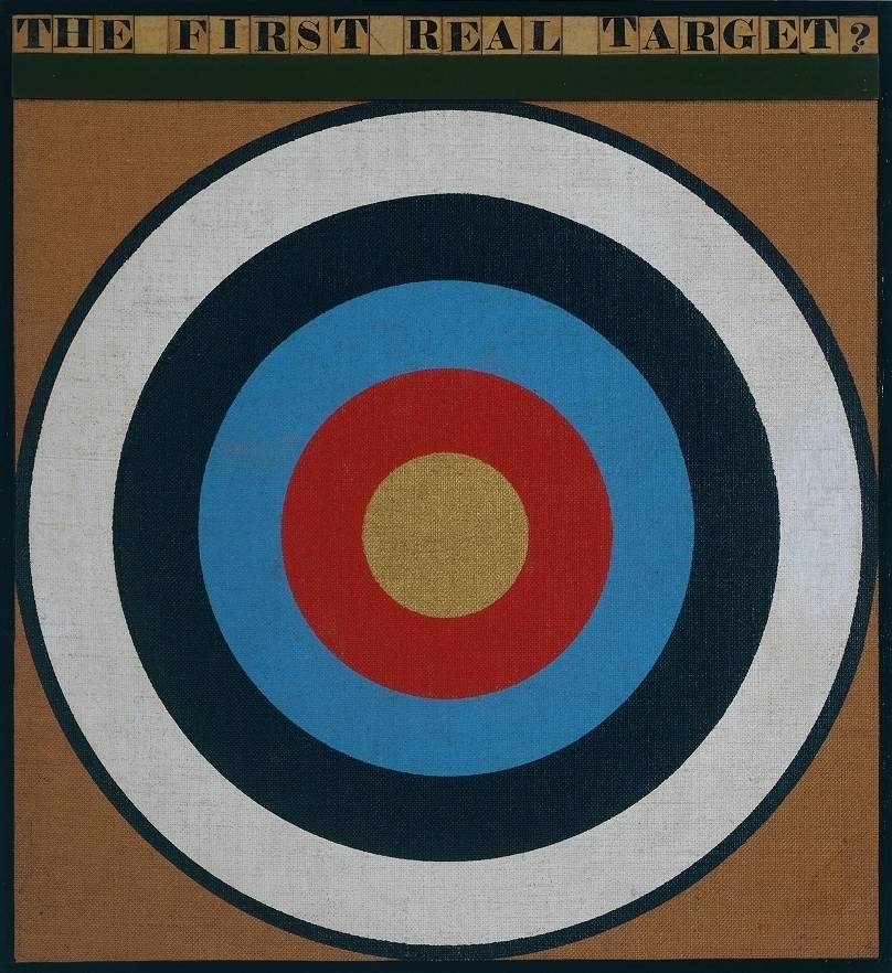
Peter Blake 'The First Real Target' 1961

Peter Blake 2009

Kenneth Noland 'Infanta' 2000


Television test cards (see here) have come in numerous designs often combining geometric shapes and colours. Taken from their original function they have a certain aesthetic quality.
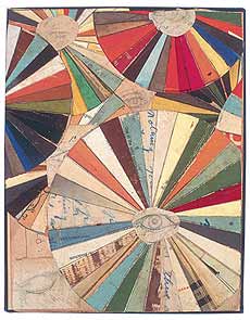


Poster for B Music/Finders Keepers
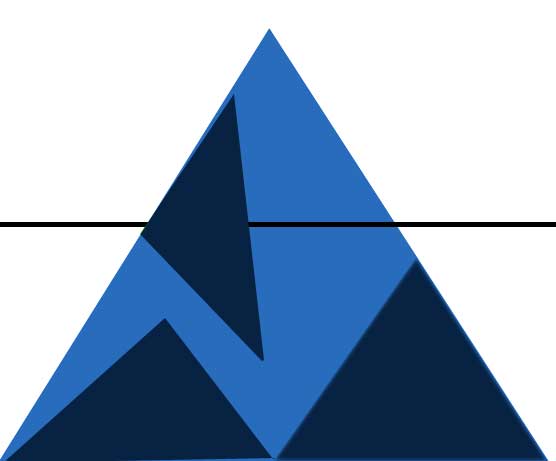
THE TRIANGLE

Kenneth Noland 'Shoot' 1964

The hill intertwining create natural triangles in this photograph by Franco Fonatana.

This painting is by Emma Biggs and Matthew Collings – it is a collaborative act where Biggs designs the painting (shape, colours and combinations) and Collings paints them. The simple geometric shapes and subtle colour combinations shimmer and create a sense of movement. Collings is also a critic who has his own theory on Beauty.


Album cover design for Grizzly Bear
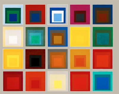
THE SQUARE

 Paul Klee ‘Ancient Sound’

Joseph Albers 'Homage to the Square: Apparitio' 1959
The world is vast - there are many subjects that an artist or photographer could choose as the focus of their life's work. What should you choose? What element of the world deserves your focus?
It is possible for any artist to create one great image, or a photographer to take one great photograph. However, it is harder to create a body of work and many of the artists that we go back to created a body of work that returned to certain themes.

A selection from the series 'Homage to the square' Joseph Albers
The Bauhaus artist and teacher Joseph Albers spent the last 25 years of his life dedicated to Colour theory. His most famous series of work is 'Homage to the square' 1950 - 1976 was a series of paintings that explored colour. Each painting consisted of several squares on top of one another. Each square was a different colour and depending on the combination would create different effects. Some colours would complement one-another and be calming to the eye. Other combinations would create bold graphic images where the squares would hum, buzz and bounce off one another. This dedication to one simple theme could seem tedious but also shows how art can help you appreciate the simple elements of life.
'Easy to know that diamonds are precious
Good to learn that rubies have depth
But more to see that pebbles are miraculous'
Joseph Albers
'Art does not reproduce the visible but makes visible' - Paul Klee
This image reflects Klee’s interest in Colour and Music. The squares seem to have a rhythmic quality like the notes in a song. The colours complement, contrast and work with one another. There is a flicker effect and movement in this image.

