


These images are political propaganda - whoever controls images has control (and Vice Versa). In each image Mao Zedong (leader of the peoples republic 1949 to 1976) salutes and waves at the people like a friendly uncle, father and leader. There is a great warmth to the images and the symbol of the sun radiates behind him. In fact - he is the sun - the centre of your world. On both images sunflower seeds grow reaching for the sun. They are symbols - the sunflower seeds are the people draw towards their great leader.


Ai Weiwei - Tate Modern Turbine Hall
The Chinese artist Ai Weiwei has filled Tate Moderns Turbine hall with 150 tons of sunflower seeds which cover 1,000 square metres. However, these are no ordinary kernels - they are made of porcelain and each one is completely unique. The imitation seed husks have been individually hand carved by skilled artisans working in the city of Jingdezhen. The ceramic seeds were moulded, fired at soaring temperatures, hand-painted and then fired again over the course of two years. Weiwei is using the same images as the political propaganda poster - the sunflower seeds. Weiwei's view of Mao is not of a cuddly father figure.
Mao remains a controversial figure to this day, with a contentious and ever-evolving legacy. He is officially held in high regard in China as a great revolutionary, political strategist, military mastermind, and savior of the nation. Conversely, Mao's social-political programs, such as the Great Leap Forward and the Cultural Revolution, are blamed for costing millions of lives, causing severe famine and damage to the culture, society and economy of China. Mao's policies and political purges from 1949 to 1976 are widely believed to have caused the deaths of between 40 to 70 million people.


This is a photograph of Tzar Nicholas II - Russia's last crowned emperor (he reigned from 1894 until 1917). This photograph seems to be an embodiment of Nicholas' rule. It is a photograph (a modern invention) posed like a traditional portrait painting - even with added colour to add to this feel. Nicholas wasn't able to break away fully with the old traditions - the world was changing. While Russian Peasants lived in poverty the Russian Royal family lived a lavish life. The flamboyant costume speaks of Nicholas statues and absolute power. Nicholas stands for old Russia - a divide between rich and poor, autocratic rule, superstition, religion and traditional approaches to art (read Chekhov and Gogol). The people wanted change and the story of his downfall includes the First World War, Rasputin and, most dramatically, The Russian Revolution.

The Revolution took place in 1917, Tzar Nicholas II and his family were assassinated 1919, Lenin and other Bolshevik leaders took power in 1919 - from this point on they are known as Communists. Almost overnight an entire society was destroyed and replaced with one of the most radical social experiments ever seen - poverty, crime, privilege and class division were to be eliminated. A new era of socialism promised peace prosperity and equality for the peoples of the world. There was an optimism in the air.
A new society needs a new vision - David Hockney has said that visual control equals power. The people who have power control images – and the people who control images have power. The image above is by El Lissitzky who, along with his mentor Malevich, created Suprematism. 'Beat the whites with the red wedge' is a propaganda poster that initially seems abstract. A large red triangle breaks into a large white circle surrounded by black. In fact the red represented the new communists who were breaking down the old world of tradition and monarchy - represented by the white circle embedded in seemingly solid black form. This was a new visual look for a new world where graphic shapes represent ideas.

"the streets are our brushes, the
squares our palettes"

In the middle of the 1920's Alexander Rodchenko announced he would no longer paint and instead he would focus purely on photography as a means of searching for a new visual language. He made pure photography that broke away from the traditions of painting. Photographs would be taken from unusual angles - from underneath the subject or looking down turning the world into forms. His images had a graphic quality that seemed like a new way of seeing. There were strong diagonals, verticals and areas of graphic pattern. Rodchenko believed the era of painting was over and a new visual era was about to begin.

Alexander Rodchenko 'Lilya Brik' 1924

Rodchenko, along with Liubov Popova, gave the visual look for this new world. Designing a humble advertisement had more worth than making a piece of art. Art is seen by a few people in galleries - adverts are seen by everyone everywhere. This graphic language, designed under Communism, gave the visual language of Capitalism to the West - the origins of the McDonald's logo began here. This look has been used and revisited by Neville Brody (at Face Magazine) to Modern album covers.
Above we can see how Rodchenko took his photographs and cut them up and resembled them with flat coloured paper and text. The colours, forms and angles are taken from suprematism and are the language of constructivism. The text shouts out - in this image above the head of Lilya Brik actually does shout out. Rodchenko has given a visual triangle form to the way sound seems to travel - we understand that this girl is shouting. 'Books' she cries 'in all fields of Knowledge' - it a propaganda poster urging people to read books. This is good advice - we could all do with reading more books - they're much better on the eyes than a computer screen.
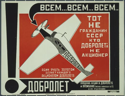
Alexander Rodchenko 'Dobrolet' 1923
Russian icon 15th to 17th Century
"In Russia there is a word for 'Thing' with no precise equivalent in English: 'vesch' means 'a thing with a soul" Warner, M 'Things'
Constructivism's new look - bold flat areas of colour, sections of pattern and geometric shapes created a new visual language. The Russia artists, usually on the outskirts of society, found themselves central - as the Bolsheviks sought out an art that was as radical as their new politics - Lenin even included artist in his hero's of the revolution. However, placed next to an old Russian icon those geometric shapes, flat areas of colour and pattern do not seem so alien. Icon's where made for churchs, to tell the story of Christ to an illiterate congregation. They were painted directly onto wood and often had other elements attached. There is a directness, a 'thingness' about icon's that can also be felt with a Malevich suprematist painting. Icon's where commissioned by the church (who had control) and the new look was adopted by the Communists (who had control). Some things don't change.

Many hands saluting in unison - the original utopian vision would eventually breed greed, division and horror under Stalin. The constructivists set the look - Red, white and black mixed with cut and paste methods - they didn't have photoshop only paper, photographs scissors and glue. The use of scissors and paste was advocated during the five year plan as the proletarian and propagandistic device of choice. Like Photography (even more so today with our invisible technology), it required virtually no training and the most ordinary materials. Of course Rodchenko, Klutsis and the Stenberg Brothers did have wonderful visual skill.

The Stenberg Brothers 'The Traitor' 1926

Stenberg Brothers 'The Last Flight' 1929
Geometric shapes, flat colours, text and figurative elements jostle to tell aspects of the narrative. These are both examples of Film Posters by The Stenberg Brothers produces hundreds of film posters during the 1920's and 1930's. The influence of Suprematism, Dada and Rodchenko are evident. These artists working under communism were creating a language we still use today in modern graphic design.

Stenberg Brothers 'Man with a Movie Camera' 1929

Stenberg Brothers 'Man with a movie camera' 1929 a film by Dziga Vertov
This is the Stenberg's poster for Dziga Vertov's revolutionary film 'Man with a Movie Camera'. The diagonal lines of Constructivism become the legs of Vertov's film camera tripod. The moving image is the ultimate Photomontage but rather than a static image you have multiple images, one after the other, creating strange juxtapositions and new meanings. Vertov's films are like a living Dada Photomontage.
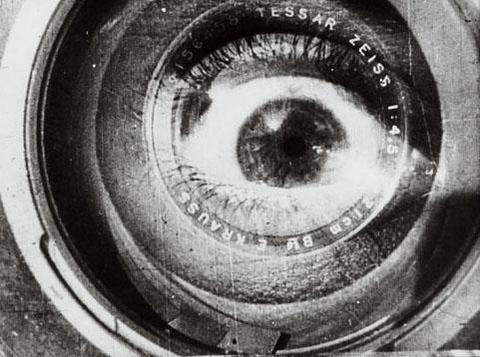
"I am kino-eye, I am mechanical eye, I, a machine, show you the world as only I can see it."

Vertov wasn't making art - he was making work for the people. In doing so he helped create the language of cinema. Like the juxtaposition used in Surrealism, editing film together creates new meaning. When the director Lev Kuleshov demonstrated the psychology of cinema by splicing the same shot of an actor's face with, alternately, a dead woman, a child and a bowl of soup, audiences interpreted the actor's unchanging expression as a reaction to the three contextualising shots. This is known as The Kuleshov Effect.

The Communist Soviet state had its enemies - mainly from the capitalist USA - this conflict became known as The Cold War. The Cold War lasted from the end of World War II right up to the early 1990s, although the Soviet Union and the USA never actually engaged in direct battle. Instead, the Cold War was expressed through weapons development (the nuclear arms race), technological development (the space race), espionage and propaganda.

Western democratic states churned out huge amounts of propaganda material throughout the First and Second World Wars, but practically decommissioned their propaganda machines post 1945.
This poster above is British and was displayed in government and military offices throughout the country. Although it carries no explicit anti-communist message, we can safely assume, given that it was published in 1960, that it warns against the presence of Soviet spies.

Photomontage - Astronaut Dave Bowman (played by Keir Dullea), in 2001: A Space Odyssey, 1968
John French Fashion Photograph, 1960
John French Fashion Photograph, 1960
The V & A show 'Cold War Modern' explores the art, graphic design and technology that was created during the cold war. Each side wanted to show that their philosophies worked better - Communism vs Capitalism - and in this race great developments were made.

From Utopian Cityscapes

Architecture
The Philips Pavilion, Brussels World’s Fair, 1958, designed by Le Corbusier

Transport

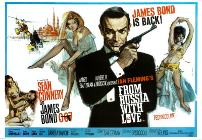

To Spies and James Bond


Brian Moore
Inspired by the 2009 Iran election protest and activism and censorship therein, these third world war propaganda posters were conceived by Milwaukee-born designer Brian Moore. They are a playful statement on wartime, citizen journalism, censorship, and the advent of the internet. Similar work is done by Aaron Wood and others.