William Eggelston - from his 'Los Alomos' series
Patterns are found everywhere – Nature, Literature, Music and Art.
Try this yourself - follow this link to use the Tone Matrix. By adding white squares to the grid you can make a pattern that will loop - creating a delicate sound like a music box. See what loop you can create and see if it changes your mood (you could also try the FM3 Buddha Machine) - then come back!
This image is called ‘Ancient Sound’ by the 20th century artist Paul Klee. He was a member of the Bauhaus and also wrote about art.
'Art does not reproduce the visible but makes visible' - Paul Klee
This image reflects Klee’s interest in Colour and Music. The squares seem to have a rhythmic quality like the notes in a song. The colours complement, contrast and work with one another. There is a flicker effect and movement in this image.
The GSW Headquaters in Berlin was designed by Sauerbruch Hutton (1999). This architecture shares similar characteristic to Klee's. Like a Klee painting (or a repeated sound) the building has a visual rhythm with the various hues of red reacting with one another and contrasting with the blue sky.
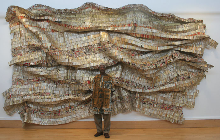
El Anatsui creates shimmering large scale artworks made from discarded bottle caps. They are simultaneously sculptures, paintings, collage and installation and have a genuine visual zeal. Like Klee's work and the GSW Headquarters the smaller visual elements come together to make a greater whole.
Lance Letscher is a contemporary artist who collects old books, paper and materials and pieces them together to give them new life. The manufactured colour's that are all around us are combined and contrasted using different structures. Letscher's work, like Anatsui's work, seems to have its roots in craft and folk art.
VE Day Celebrations, Hoyland Street, Wincobank
Bunting is little triangles cut out of various left over material, attached to string and hung up for decoration. The 'make do and mend' aesthetic and the combination of different materials make bunting an interesting artifact. It was often used in street parties - for example the VE day celebrations. Notice in this photograph above how it hangs above the street blowing in the wind. As our sense of community has changed there are less street parties that take place - bunting seems to belong to this bygone era.
This is Log Cabin Quilt circa 1900 from North America shows the characteristic design of the American frontier home. They adapted an economic way of using up even the smallest fragment of material achieving a surprising variety of designs. The design was influenced by the width of the strips and the placements of the various colours.
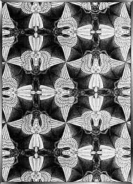
This image by M C Escher juxtaposes Bats and angels to create a continuous pattern. There is an element of playfulness to Escher's work.
These Victorian tile designs are influenced by Islamic tile design. Owen Jones soon realised the debt that Islamic design had to geometry, mathematics and astronomy. He was a strong influence in the contemporary development of tile designs, seeing the patterns of tessellation as a key to rationalising the beauty of Islamic ornament.
This painting is by Emma Biggs and Matthew Collings – it is a collaborative act where Biggs designs the painting (shape, colours and combinations) and Collings paints them. The simple geometric shapes and subtle colour combinations shimmer and create a sense of movement. Collings is also a critic who has his own theory on Beauty. 

These are antique board games. The circles, lines and colour are mainly there because of the rules of the game. The worn paint wearing off the wood gives them a feel of a Russian Icon or evan a later work by Frank Stella.
Frank Stella used house hold paint out of the tin with painter and decorators brushes. The bands in his paintings are determined by simple things - the width of his brush or the width of the wooden frame. His painting were about themselves and completely self contained. Like the Log Cabin quilt the image has a direct relationship to the materials used. Stella came to prominence in the 1960s and is considered one of the fathers of Minimalism - seeing his paintings as objects not signs to something else. Stella's later work broke out of the square frame and became more colourful and vibrant. Whether you look at his monochrome early work or his bold later work there is a sense of movement and pattern in his paintings. There are visual effects that happen when you look at these paintings.
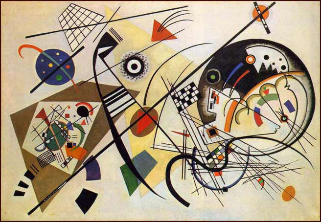
Kandinsky used music to influence his compositions –
‘Hearing tones and chords as he painted, Kandinsky theorized that, for examples, yellow is the colour of middle-C on a piano, a brassy trumpet blast; black is the colour of closure and the ends of things; and that combinations and associations of colours produce vibrational frequencies akin to chords played on a piano. Kandinsky also developed an intricate theory of geometric figures and their relationships, claiming, for example, that the circle is the most peaceful shape and represents the human soul. These theories are set forth in 'Point and Line to Plane’.
The merging of sound and vision was also being explored in avant garde films of the 1920's. Moholy-Nagy's 'Light Prop for an Electric Stage' is a development of his earlier work with photography, photograms and painting. It is a sculpture, a piece of Kinetic Art and a device he used to make an early abstract experimental films.
Film was still evolving at this time and artists who experimented with film were leading the way for title sequences, animation, music videos and computer animation. During the 1920's pioneering abstract films were being made by Hans Richter and Viking Eggeling (for example Filmstudie).
Also see Fernand Leger.
Also during the 1920's Marcel Duchamp created a series of kinetic works that he conceived as optical toys. Making apparent the deceptions that visual perceptions play on our minds fascinated Duchamp. Beginning as a series of lithographs, The Rotoreliefs work as a series of gyrating discs that the artist dubbed an 'Anemic Cinema'. When the discs are spun on a turntable, they appear as three-dimensional objects, making visual symphonies that also parody traditional art.
Roger Vail
Mary Ellen Bute made a series of films called 'Seeing Sounds Films'. Her first colour film 'Synchromy No.4:Escape' (1937) tells the story in abstraction of an orange/red triangle set to the music of Bach -'Toccata in D Minor'. (see Also Norman Mclaren - Spook Sport 1940).
Ultimately avant garde art filters down into the mainstream - A Mondrian bag, A Bridget Riley dress to modern surreal adverts. This Advert for Total Oil (1958) by Andre Sarrut shows sound being merged with abstract images.
These early experiments have filtered down to popular culture and influenced the next generation.
You could follow the Apollo 11 mission to the moon, influence an abstract pop video, reinvent colour at the MOMA, conduct your own doo wop group, contribute to a Johnny Cash video, edit a pop song, draw with type (like John Cage), make drawings out of fonts or take a line for a walk.
John Cage was primary known as a musician – his most famous musical composition is called 4'33". It consists of the pianist going to the piano, and not hitting any keys for four minutes and 33 seconds (see also Rauschenberg’s and Robert Rymans White paintings). In the silence the audience is encouraged to listen to all the sounds that take place during silent moments.
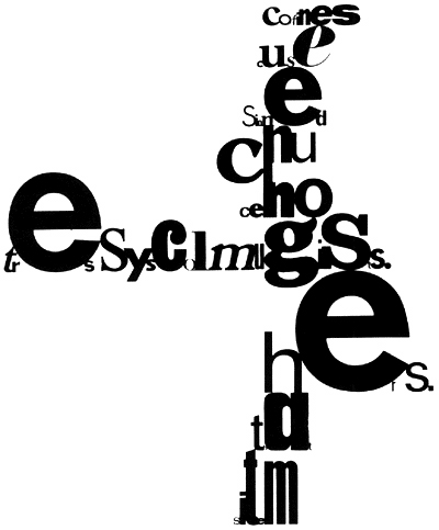
Cage also created poetry and art using elements sutch as chance. His images often have the fluidity of a piece of music – giving visual form to sound. Cage’s ‘Mesostics’ are his chance experiments with writing creating visually striking graphic texts.Cage worked closely with Robert Rauschenberg at the Black Mountain College.
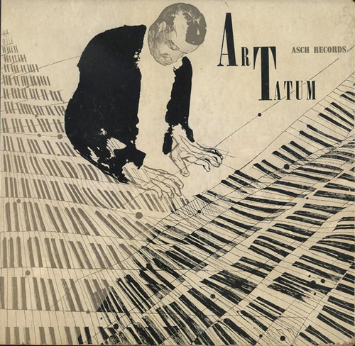
Jazz album Covers of the 1940's and 1950's seem to reflect the quality of the music. As sounds intertwine so do the visual elements of this album cover. the keys of the keyboard have the repetitive quality as a Paul Klee. The keys create two triangles on both bottom corners making a top, central white triangle where the figure sits. Black and white is used to dramatic effect - the keys create delicate patterns and contrast with the flat black of the figure and the font. See more examples here.
The painting above is by Wassily Kandinsky (1866-1944) 'Transverse Line' 1923.
Like Klee, Wassily Kandinsky taught at the Bauhaus and his ideas influenced modernist art. He is credited with making the first purly abstract painting.
A Vintage Vanguard album cover


