


Still from Alfred Hitchcock's - 'Champagne' 1928 - shot through the bottom of a wine glass.
This is a strange still from an early silent Alfred Hitchcock film. It is taken from his 1928 film 'Champagne' were he experimented with a camera lens placed inside a giant champagne glass. The glass fills with liquid and is tipped as if we, the viewer, are drinking from it and seeing through it. We can just make out a crowd and couple dancing.

Still from Hitchcock's 'The Ring' 1927 - a moving reflection in a stream
During the filming of Hitchcock's early silent film The Ring (1927) he experimented with trick photography. In the above still we see a reflection of a couple in a stream. When the water ripples the image itself ripples and the figure go in and out of abstraction.


Stills from Hitchcock's 'The Ring' 1927 - seen from the viewpoint of a drunk man
In these two scenes we see what a drunk sees and the world appears distorted. This could emulate the effect of drink but also be a metaphore for viewingt he world through the bottom of a glass. Dancers distort until they are unrecognizable. Hitchcock uses blurring and mirrors to distort the image and create a sense of disorientation. The keys of a piano appear elongated as if seen through a fairground mirror. This visual experimentation is a key aspect of Hitchcock's Cinematic style.
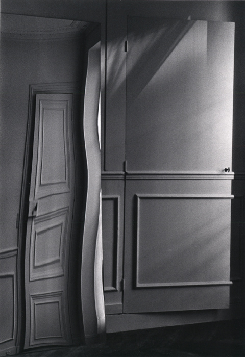
Andre Kertesz - Paris, Door Distortion, July 29, 1984

Andre Kertesz ‘Distortion 144, Paris’ 1933

Andre Kertesz ‘Distortion 147, Paris' 1933
These strange distorted images are by André Kertesz. ‘Distortions’ (1933) is a series of photographs of women reflected in distorting carnival mirrors that transform them into dreamlike creatures.

Salvador Dali 'Soft Construction With Boiled Beans (Premonition of Civil War)',1936, oil on canvas.
The deformed melting figures of Dali's painting mirrors the distortions that appear in Kertesz's photographs. This painting is one of only a handful in which Dalí turned his attention to the tragedy that beset his homeland on July 17, 1936, when General Francisco Franco led a military coup d'état against the democratically elected Popular Front government. The artist's savage vision of his country as a decomposing figure tearing itself apart preceded the outbreak of the Spanish Civil War and thus prophetically foretold the atrocities committed during this bloody conflict. Other artists who have focused on the Spanish Civil War are Picasso (Guernica), Guillermo del Toro (Pan's Labyrinth) and, during the earlier civil war, Goya (Disasters of War). Dada Photomontage distorted the human form immediately after the first world war. As well as having surreal qualities these images, like the Dada Photomontages could be a reaction to the human horrors of the first world war and the rise of 1930's fascism.
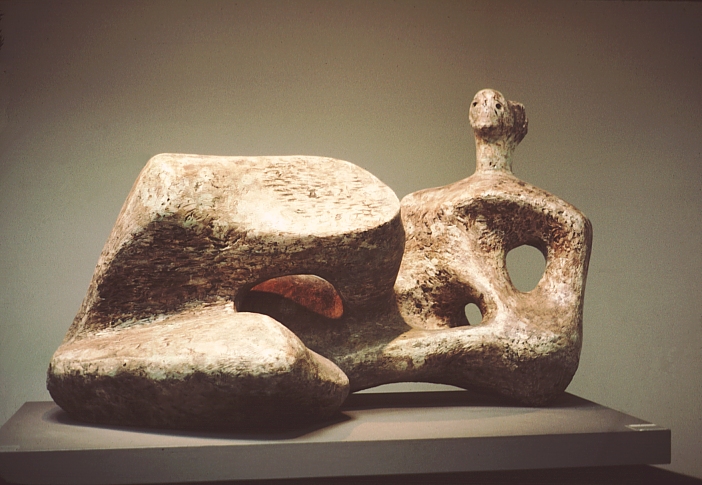
Henry Moore. Working Model for Reclining Figure, 1957. Bronze.
Henry Moore emerged in the 1920s as a radical, experimental and avant-garde figure and was rapidly established as the leading British sculptor of his generation. His principal and enduring subject was the human body, through which he believed ‘one can express more completely one’s feelings about the world than in any other way’. Moore also reflected in his work his reaction to two world wars. The smooth quality of these images are similar to the effect of melting ice and how is distorts as it transforms back into liquid.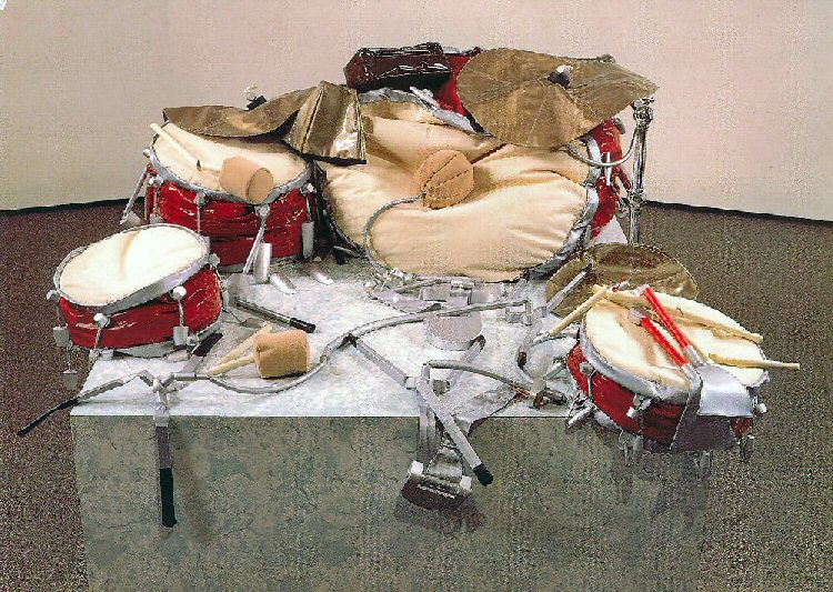
Claes Oldenburg 'Giant Soft Drum Set 1'
Sculptures are traditionally cut from rock or wood. They can be moulded from clay. Oldenburg's everyday objects seem to melt into the gallery floor - evaporating into nothing.

LP designed by Alex Steinweiss
In 1940 23 year old Alexander Steinweiss proposed to Columbia to make a change in the presentation and packaging of the 78 RPM record albums. His idea was to use original artwork (drawings and paintings) on the front of the albums. This new approach was quite a change if compared to the gold or silver imprint of just the nomenclature in a serif or gothic font on the black, brown or beige heavy books.

Alex Steinweiss cover designed in 1938
Steinweiss revolutionary idea would transform the packaging of music - it was no longer just sound but a physical object to be coveted and collected. He designed them as miniature posters, with eye catching graphics, distinctive and vivid colours, and creative, original typography. The key information was still included but was incorporated into the overall design. The large square format was a perfect size for a piece of graphic design. Until the arrive of the CD format in the 1980's the LP would be the main format, and the LP cover the main format for art work.


"If you wanted colour, you had to give them (the printers) tight keyline drawings, and they would break these down into the specific colours. Everything was printed as solid." Steinweiss
The use of simple lines and bold colours was partly due to the limitations of the printing technique but this resulted in a certain visual style.

'The Red Sun' Joan Miro 1948
Steinweiss was also influenced by wider design. The paintings of Joan Miro, from the same period, has a similar use of of bold colour, abstract forms and delicate line. The abstract nature of the images reflected the abstract nature of music - especially classical and jazz records.

'Sonny Clark Trio' 1958 designed by Reid Miles

1950's record sleeves for the Blue Note label are some of the most iconic designs. During the 1950's and 60's Reid Miles produced over 500 record sleeves for the label. In the two above images the keys of a piano have inspired the design. The top design by Reid Miles has a similar feel to the work of Steinweiss with the flat over lapping colours and the hand drawn illustration. However, Reid's bottom design uses uniform flat black forms contrasted with one out of place key with a photograph embedded. The out of synch key could be a metaphor for new approaches to musical composition. This combination of simple minimal graphic forms, simple typography and photographs are typical of the Blue Note style.

Miles worked closely with photographer Francis Wolff to create the iconic covers. The combination of Wolff's cool black and white photographs and Reid's typography experiments and layouts was the ideal partnership.


'Grant Green Street of Dreams Session' - Photographed by Blue Note Photographer Francis Wolff
Miles worked closely with photographer Francis Wolff to create the iconic covers. The combination of Wolff's cool black and white photographs and Reid's typography experiments and layouts was the ideal partnership.

Reid would take a black and white image and position the text to work with that image. In the sleeve for Donald Byrd's 'A New Perspective' a photograph of a car has been used as the main image. Over half the composition is dominated by the spherical shape of a car head lamp creating a bold graphic form. Byrd himself can be seen in the distance and placed in the center of the frame. Reid has then placed the text within the negative space (the sky in this case) between Byrd, the car and the edges of the frame. In this way the Typography becomes a central part of the image.

The Beatles 'Sgt Peppers Lonely Heart club Band' designed by Peter Blake
The concept of an album, a collection of songs that work together to form a whole is a relatively new concept. The Jazz artists on Blue Note created albums but most 'Pop' groups released single and compilations. The notion that most bands and artist created albums was made popular in the 1960's by bands such as The Beatles. They wrote their own songs (this was new in itself) and with each album (for example 'Rubber Soul' and 'Revolver) there was a sense of the classic album - a format that future generations would follow.
This approached came to its logical conclusion with the release of 'Sgt Peppers Lonely Heart club Band' in 1967. The whole album was designed as a 'Concept' album with each track being apart of the whole. This approach was carried through into the art work.

The whole packaging was designed by the Pop Artist Peter Blake who used his style through the packaging. Targets, Military paraphernalia, Victoriana, bold colours were all used to created the final product.
The front cover is an elaborate photo-shoot involving the band and a multitude of cardboard figures of famous people. It was an elaborate stage set full of props and has been mimicked many times.


Different views of the 1967 Vinyl released of The Beatles 'Sgt Peppers Lonely Heart club Band'
The other key element is the gatefold sleeve - meaning the sleeve opened up like a book. It even had a pull out cut out inner sleeve - designed by Blake. This was very much an object - not just a piece of music made from plastic.

An IPod showing mp3/mp4 in Cover Flow
Vinyl records due to their size were the ideal medium for cover art. The physicality of a vinyl record made it a sought after treasured item - when they were first released and for future collectors. The CD used a similar square format but on a much smaller and less effective scale.
Is the album sleeve dead? In the age of digital music downloads the music industry itself is changing and evolving. The way we consume music will move on. The format of the album could also be dying. Recorded music in a physical package (a wax cylinder, Vinyl, 8 track, tape, or CD) had a very brief lifespan and that physicality has been replaced by another object. A smooth, glowing modern piece of consumer technology - the ipod.
However, even the ipod copies the square album cover format. 'Cover Flow' on ITunes allows you to browse through little square album covers. This emulates Vinyl record covers in the same way modern digital cameras emulate the sound of an analogue film camera (see this article on 'Retromania' by Simon Reynolds).
As the music industry will have to evolve so to will the way visuals interact with music. As video become more omnipresent (via the internet and Youtube) still images and photographs could be coming to the end of their visual dominance. Some bands are using these uncertain times to be creative with how you experience their music like this interactive site for Arcade Fire.