Pablo Picasso 'Guitar' 1913
This image above is by Pablo Picasso and is a picture of a guitar. He has abstracted the image as if it has been seen from multiple viewpoints and so the guitar itself seems fractured. Segments of the 'Guitar' are cut from a variety of materials - a piece of old wall paper, a scrap of cardboard and a circle cut out of newspaper. The different patterns and textures contrast and compliment one another - drawing your eye in different directions. This is an example of Picasso's and George Braque's Synthetic Cubism and shows a break away from traditional mediums in western art. Where once artists would manipulate paint to create objects, Picasso takes elements from the real world to depict the real world.
This is an example of collage - an image made from different materials and images combined. To understand Collage completely we must look at Photomontage as the two are closely related. Collage had existed before Picasso but this was the first time the 'high' culture of professional art had mixed with the 'low' culture of a scrap of newspaper or a torn bit of wall paper.
Eugene Atget Place Saint-Andre-des-Arts, Paris 1903-4
This is a photograph of the Parisian streets Picasso and Braque walked while they developed their cubist work and their use of collage. Atget has captured the excitement and apparent randomness of the information environment of the modern city, emblazoned on a scale no sensitive eye could miss. Squares, rectangles, vertical lines, triangles, fonts and tones compete for our attention. This is almost a found collage - could this scene have influenced Picasso? It reminds me of a busy web page with flashing adverts, links and information vying for our attention.
Eugene Atget 'Magasin, avenue des Gobelins' 1925
Atget spent his career documenting Paris often combining the old with the modern. This image, from his later period, shows the height of French fashion with the reflection of the three hundred year old Gobelins complex. People rarely appear in his images - only the traces of people remain. He would document Paris's grandest building and most humble corners. Advertising and shop windows were unusual themes for Photography - his images were mainly taken as reference for other artists and illustrators. He was relatively unknown in his time but Man Ray, who lived only a few doors away from Atget, had been the first to celebrate his work. Man Ray saw Atget's work as a kind of naive proto-surrealism. Atget's unique eye and straightforward approach can be seen in the objective look of future generations like Walker Evans, Stephen Shore, Lee Friedlander.
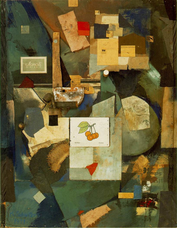
Kurt Schwitters 'Merz Picture 32 A (The Cherry Picture) 1921
"I'm a painter and I nail my pictures together."
These are the words that Kurt Schwitters used to introduce himself to Raoul Hausmann (according to Hausmann). Painters don't nail things together they just apply layers of paint onto one another to create their images. However, images have been made out of all manner of materials for thousands of years - why can't a collage be a painting?
Schwitters joined the Dada group (see the Photomontage section for more info on Dada) although Schwitters chaos always had a sense of beauty - a fact that made the other Dada artists see him as being too romantic.
'You can't make either life or art, you have to work in the hole in between, which is undefined. That's what makes the adventure of painting.'
Natasha Kerr - 'At the end of the Day' 2007
Schwitters joined the Dada group (see the Photomontage section for more info on Dada) although Schwitters chaos always had a sense of beauty - a fact that made the other Dada artists see him as being too romantic.
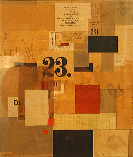
Kurt Schwitters - 'Mz 601' 1923
Picasso's collages and paintings still depicted the real world - like a guitar. Schwitters created collages that were purely abstract and were made up of fragments of detritus from the streets. He called these collages Merz - taken from the words left on a fragment of torn paper. In this collage Schwitters has used a series of squares laid next to and on top of one another. Fragments of paper are joined by fragments of letters and numbers - the overall composition is dominated by a large number 23 just left of center. The image could be described as having a random nature but there also seems to be movement, animation and rhythm. There could be an order to this chaos - as if Schwitters has used elements of the golden rectangle in his work.
These photographs above were taken of Schwitters 'Merzblau'. From 1923 Scwitters began work on what he regarded to be his life's work. In his home he began to place collages on the walls, eventually adding and expanding them all over his home. He gradually connected them with string, wire, wood and plaster. His home eventually became a 'Merzblau' (a Merz Building) - both his home and a giant three dimensional sculpture/installation. The flat angles from his collages became sculptural forms, wall became distorted planes like a german expressionist stage set. As with many key German artists Schwitters fled to escape the Nazis' in 1937. Never one to be put off by the tyranny of fascism Schwitters built more Merzblau in Norway (1937 -1940) and Cumbria, England (Merz Barn 1947).
The three dimensional angles of Schwitters Merzblau and German expressionism are found in this visually rich building. This is the Nestle Chocolate Museum designed by Rojkind. The exterior is made up of rich primary red prefabricated sections pieced together. Many of the skins of buildings combine different materials like a Scwitters collage. When Collage moves into three dimensions it becomes an Assemblage.
This is a photograph of one of Picasso's Assemblages. Picasso had been making assemblages of objects since 1912. He took a Bicycle seat and handle bars and stuck them together on a plinth. On one level that is exactly what we see. On another level it is quite clearly a bull's head (or a ram or goat). A transformation has occurred - Picasso has had the creative idea and set up the signals for us to read. This is what a drawing does - graphite is built up on the surface of paper to create the illusion of something. The drawing manages to be both a sign to the thing depicted and still a piece of paper with graphite on it. Picasso is taking advantage of our ability to what to see things. We see shapes in clouds and faces in marks often. We are programed to see faces and Picasso has playfully taken simple things and made us see a bull.
Walker Evans 'Interior Detail, West Virginia Coal Miner's House'
Atget found collages in the city - on billboards, shop windows and walls. In this image above Walker Evans has photographed a found collage. Did the occupant use card board on the wall as cheap insulation or decoration. Maybe there is element of both. Evans noticed this aesthetic quality. It is reminiscent of the the Collage and Photomontage work of Robert Rauschenberg.
Robert Rauschenberg 'Retroactive I' 1964
Rauschenberg appropriated images from the media but also combined them with his own images
Robert Rauschenberg
In these images you can see Rauschenberg is finding strange juxtapositions, unusual compositions, found collages and using photography as tool for his paintings. They almost have an anti-atheistic and a sense of a dystopia or broken society. Rauschenberg comments that for him photography is “a kind of archaeology in time only, forcing one to see whatever the light of the darkness touches”.
Robert Rauschenberg 'Short Circuit' (Closed) 1955
Robert Rauschenberg 'Short Circuit' (Open) 1955
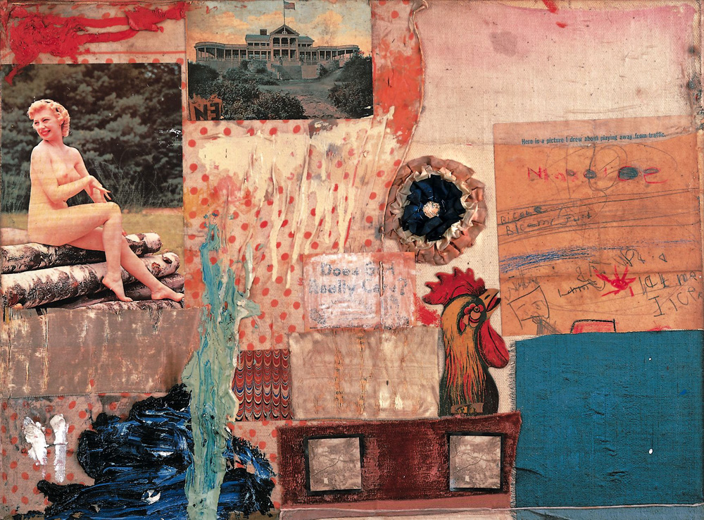
Rauschenburg's early work mixes printed images (newpaper, photographs etc.) with scraps of material, found letters, paint and objects. Even though they used photographs they were not simply Photomontages, and even though they used a variety of materials they were not just Collages, and they were more than paintings. Rauschenberg himself called them Combines - because they combined all the deitrus the city left behind. Rauschenberg said -
'You can't make either life or art, you have to work in the hole in between, which is undefined. That's what makes the adventure of painting.'
Robert Rauschenberg
There is a raw beauty to his early work and a great feeling of energy - just like the city itself. Rauchenberg's was also influenced by Dada.
Robert Rauschenberg 'Canto XXXI: The Central Pit of of Malebolge, The Giants' 1959 -60 - Solvent transfer
As Rauschenberg's works progressed it became flatter and more graphic. In this piece he rubbed solvent onto the back of newsprint and scratched the image onto another surface. This can still be done today with news print, magazines and photocopies and rubbed on with Brush Restorer (Rustins). However, it can irritate the skin and is bad for the environment (in his final collage Rauschenberg used Vegetable dyes because of this).
You can also transfer photograsphs on surface using Liquid Light/Emulsion, Lazertran, Acrylic Gel (here) or Wet Decal Transfer Paper (also look here and here).
Robert Rauschenberg 'Port of Entry' 1998 -vegetable dye transfer on polyminate
Rauschenburg, along with his friend and fellow artist Jasper Johns, would influence a shift in art. Their work was the bridge between the pure abstraction and 'high art' values of the Abstract Expressionists and the commercial figurative world of Pop Art.
American Pop Art referenced its own culture and reference the everyday commercial world. Collage became central to Pop Art. Above we can see how James Rosenquist collaged together ephemeral scraps of paper from magazines. He then gridded up his collages and painted then on a huge Panoramic scale. At first it seems like a random collection of images, like the chance juxtapositions of dada. However, Rosenquist was referring to the John F Kennedy campaign receiving funding or 'sweeteners' (hence the cake) from Pirelli tyres (hence the car tyre) - democracy sponsored by commerce.
Rauschenberg's and John's work still had the drips and smears of Abstract expressionism - along with the everyday. The American Pop Artist work had the professional, smooth, polished sheen of an advert, a Billboard or a glass television screen.
The most Famous American Pop Artist was Andy Warhol.
'Buying is more American than thinking'
Warhol 'Triple Elvis' 1963. Acrylic and silkscreen ink on canvas
In 'Triple Elvis' a promotional photograph of Elvis is overlaid three times using the silkscreen process. This creates a visual Jump - creating movement in a static image. It also suggests that celebrity is shallow - that stars are turned into products to be consumed by the viewer. When you see a Warhol in the flesh you notice that each silkscreened image is slightly different to the next. Little imperfections give the initially mechanical image painterly qualities.
Andy Warhol 'Orange Car Crash' Silk Screen print on Canvas 1964
Warhol celebrates all that is common, everyday, vulgar and mechanical. Coke bottles, soup cans, movie stars, adverts, newspapers - they were all up for grabs for Warhol. This is Pop Art - Pop because it is popular or Pop because you get it in a instant - like an advert. He did not paint these images by hand - instead he used the silkscreen process so he could reproduce the images again and again. In his Car Crash series he repeats an image found in a newspaper, again and again, until it becomes meaningless. We just stare, like we would at a TV screen, and let real life tragedies become wallpaper to our world.
Pop Art was also a major movement in Britain and had a different feel. In Europe a kind of Pop Art was explored but not to the same degree. In Europe, which still had the scares of war in every major city, advertising were not used smoothly like in America - they were battered, ripped and (war) torn.
Walker Evans 'Torn Movie Poster' 1931
Here is a photograph of a torn movie poster by Walker Evans. Evans would often appropriate the work of others and take a photograph of a photograph. Layers of life and culture build up only to be replaced by the latest trend. These images are ephemeral - destined to be lost and Evans has captured it forever. These images have the look of Decollage.
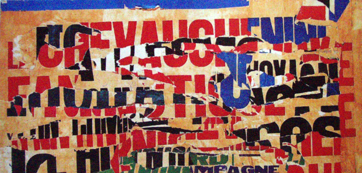
In the early 1950s, Mimmo Rotella began to rip posters away from the walls of outdoor hoardings in Rome, and used them to create elaborate collages. Many of these were film posters but he also used advertisements for appliances and other goods, so that his works became a commentary on the post-war consumer boom. In the studio he would mount the poster fragments onto canvas, rearranging the pieces into new compositions but also stripping away further layers to accentuate their distressed appearance.
Mimmo Rotella
This is an example of Decollage (a French word meaning literally to unstick). The term is generally associated with the Nouveau Réalisme (new realism) movement. Nouveau Realism often found beauty in the everyday and was a poetic recycling of reality. In the context of Nouveau Réalisme it meant making art works from posters ripped from walls, exhibiting them as aesthetic objects and social documents.
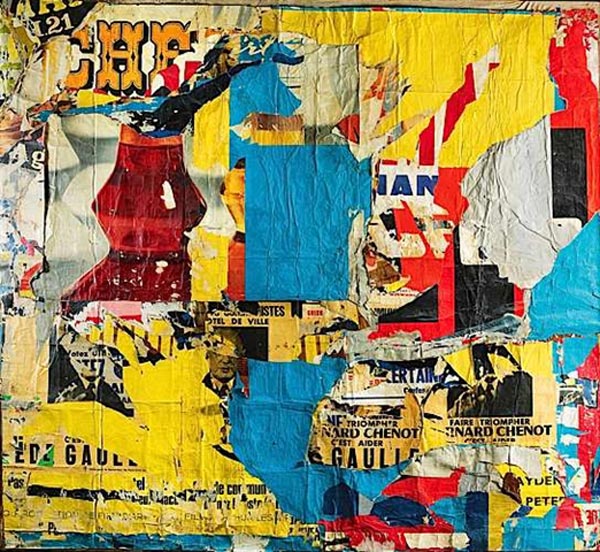
Jacques VILLEGLÉ
Jacques Villegle is another key decollage artist. Found objects, ripped posters, radical collages are all used in the New Realism movement of the early 1960s. Décollage is the opposite of collage; instead of an image being built up of all or parts of existing images, it is created by cutting, tearing away or otherwise removing, pieces of an original image.
De-coll/age was a term invented by Wolf Vostell after he saw (a version of) it used in a newspaper article to describe the crash of an airplane that had taken place at takeoff.
Peter Blake 'On the Balcony' 1955-1957
Peter Blake is British artist who came to prominence in the 1956 exhibition ‘This is Tomorrow’. In reference to this exhibition the art critic Lawrence Alloway invented the term ‘Pop Art’ to describe the artists use of images from ‘low brow’ pop culture.
British pop art seemed more nostalgic and in oar of American culture. This could have been a development from the Second World War when American troops were based in Britain. Along with Hollywood this was most peoples first direct contact with Americans and there culture.
Although Blake was a painter by trade he has always used collage partly influenced by the Dada art movement and Kurt Schwitters. Blake was also influenced by Folk art and found collages e.g. – shop fronts, religious alters, bedroom shrines to pop stars badges on peoples jackets etc (see video here). He used these ‘naïve’ influences to create his own aesthetic and elements of these can be seen in his work.
Natasha Kerr's collages have a look of the work of Peter Blake. There has always been an element of Nostalgia to Blake's work. In our modern world Nostalgia is every where.
Lance Letscher is a contemporary artist who collects old books, paper and materials and pieces them together to give them new life. The manufactured colour's that are all around us are combined and contrasted using different structures. Letscher's work seems to have its roots in craft and folk art.
Robert Mars 'One of a Kind' 2008


