Willem Kalf - 'Still life with drinking horn' about 1653
Pieter Claesz - 'Still life with Turkey Pie' 1627
The combination of elements in still-life paintings can have profound implications for the paintings meaning. Dutch 17th century still-life pictures frequently contained messages about the fragility of life and the onset of corruption. These combine with a sense of opulence, splendours and successes of international trading and maritime prowess. Such features can be seen in the detailed works of Willem Kalf and Pieter Claesz.
Sam Taylor Wood - 'A Little Death' 2002
Jan Lievens (Dutch, 1607–1674), 'Still Life with Books', ca. 1627–1628.
Sam Taylor Wood 'Still Life' 2001
Sam Taylor Wood is an artist, photographer and film maker. Her 2001 Film/animation ‘Still Life’ has the visual look of a 17th Century Dutch still life. Sequences of still photographs are taken over a period of time to show the fruit slowly decaying. This is shown as a piece of video art in a gallery space - it is almost displayed like a painting on the wall. It is similar to time lapse photography used to capture the growth of a plant - who move at a completely different pace to ourselves.
Valerie Belin - Palettes
One of the great scandals of the modern age is "built in obsolescence". A product is no longer designed to be mended or maintained; the consumer is forced to throw it away and buy a new one - while manufacturers gleefully count their profits. The computer industry has led the way in this, and it is computers that are the subject of French photographer Valerie Belin's 'Palettes'. They are a series of 6ft tall black and white prints that feature mournful stacks of abandoned hardware that Berlin photographed in a dump on the outskirts of Paris.
The columns are not her own arrangements; Belin shot the stacks of monitors, oscilloscopes and hard drives just as she found them, arranged on fork lift palettes. Blown up to life size and deprived of context by the black velvet background against which she shot them, the stacks look like weird ziggurats for the digital era.
"I use a large photographic plate to produce a very high definition image," she says." It means you get a strong sense of surface of the objects - the texture. Each one is a 'vanitas', based on the 17th century still life's that were allegories for the transience of life. Computers are objects that are part of everyone's lives, and this is the moment of their demise. Each tower is like a jigsaw, made by hand. And this is the moment when man triumphs over this machinery - when man destroys the robot!"
(words by Tom Horan).
Thomas Richard Williams 'The sands of Time' 1850-52
Adolphe Braun - 'A Hunting Scene' 1867
Since the 17th century, along with landscape and portraiture, still-life has been one of the great traditional art forms. Objects could be arranged to suggest new meanings or they could simply be found and depicted as they are. Within the simple traditions of the Still-Life artists and photographers were free to experiment and explore - pushing our progress into modernism. Painters used still-life to push the boundaries of seeing (Cezanne and Picasso), modern artists explored the use of everyday objects (from Marcel Duchamp to Carl Andre) and Photographers, in particular, became fascinated with simple scenes of the every day world. A photograph, by its very nature, captures a section of ephemeral transience life and makes it permanent. Still life is central to photography's story.
One Summers day in 1826 Nicephore (Joseph) Niepce created the image above. This Grainy image is thought to be the first permanent photograph and it had an exposure of over eight hours. It is too simple to say Niepce invented photography because the photographic process has undergone so many significant modifications since then (most famously Fox Talbot and Daguerre1839).The invention of a device that could allow anybody to record the world in perfect detail would revolutionise how we see ourselves, how we communicate and how we make art. Without Photography Modern art, film and the Internet would not exist – or at least not as we know them.
Another one of Niepce’s earliest images was of a table – a traditional still life. It is a time honoured theme in Art that would still be revisited by future artists. During the 18th century Chardin produced beautiful painted still lives of simple Kitchen Utensils. There is great poetry in Chardin’s ability to bring such importance to such humble things.
Niepce was simply continuing a long tradition – what else would you do with a camera other than make images in the tradition of Painting? These two early photographs show photography's two directions - as a force for modernism and connected to the history of painting.
Niepce was simply continuing a long tradition – what else would you do with a camera other than make images in the tradition of Painting? These two early photographs show photography's two directions - as a force for modernism and connected to the history of painting.
The everyday has been a fascination for many artists – the things they immediately experience as part of their existence. Jean-Baptiste-Simeon Chardin
William Henry Fox Talbot - 'The Open Door'
Roger Fenton - 'Still Life with Fruit and Decanter' 1860
Early photographic pioneers used still life partly because of the tradition of painting (this is the same reason a photograph is square or rectangular and not round - because of canvas frames and the golden rectangle). The long exposures needed with early processes lent themselves to static still life objects. However, soon painting and photography would develop through experimentation with still life.
Paul Cezanne 'Still life with plaster cupid' 1895
Paul Cezanne used landscapes and still life painting to explore how we see. At first glance Cezanne abandoned traditional perspective and the table appears to buckle, as if viewed from shifting angles. This is because he painted the same scene from several viewpoints and not one - within one image.
Pablo Picasso 'Guitar' 1913
Inspired by non western art and Cezanne's experiments Pablo Picasso has abstracted the image as if it has been seen from multiple viewpoints. At first glance it is abstract but is actually a still life of a guitar - it is just that the guitar itself seems fractured. Segments of the 'Guitar' are cut from a variety of materials - a piece of old wall paper, a scrap of cardboard and a circle cut out of newspaper. This is an example of Picasso's and George Braque's Synthetic Cubism and shows a break away from traditional mediums in western art. How did Picasso get to this stage?
David Hockney 'The Desk, July 1st 1984'
David Hockney's first love and main medium is drawing and painting, not photography. He is fascinated in how we make images and in the history of image making. To understand how Hockney, a painter, is as famous for his joiners we need to look at his influences.
Certain joiners hold clues to his thinking. In this joiner by Hockney he has photographed the desk from multiple viewpoints warping time and space. On the desk is a book and the book is open on a page that shows the above collage by Pablo Picasso. Hockney has looked at Cezanne and Picasso and responded by creating a photo-montage that includes multiple viewpoints.
All three of these breakthroughs use the tradition of the still life to push boundaries.
Man Ray 'Scissors and cut paper' 1927
This is a Rayogram by the 20th century artist Man Ray. It is actually a photogram but in a bold act of self promotion - Man Ray called his images Rayograms. It is created by moving object around light sensitive paper. The objects are humble - scissors, paper and possibly a stand of some sort. Man Ray has taken ordinary things and made them extraordinary. This is a photogram, a photo-montage but it is also a type of Still Life - but a modern one.
These images were produced in the 1920's - eighty years after Fox Talbot. In many ways these were still early days for photography and photographers were just starting to create images that were their own thing - not just mimicking painting.
These images were produced in the 1920's - eighty years after Fox Talbot. In many ways these were still early days for photography and photographers were just starting to create images that were their own thing - not just mimicking painting.
Paul Strand, Untitled 'Still Life of Cigarette Boxes with Bowl and Bottle' 1917
Paul Strand 'Ackley Camera'
Paul Strand 'Black Bottle' ca.1919
Early photographers (for example Roger Fenton and Fox Talbot) took their inspiration from the history of painting. This meant that the compositions and layout followed conventional rules. A camera is a different tool to a paint brush and naturally allows the photographer to experiment with composition. The modernist photographer Paul Strand helped create the language of photography and he helped establish photography as an art form in itself. Strand often used the Still Life but his compositions were stark, geometric and modern. He would zoom into a subject, unlike a painter, and create compositions built up of strong diagonal lines, circles, triangles and contrast. Again we see the conventional form of Still Life used, altered and twisted to explore and develop visual ideas - and in the process creating the language of photography (different to the language of painting).
Andre Kertesz 'The Fork' 1928
In this image Andre Kertesz turns the simple act of a fork leaning against a plate into a beatiful and simple early modernist photograph. Other photographers, who worked in a similar way to Strand and Kertesz, include Josef Sudek, Paul Outerbridge, Hans Bellmer and Edward Weston.
Edward Weston 'Pepper' 1930
Edward Weston 'Nude' 1936
Both of the images above are by Edward Weston. Whether Weston was photographing a natural form, a human figure, a car engine or a toilet (he create a series of these) he considered curves, light and form. Although he has not combined the images, by photographing them in the same way, he encourages us to compare them.
Walker Evans 'Alabama Farm Interior (Fields Family Cabin) 1936
Strand, Weston and Kertesz were pioneers and their images were inventive, creative and, crucially, obviously artistic. The camera is an objective instrument that is capable of showing the world as it is - coldly with no sentiment. Walker Evans recognised this quality of the camera and he images just seem to document what lay before it.
Evans was a hugely influential 20th century photographer. He came to prominence during the 1930's while working for the FSA (Farm Security Administration) in America. His black and white images often focused on aspect of life other photographers might ignore - the interior of a barbershop, an old sign, cutlery jammed in lock etc. His images had an objective look - showing the everyday as it was, but ultimately, showing it to be other than itself.
The image above was taken during the great depression for the FSA (Farm Security Administration) to show America how many of the poorest lived. Evans documented every aspect of life - even a simple wall in a field family's cabin and their simple storage system for their cutlery.
As a young man Evan's wanted to be a writer and his images have the quality of a descriptive passage from a piece of literature -
"the sloping, paper-littered bank"
Dylan Thomas 'Reminiscences of Childhood'
"Eight mahogany chairs were lined up against the white painted wainscoting, and under the barometer stood an old piano loaded with a pyramid of boxes and cartons"
Gustave Flaubert 'A Simple Heart'
'I saw in Louisiana a live-oak growing, all alone stood it and the moss hung down from the branches'
Walt Whitman 'I saw in Louisiana a live-oak growing'
It is worth bearing the connection in mind when viewing any Still Life photographer - how would the same scene be described in literature? Evans work in particular had this quality - as if he was a frustrated writer with only a camera to record the small unnoticed details of life.
Walker Evan 'Barber shop Interior'
Walker Evans was fascinated by the everyday. Things that were taken for granted in their day become strange portholes to another time. Evans had an eye for what would be interesting in the future. There is so much detail captured in this image - a shop that has probably long since been demolished and and chairs that are no longer sat in.
'Hale County, Alabama' 1936
A documentary within a documentary, this picture suggests the way an Alabama tenant family lived, and, in the two snapshots tacked to the wall, bears witness to the family's informal documentation of its own experiences. The photograph was taken by Walker Evans in 1936, while he was employed by the Farm Security Administration; it was the powerful and moving record of rural poverty made by him and his FSA colleagues that popularised the term documentary photography.
Walker Evans - Penny Picture Display, Savannah, Georgia 1936
In this photograph by Evans he has photographed a set of Photographs. This is something he returned to again and again - the layers build up and you are looking at an image of an image. It is a shop window display in a penny photo arcade - people would go in to have a portrait taken as a memory. We photograph ourselves to prove we existed - we were here. These original images are not art in themselves but Evans photographs them and draws our attention to them. The act of using the work of others is know as Appropriating.
Walker Evans 'Torn Movie Poster' 1931
Here is a photograph of a torn movie poster by Walker Evans. Evans would often appropriate the work of others and take a photograph of a photograph. Layers of life and culture build up only to be replaced by the latest trend. These images are ephemeral - destined to be lost and Evans has captured it forever. These images have the look of Decollage.
Walker Evans 'Mail Box, Alabama' 1973 (from metmusuem archive)
We can still see this quality in his later work. He had spent his life transforming the world onto Black and White until, when given a Polaroid SX70 and film by Polaroid, spent his final years using seeing in (Polaroids warped) colour. His subject matter of sidewalks, signs and street furniture suddenly exploded with colour. We live in an age when people take colour photographs purely because technology allows it - not because we see and appreciate colour.
Walker Evans 'Interior Detail, West Virginia Coal Miner's House'
In this image above Evans has photographed a found collage. Did the occupant use card board on the wall as cheap insulation or decoration. Maybe there is element of both. Evans noticed this aesthetic quality. It is reminiscent of the the Collage and Photomontage work of Robert Rauschenberg.
Robert Rauschenberg
In these images you can see the painter Robert Rauschenberg is finding strange juxtapositions, unusual compositions, found collages and using photography as tool for his paintings. They almost have an anti-atheistic and a sense of a dystopia or broken society. Rauschenberg comments that for him photography is “a kind of archaeology in time only, forcing one to see whatever the light of the darkness touches”.
The influence of Evans is everywhere in modern photography - as is the photographic evolution of the Still Life.
Paul Caponigro 'Frost Window No.2' 1961
Simple net sails of a boat overlap to create a delicate pattern. A picture of frost crystals on a bedroom window makes a tapestry out of a mixture of pattern and texture. Positioning his view camera about 30cm from the glass, the photographer stopped the lens all the way down to f32 so as not to loose the dark trees in the background. These are Still Lifes but they are far from the Still Life traditions in painting.
We now take these kind of images for granted and a lot of images taken today fall into the category of Still Life. When we start to look at photography after Strand, Weston and Evans we can see their influence and the health of Still Life.
“Following Walker Evans’s example, a postwar generation focused on what everybody in America during the 1950s, 60s and 70s actually saw in front of their faces or through their windshields or across their backyard fences, but didn’t bother to register or preferred not to – much less to think was worth photographing. These were run of the mill subjects, mostly, shot with deadpan acumen.. seemingly nowhere places, shown to be somewhere after all. In the populist spirit of Walt Whitman, but with a heavy dose of dry-eyed scepticism, they found a fresh kind of poetics in the American everyday… [Wessel] had a knack for seeing a compositional order where it didn’t obviously present itself – making pictures like visual haikus.”
- Michael Kimmelman
Martin Parr Individual photographs from 'Common Sense' 1995 - 1999
Martin Parr 'Common Sense' Series (displayed on a gallery wall) 1995-1999
Martin Parr photographs as if he is collecting and he focuses of the small details of life. In his 1995-99 Series 'Common Sense' he focused on minor trashy elements of everyday life - lipstick marks on a cup, finger marks on buttons or a cup of tea on a table cloth. He uses a ring flash to create bold, saturated colours giving his work the look of the hyper real. Does Parr have a genuine affection for his subject matter or is he poking fun? Does he reveal our own prejudices by presenting us images that create a certain reaction? Arguably he is somewhere in the middle - or neither - he just records and collects.
Stephen Gill 'A series of Dissapointments'
Stephen Gill is a contemporary British photographer who often works in a series. He will often focus on subject you would normally pay no attention to - A lost stranger looking at a map, painted over signs, the backs of bill boards or people sat on trains. His work shares the straight forward irony of martin Parr, the cold methodical approach of The Bechers and the fascination with the everyday of Walker Evans.
His series 'A Series of Dissappointments' looks at the proliferation of betting shops in the Borough of Hackney. The discarded slips 'were shaped by loss or defeat, then cast aside. these new forms perhaps now possess a state of mind, shaped by nervous tension and grief. After these images were made, little autopsies were performed on the papers to reveal the failed bets held within.'
In our modern consumer world we rarely 'Make do and mend' - we just use things and discard them. A chair is designed for a person to sit on - it isn't whole when not in use. The chair has legs like us - when it is abandoned it looks like a injured creature that has been abandoned. A carpet slumps in a corner of an alley like a frail old man. These discarded objects were photographed on the streets of Southwark in south east London by Guy Batey. If you walked past them they could be easily missed and ignored. However, when gathered together and presented (with a perfect title) they take on a life of they own. The photographs has a simple, quite quality and, as the title suggests, a melancholy feel.
Richard Wentworth 'Making do and getting by' ongoing project
Batey's 'The Melancholy of Objects' remind me of the photographs by the British sculptor Richard Wentworth. Wentworth's work (see 'Making do and getting by' and the work of Jane Fulton Suri) is an ongoing conversation with his native habitat, fuelled by daily walks down the Caledonian Road and expeditions into the hinterlands of King's Cross. In photographs, objects and lectures he charts the contours of the inner city, the ebb and flow of urban life, the things that change and the things that never do. Wentworth and Batey are part of a long tradition of photographers who roam the streets with their cameras.
"The photographer is an armed version of the solitary walker,"
"reconnoitring, stalking, cruising the urban inferno, the voyeuristic stroller who discovers the city as a landscape of voluptuous extremes."
Susan Sontag in On Photography,
Sontag's "voyeuristic strollers" included Atget, Brassai and WeeGee, all of whom were "not attracted to the city's official realities but to its dark seamy corners, its neglected populations". She could also have mentioned Bill Brandt, an often-solitary wanderer on the night-time streets of wartime London, or Cartier-Bresson, forever in search of the decisive moment, as well as all manner of street photographers, from the frantically obsessive Gary Winogrand to the gently observant Helen Levitt. (words by Sean O'Hagan).
Jeff Brouws
Jeff Brouws focuses on lost forgotten aspects of American Culture - the same forgotten and disappearing aspects of life that Walker Evans look at 70 years earlier.
Sophie Calle 'The Hotel'
Sophie Calle became a cleaner so she could get into people’s hotel rooms. In the series she photographs a room, photographs their personal items and mentions if they have been moved and writes a diary throughout the guests’ stay, deducing what she can about them by what they leave in their rooms e.g.
"Room 25 “ Thursday 19. Noon. He is gone. He has left his orange peels in the wastebasket. Three fresh eggs on the windowsill, and remains of a croissant which I polish off. I shall, miss him."
The photographs make you feel as if you have sneaked into the people’s rooms too and might be caught out at any moment. Calle's work was included in Tate Modern's 'Exposed' exhibition. The exhibition was looking at the issue of voyeurism and how it has played a role in photography. It makes you consider the intrusive role that photography and surveillance can play in our society. Exposed looked at pictures made secretly, without people's permission, from the 19th century to the present day. Photographs gave a shocking, illuminating and witty perspective on iconic and taboo subjects.
'The English Sunrise' (1972) by Brian Rice and Tony Evans is a beautiful book designed around a series of photographs of sunrise motifs. Many cultures have used the Sunrise motif from Communist China to Art Deco Designs. It is often a symbol of hope and optimism. However, this small book seems very English and from a period that there are less and less traces of.
From the disappeared world to the rounded edges Tony Evan's Photographs in 'The English Sunrise' demonstrate that by focusing on one element in the world around us - becomes a world in itself.
Richard Heeps
Simple subject matter and found still life's are found constantly in photography. Richard Heeps subject matter is also nostalgic - they are contemporary but seem to come from another time.
Michael Eastman 'Red Ribbon' from the American Series
Early morning (or evening) light pours through a shop window turning a simple scene into a dreamlike image. You are reminded of Walker Evans' 1930's interiors or Edward Hopper's paintings of America.
Photographers have changed the way we view the Still Life but artists have also found new ways to respond to the objects around them. The do not always paint them but they do use and contemplate them.
At first Thomas Demands images seem dull and everyday - a messy office, a kitchen table or a sink full of pots. All of his images are constructed and based on images he fines in text books, magazines and periodicals (usually buildings and interiors). Using these images as his basis he constructs meticulous models of the chosen scenarios in his studio. Look again at his photographs and you can just about tell that the material he has used is paper and card - like elaborate origami. He then carefully lights the models and photographs them using a large format camera. There always seems to be something 'wrong' with Demand's images and it is this tension between the real and the fake which exists in all photographs.
Irving Penn 1975
Irving Penn - New York 1972
Irving Penn is mainly famous as a top fashion photographer and his images are the height of style and elegance. However, he also managed to create a wide range of images and amongst the most curious are his images of New York rubbish. Close up shots of Cigarette butts and empty carton's are reduced to pure black and white, with a white background and in fine detail. A lot can be learnt from the remnants and artifacts of a society. These are ours - magnified.
Arman 'Accumulation of electric razors embedded in plexiglas' 1968
Arman was a European pop artist who collected the same type of object and placed them inside glass containers. This act of taking what seems to be rubbish is exactly what is do in Museums - by taking an object out of its original context and placing it in a cabinet the viewer sees that object in a new way. Arman's objects seem to be relic's from another age and as we get further away (in time) from
Arman's work the objects seem stranger and more unusual. The second world war had still left scars on Europe and Arman started by going through the rubble of derelict building to collect these everyday objects. In many ways they are both relics but also an example of the everyday amassed and becoming strange.
Rachel Whiteread looks at many ignored areas -
the space under a chair,
RACHEL WHITEREAD 'UNTITLED (SIXTEEN SPACES)' 1995
the space in front of a book case,
Rachel Whiteread "Sequel IV”, 2002, Plaster, polystyrene and steel
or the space around a light switch.
Rachel Whiteread, Untitled (Twenty-Four Switches) 1998
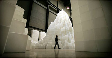
Rachel Whiteread deals with negative space - the space under a chair, in front of a book case or in an empty room. In 'Embankment' Whiteread used the empty space inside a card board box - giving form where there isn't any. In Tate Moderns Turbine Hall, she created a gigantic labyrinth-like structure, entitled EMBANKMENT, made from 14,000 casts of the inside of different boxes, stacked to occupy this monumental space. The form of a cardboard box has been chosen because of its associations with the storage of intimate personal items and to invoke the sense of mystery surrounding ideas of what a sealed box might contain.


