Diego Velasquez 'Las Meninas' 1656
In many portraits the negative space surrounding the subject contributes as much to the impact as the model. The Spanish artist Diego Velasquez was a master of the use of negative space with portraits such as 'Las Meninas' (1656), exploring the compostion to provide a wealthy of narrative information.

Look at this image. What do you see? Do you see two faces looking at one another? Or do you see a vase? If you see faces then the black area is positive space and the white area is negative space. If you see a vase the White area is positive space and the black area is negative space. The negative space is where nothing happens. A blank or void is used to create more drama. However, used well it is a key elements of images.

I.M. Pei, New York, NY, 1967 - Arnold Newman
In this portrait Arnold Newman uses negative space dramatically. It is mainly made up of negative space - it is dominated by black. Three circles hover above while a narrow slit at the bottom reveals the subject -The Architect I.M.Pei. If this area had more happening in it the image would loose its graphic strength. The minimalist qualities of Pei's architecture is mirrored in Newman composition. Newman placed his subjects in a way that represented what they did.

In this portrait of the The Composer Igor Stravinsky for Harpers Bazaar, Newman has created a simple stark image. The bold black form of the piano lid is reminiscent of the symbol for a b flat. The negative space (the walls in corner of a room) add a subtle addition to the composition. One wall takes up two thirds of the composition creating a stark white, while the last section adds a simple grey tone behind Stravinsky's head.

Francisco de Goya 'The Dog' 1820
In this painting the dog stares into the void. It is a dreamlike image with a sense of despair, yet it is also a demonstration of the power of simplicity. Because the scene is so minimal and non-specific, it is highly ambiguous. Is the dog possibly looking over the hill into the void? Or is he sinking into the ground?
The picture's structure is minimal and non-specific. It is divided in two, an above and a below. The upper area is a pale golden yellow; the lower one is brown. The upper area fills most of the picture; the lower is a strip across the bottom with a slanting wavy edge. You could call the upper area sky, and the lower one earth.
The Spanish Painter Goya painted this and other images straight onto the walls of his home and they have become known as his 'Black Paintings'. The use of negative space creates a timeless eerie image - a wonderful painting by a great artist.

Ernst Haas 'Growing and Wilting Cactus Leaves' 1963
Two leaves of a Mexican Cactus- one dying, the other one a healthy green-create a dynamic composition. The image is made of areas of Negative space. The hand side of the image is a deep rich green that descend into black. On the left hand side the wilting leaf makes a contrasting curve - creating a bright white triangle. The coloured edge of the leaf finishes off the composition - a thin, rich orange that draws a unnaturally straight line down the center. It seems like the photographic equivalent of a Barnett Newman.

Barnett Newman 'Onement I' 1948

Floris Neususs 'Untitled 1962'
A curled figure in the fetal position is framed by the square edge of the photograph. Areas are blurred while other areas are pin sharp. The is a Photogram, a image created by placing an object directly on photographic paper. By their very nature Photograms tend to have a high contract between black and white and are mainly made up of negative space. We only see a figure because our mind recognizes the dark form as a human figure. The dark can only exist because it is framed by the flat white negative space. This image is by Floris Neususs 'Untitled 1962' who is in 'Shadow Catchers' at the V&A in London. The exhibition looks at work by contemporary photographers who create Camera-less images you can view videos of each artist discussing there work here.

This is a much earlier inverted photogram by the Bauhaus artist Laszlo Moholy-Nagy. Abstract forms appear and disappear through their different tones. A huge areas of flat white/light grey dominates and surounds the abstract forms. These design aspects can be seen in Bauhaus posters.

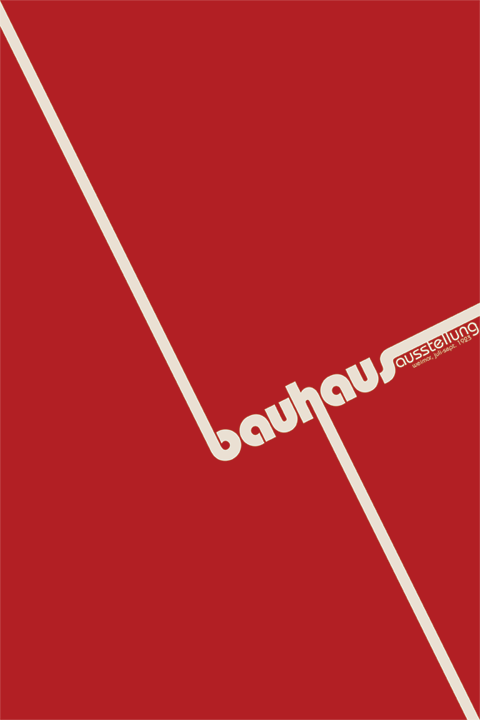
This Bauhaus poster mixes flat planes of negative space (Red and White) with text and Photomontage.
Vincent Schunk - Bauhaus poster
This is a contemporary poster influenced by the Bauhaus' use of diagonal lines and flat areas of colour. It is mainly made up of negative space with only the text breaking it up and creating the composition. This poster is made of the most simple means - text, three diagonal lines and three (triangle-esque) areas of flat colour (negative space).


stills from 'The Passion of Joan of Arc' 1928 directed by Carl Theodor Dreyer
In the 1928 film 'The Passion of Joan of Arc' Carl Theodor Dreyer uses bold areas of white negative space to fill the film with striking minimal compositions. The walls were painted pink so there would be no flair and no shadows. The script, the set, the images and reality are broken down into the simplest forms. You can watch the film here and see how Dreyer's spare use of whiteness is used in his other films - 'Vampyr' 1932, 'The Word' (Ordet) 1955 and 'Gertrud' 1964.


A landscape wrapped in snow. A ring of monks dance in a circle, their black robes contrast with the white ground. Their figure seem like a collection of black triangles floating on a white back ground. The negative space in this image is the white, there is no detail there. The white gives the dark figures a platform to dance on. The pose is reminiscent of Matisse's 'The Dance' 1909. Both images seem simple yet show the sense of joy felt by people in the middle of a dance - their figures creating a circle.

In a similar way Matisse uses flat areas of negative space. A rich blue that suggests the sky and a speckled earthy green suggesting the ground.

This series of photographs are so iconic that were made into a beer advert. The advert used the high contrast black and white look to give their brand a sense of authenticity and tradition.

In this blue note jazz cover a modernist sculpture has been used to create a minimal composition. The dark form of the sculpture creates a window for the figure to appear in. The image is mainly made up of positive and negative space - with just a sole figure and text adding detail.

Koto Bolofo
In this image Kofo Bolofo has used a Henry Moore sculpture to frame his model. The dark form of the sculpture agian frames the model and the only real detail in the whole image is the models face.
Rachel Whiteread deals with negative space. She gives these non areas form using resin, concrete and other materials to create sculptures.
She looks at many ignored areas - the space under a chair,

RACHEL WHITEREAD 'UNTITLED (SIXTEEN SPACES)' 1995
the space in front of a book case,

Rachel Whiteread "Sequel IV”, 2002, Plaster, polystyrene and steel
or the space around a light switch.

Rachel Whiteread, Untitled (Twenty-Four Switches) 1998

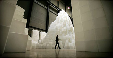
Rachel Whiteread deals with negative space - the space under a chair, in front of a book case or in an empty room. In 'Embankment' Whiteread used the empty space inside a card board box - giving form where there isn't any. In Tate Moderns Turbine Hall, she created a gigantic labyrinth-like structure, entitled EMBANKMENT, made from 14,000 casts of the inside of different boxes, stacked to occupy this monumental space. The form of a cardboard box has been chosen because of its associations with the storage of intimate personal items and to invoke the sense of mystery surrounding ideas of what a sealed box might contain.

Rachel Whiteread 'House'

Rachel Whiteread - 'House' Photograph by John Davies
Number 193 Grove Road used to be an unexceptional Victorian house in the East End of London. 'Mile End, E3 - 3 storey end of terrace Victorian house, 4 beds 2 receps, original features,' an estate agent might have described it. Extensively remodelled, improved beyond habitability, it has become both monument and memorial. It has become Rachel Whiteread's House: a strange and fantastical object which also amounts to one of the most extraordinary and imaginative public sculptures created by an English artist this century.
193 Grove Road is no longer a home but the ghost of one perpetuated in art. It has no doors, no windows, no walls and no roof. It was made, simply (although the process was complicated, the idea itself was simple) by filling a house with liquid concrete and then stripping the mould - that is, the house itself, roof tiles, bricks and mortar, doors and windows and all - away from it. The result could be described as the opposite of a house, since what it consists of is a cast of the spaces once contained by one. Known as a sculptor she has recently had an exhibition of her ideas and drawings (see here).


In this series of images Alexander Apostol has digital removed the windows and writing from these buildings. By removing these simple features the buildings seem like modernist sculptures and manage to be everyday and unusual at the same time.

An example of Iconoclasm - A defaced icon from All Saints Church, Thornham, Norfolk

An example of the 'Falsification of History' a defaced photograph from Soviet Russia - see 'The Commissar Vanishes'

The Russian artist Alexander Rodchenko was forced to deface his own images from his book 'Ten Years of Uzbekistan'

Front cover for Boards of Canada's 'Music has the right to Children' 1998

People with no faces on Google Earth

In this images Robert Rauschenberg has turned a paineted over sign into an object to look at. To conceal the sign an abstract shape has been made. Rauschenberg used photography to find strange juxtapositions, unusual compositions, found collages and then used these images in his paintings and collages. They almost have an anti-atheistic and a sense of a dystopia or broken society. Rauschenberg comments that for him photography is “a kind of archaeology in time only, forcing one to see whatever the light of the darkness touches”.

In this photograph Robert Frank has focused on a non-event - a covered car. Framed by the two trees, like Rauschenberg, he has noticed that covering something reveals something else.

Christo & Jeanne-Claude - wrapped trees
“People think our work is monumental because it’s art, but human beings do much bigger things: they build giant airports, highways for thousands of miles, much, much bigger than what we create. It appears to be monumental only because it’s art.” – Christo


Barrels Structure“The Wall” (Project for 53rd between 5th and 6th Avenues). 1968
A present under a Christmas tree can be the most intriguing object. Not knowing what is inside is the appeal. The imagination runs wild - we judge it by its form, texture and feel. Often when the present is opened the mystery is gone. Christo and Jeanne-Claude have spent over 40 years wrapping objects and making them disappear - and in the process making us notice them. They started with small objects like magazines -

They worked with larger objects, until eventually they wrapped public buildings. They believed art should be experienced by the public in places other than museums.

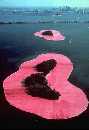
They eventually progressed to sections of landscapes - like an island. Christo & Jeanne-Claude earn the huge amounts of money required to execute their monumental works by executing and then selling preparatory drawings to collectors and dealers.
+1982+Christo.jpg)