


A Photomonage is related to Collage. However, where a Collage is made from a variety of different materials a Photomontage is made purely from photographic images and then rephotographed. In the age of Photoshop most images you see have been edited in someway and could be described as Photomontages.


John Heartfield 'Adolf the Superman Swallows Gold and Spouts Junk' 1932.
All the characteristics of Banksy's art - Juxtaposition, Photomontage, Humour and Political ideas have a long history. This image is by the German artist John Heartfield. The image was made in 1932, one year later Adolf Hitler would become chancellor and take Germany into World War II (1939). Heartfield's images were Anti-Nazi - he used art to warn of the terrors to come and this can be seen in his body of work. This photomontage would have been created without the use of Photoshop. A combination of cut and paste techniques, rephotographing and burning & dodging darkroom work were used to piece together the work. You don't have to be able to speak German to read the montage. Hitler is portrayed as being greedy for power and money. Combined with the title ('Adolf the Superman Swallows Gold and Spouts Junk') we are left with a powerful Anti Fascist message.

This is a photograph of Salvador Dalí's 'Téléphone-homard (Lobster Telephone)', 1938. Dali was a Surrealist and one of the key themes of Surrealism was the unconscious mind. They were fascinated by dreams and the juxtapositions that occur in them. Often in a dream we combine everyday things to create something new and strange. We have all seen a plastic lobster and we have all seen a telephone but by combining them together Dali has created something Surreal. The surreal look has slowly merged with popular culture and many adverts today have a surreal quality. Surrealism is now the norm.

This is a still from the 1928 film 'The Andalusian dog' that Dali was involved with (see MOMA exhibition). There is a clever juxtaposition between moving images, most famously the section where an eye is slit but at the key moment the camera jumps to a cloud passing a moon and then to a false eye. Although mild by today's standards the film is still able to shock.
The ideas of the Surrealists were a development of Dada. Many Dada artists became surrealists and Heartfield's roots lie in Dada.


These images are by one of Dada's founding members, Raoul Hausmann, who claimed he invented Photomontage. The top image is actually a collage that mixes different printed emphemeria to create a jarring image. This image was created almost a hundred years ago and to Hausmann's contemporarys would have seemed raw and ugly. This busy, hectic visual language is common place today but it would not exist without the experiments of these early 20th century artists.

A Dada collage by Hannah Hoch
In 1916 a meeting of artists and writers, emigres and opposition figures took place in the Cabaret Voltaire in Zurich. The French poet Tristan Tzara thrust a penknife into the pages of a dictionary to randomly find a name for the movement. This act in itself displays the importance of chance in Dada art. Irreverence was another key feature: in one of Dada's most notorious exhibitions, organised by Max Ernst, axes were provided for visitors to smash the works on show. Dada began under the shadow of the first world war - a generation of young men returning from the front line disfigured and broken. The movement, which lasted until about 1923, was a reaction against the ideas of the bourgeoisie (the establishment or main stream). Their intention was to create an anti-art that questioned the aesthetic taste and pushed the boundaries of what art could be. Their major form of artistic expression were collage, photomontage, assemblage, poetry and performance. The artists often used the fragments of the everyday (objects and newspapers etc) and brought them together to create (seemingly chaotic) pictures and sound poems. They both celebrated and ridiculed the everyday. Leading members included Kurt Schwitters, Raoul Hausmann, Marcel Duchamp, Hans Arp, Man Ray, Max Ernst and Hannah Hoch.

These images were produced in the 1920's - eighty years after Fox Talbot. In many ways these were still early days for photography and photographers were just starting to create images that were their own thing - not just mimicking painting. Man Ray was originally a painter but had used the relatively new medium of photography to find new forms and a new aesthetic. The generation before had questioned the very notion of painting because of the invention photography. Look at the expressive brush marks, subject matter and compositions (especially Degas) of The Impressionists to see.
Man Ray was a key member of the Dada group and he went on to be part of the surrealists. If you follow the Dada link there is a wonderful documentary that will give you a bit more insight.
Dada (and its leading figures) influenced future generations of artists. Their love of the everyday (either as ready-mades or distorted out of context) can be seen in Surrealism, Pop Art and Modern Conceptual art. In 1922 two Russian artists Alexander Rodchenko and El Lissitzky saw the Dada artists photomontages and were inspired -

This is a photograph of Tzar Nicholas II - Russia's last crowned emperor (he reigned from 1894 until 1917). This photograph seems to be an embodiment of Nicholas' rule. It is a photograph (a modern invention) posed like a traditional portrait painting - even with added colour to add to this feel. Nicholas wasn't able to break away fully with the old traditions - the world was changing. While Russian Peasants lived in poverty the Russian Royal family lived a lavish life. The flamboyant costume speaks of Nicholas statues and absolute power. Nicholas stands for old Russia - a divide between rich and poor, autocratic rule, superstition, religion and traditional approaches to art (read Chekhov and Gogol). The people wanted change and the story of his downfall includes the First World War, Rasputin and, most dramatically, The Russian Revolution.

The Revolution took place in 1917, Tzar Nicholas II and his family were assassinated 1919, Lenin and other Bolshevik leaders took power in 1919 - from this point on they are known as Communists. Almost overnight an entire society was destroyed and replaced with one of the most radical social experiments ever seen - poverty, crime, privilege and class division were to be eliminated. A new era of socialism promised peace prosperity and equality for the peoples of the world. There was an optimism in the air.
A new society needs a new vision - David Hockney has said that visual control equals power. The people who have power control images – and the people who control images have power. The image above is by El Lissitzky who, along with his mentor Malevich, created Suprematism. 'Beat the whites with the red wedge' is a propaganda poster that initially seems abstract. A large red triangle breaks into a large white circle surrounded by black. In fact the red represented the new communists who were breaking down the old world of tradition and monarchy - represented by the white circle embedded in seemingly solid black form. This was a new visual look for a new world where graphic shapes represent ideas.


'We must Revolutionize our visual thinking'
Alexander Rodchnko 1928
"the streets are our brushes, the
squares our palettes"

In the middle of the 1920's Alexander Rodchenko announced he would no longer paint and instead he would focus purely on photography as a means of searching for a new visual language. He made pure photography that broke away from the traditions of painting. Photographs would be taken from unusual angles - from underneath the subject or looking down turning the world into forms. His images had a graphic quality that seemed like a new way of seeing. There were strong diagonals, verticals and areas of graphic pattern. Rodchenko believed the era of painting was over and a new visual era was about to begin.

Alexander Rodchenko 'Lilya Brik' 1924

Rodchenko, along with Liubov Popova, gave the visual look for this new world. Designing a humble advertisement had more worth than making a piece of art. Art is seen by a few people in galleries - adverts are seen by everyone everywhere. This graphic language, designed under Communism, gave the visual language of Capitalism to the West - the origins of the McDonald's logo began here. This look has been used and revisited by Neville Brody (at Face Magazine) to Modern album covers.
Above we can see how Rodchenko took his photographs and cut them up and resembled them with flat coloured paper and text. The colours, forms and angles are taken from suprematism and are the language of constructivism. The text shouts out - in this image above the head of Lilya Brik actually does shout out. Rodchenko has given a visual triangle form to the way sound seems to travel - we understand that this girl is shouting. 'Books' she cries 'in all fields of Knowledge' - it a propaganda poster urging people to read books. This is good advice - we could all do with reading more books - they're much better on the eyes than a computer screen.
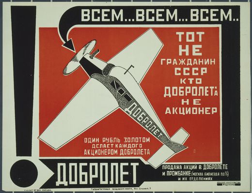
Alexander Rodchenko 'Dobrolet' 1923
Russian icon 15th to 17th Century
"In Russia there is a word for 'Thing' with no precise equivalent in English: 'vesch' means 'a thing with a soul" Warner, M 'Things'
Constructivism's new look - bold flat areas of colour, sections of pattern and geometric shapes created a new visual language. The Russia artists, usually on the outskirts of society, found themselves central - as the Bolsheviks sought out an art that was as radical as their new politics - Lenin even included artist in his hero's of the revolution. However, placed next to an old Russian icon those geometric shapes, flat areas of colour and pattern do not seem so alien. Icon's where made for churchs, to tell the story of Christ to an illiterate congregation. They were painted directly onto wood and often had other elements attached. There is a directness, a 'thingness' about icon's that can also be felt with a Malevich suprematist painting. Icon's where commissioned by the church (who had control) and the new look was adopted by the Communists (who had control). Some things don't change.
Many hands saluting in unison - the original utopian vision would eventually breed greed, division and horror under Stalin. The constructivists set the look - Red, white and black mixed with cut and paste methods - they didn't have photoshop only paper, photographs scissors and glue. The use of scissors and paste was advocated during the five year plan as the proletarian and propagandistic device of choice. Like Photography (even more so today with our invisible technology), it required virtually no training and the most ordinary materials. Of course Rodchenko, Klutsis and the Stenberg Brothers did have wonderful visual skill.

The Stenberg Brothers 'The Traitor' 1926

Stenberg Brothers 'The Last Flight' 1929
Geometric shapes, flat colours, text and figurative elements jostle to tell aspects of the narrative. These are both examples of Film Posters by The Stenberg Brothers produces hundreds of film posters during the 1920's and 1930's. The influence of Suprematism, Dada and Rodchenko are evident. These artists working under communism were creating a language we still use today in modern graphic design.

Stenberg Brothers 'Man with a Movie Camera' 1929

Stenberg Brothers 'Man with a movie camera' 1929 a film by Dziga Vertov
This is the Stenberg's poster for Dziga Vertov's revolutionary film 'Man with a Movie Camera' (watch an ongoing modern remake here). The diagonal lines of Constructivism become the legs of Vertov's film camera tripod. The moving image is the ultimate Photomontage but rather than a static image you have multiple images, one after the other, creating strange juxtapositions and new meanings. Vertov's films are like a living Dada Photomontage.
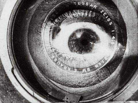
"I am kino-eye, I am mechanical eye, I, a machine, show you the world as only I can see it."


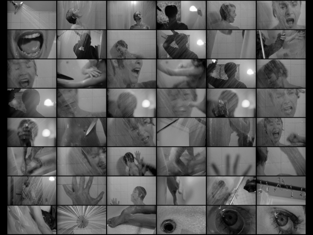

A Poster, Story board and close up from Alfred Hitchcock's 'Psycho' 1960
The shower scene from Hitchcock's Psycho is wonderful example of editing. The scene, where Janet Lee is attacked in the shower, shocked audience's on the films initial release. However, the scene is pieced together from relatively innocent shots; a screaming mouth, a knife, music, a silhouetted figure and blood spiraling down the drain. For further information watch 'The Magic of Movie Editing'.

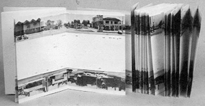
This above image is a sequence of images, designed to be seen one after the other. If seen in any other order they would not work. The photographs should be read from left to right - the same way we would read a book.
Image 1 - we see a simple bathroom, with a picture above the sink.
Image 2 - A large foot has appeared making the scene surreal.
Image 3 - It makes sense, it wasn't a giant just a normal man in a tiny bathroom in a shop window.
Image 4 - Our perspective is altered again. We zoom out. It was actually a photograph in a book.
Image 5 - We zoom out further. The man reading the book is silhouetted against a doorway.
Image 6 - This was a Photograph itself, in a frame on the wall.
Image 7 - The photograph hangs above a sink.
Image 8 - We see a simple bathroom, with a picture above the sink. This is where we started.
This is the work of Duane Michals and he has been playing a game with us. It is a picture in a picture in a picture. This is a digital reproduction on your screen - adding another layer.

He is doing it again. He takes a photograph of glasses next to a chair (playing with scale). He prints that photo and put it on what appears to be a radio and photographs it again. He continues this game of photographing and re-photographing.
It is no accident that you are reading this. I am making black marks on white paper. These marks are my thoughts, and although I do not know who you are reading this now, in some way the lines of our lives have intersected... For the length of these few sentences, we meet here.
It is no accident that you are reading this. This moment has been waiting for you, I have been waiting for you. Remember me."

Duane Michals
Michals often combines text with images. He is interested in how we see images, text and narratives. His work is ideas based and he seems more like a conceptual artist than simply a photographer.

example of Orell Füssli's "schaubücher"
Ed Ruscha - 'Every building on sunset strip' 1966
Presenting Photographs in a sequence is common. You are guided around a gallery in a certain direction, coming across certain images first. A website or slide show on a computer screen is often designed to guide us through the images in order. Arguably the most natural and intimate was to experience photography is in a book. A book designed by photographers to be read in a certain way is know as a Photobook. Another way that photographs can tell a story is through Photo Essays - look here and here.

Hans Weishaupl 'Faces of Evil'
A photograph is the perfect tool for describing something, for showing the world as it is. However, photographs are not always what they seem. These images have been create by Hans Weishaupl who recreated the faces of dictators by combining the faces of other people together. For Hitler he took 37 portraits of people from Germany to recreate Hitlers face.


Contemporary Photomontages by Julien Pacaud


ISO50 Scott Hansen- Contemporary Vector design
The curves, spirals and patterns that are found in Art Nouveau are evident in a lot of modern graphic design and illustration. The very nature of vector art lends itself to organic graphic curves and in these modern examples by Scott Hansen (ISO 50) those elements have bee given a modern twist. Technology often effects the art of its day - from oil paints, the printing press, the camera and, today, photoshop and the internet. The simple bold vector forms are given a worn texture and the faded colour and images give the images a retro feel. You can learn how he created these images in PDF tutorials here.


