Images combined together form a sequence that can change the meaning of the individual shot
Sequence photography is a group of images that need to be viewed in a certain order to make sense. If you loose one of the images the sequence doesn't work. The images could tell a story, create the sense of motion, show the passing of time, create a moody or could simply be the photographers whim.

The death and funeral of Edward the Confessor, Detail of the Bayeux Tapestry 11th Century.
Portable Iconostasis, Moscow 17th Century.
In 1877 Eadweard Muybridge helped the governor of California to win a $25,000
bet that at some point when a horse was running; all four hooves would leave the ground.
He set up a row of multiple cameras and each time the horse tripped a wire a photograph was taken. He ended up with a series of images that when combined created some of the first moving images. Without the likes of Muybridge there would no cinema, TV or most of the content on the Internet.
This is a sequence of shots by Muybridge's taken from two different angles. In his later career he would develop this idea further. In his early work the camera would be it a line and be triggered one after the other - documenting movement. In his later experiments the cameras would be in a circle and take a picture at the same time.
A similar technique was used in the film ‘The Matrix’ to create the Bullet Time effect.
The zoopraxiscope is an early device for displaying motion pictures. Created by photographic pioneer Eadweard Muybridge in 1879, it may be considered the first movie projector. The zoopraxiscope projected images from rotating glass disks in rapid succession to give the impression of motion. The stop-motion images were initially painted onto the glass, as silhouettes.
The device appears to have been one of the primary inspirations for Thomas Edison and William Kennedy Dickson's Kinetoscope, the first commercial film exhibition system.
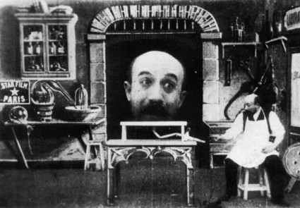
George Melies 'L’Homme à la tête en caoutchouc' 1903
George Melies 'A Voyage to the moon' 1902
Without the experiments of Muybridge and others Cinema would never have been born. Some of the most exciting and strange early cinema came from George Melies and was truly realized in 'A Voyage to the Moon' 1902. He was the grandfather of special effects and made films entertaining. Other early film experiments took place in Hove, Sussex.
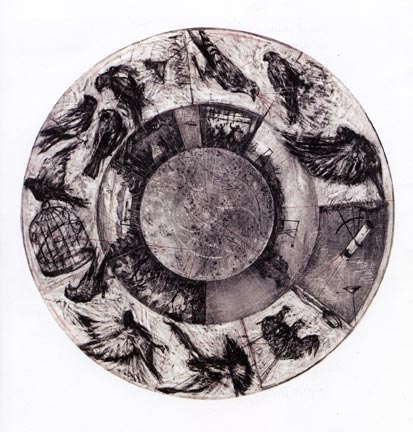
William Kentridge. 'MUSIC BOX TONDO', 2006
William Kentridge make contemporary animations by repeatedly erasing and reworking charcoal drawings on the same piece of paper to create stop-motion animated films. He does not make a story board but makes the animations as he goes. Kentridge sees it as a physical exercise - walking back and forth between the camera and the paper gives him time to improvise with the animation.
Robin Rhode is a contemporary South African artist who creates sequences of images that tell a story. He works directly onto walls or the ground and draws, erases, redraws the sections of the sequence. They have a similar feel to Muybridges work, and like a Muybridge they are primarily designed to be presents as a sequence of images and not an animation.
His earliest works were public performance pieces, often without an audience, staged on the streets of Johannesburg. In 1998, Rhode began documenting these works, which he calls “performative drawings” by taking still photographs that he would later compile into halting video animations that had the texture of flip books. In 2002, after moving to Berlin, Rhode shifted his practice from the urban streets into the contained space of his studio. This allowed for, as he describes, “a distance, an increased desire to take a more analytical position in the formation of ideas outside of the politically and socially charged environment of South Africa.". He has more to do with performance art and graffiti than photography - even though his work is displayed as photographs. In this sense his work is similar to Andy Goldsworthy.
The look of Muybridges work seems to Foresee so much 20th Century art - Rhode's included.
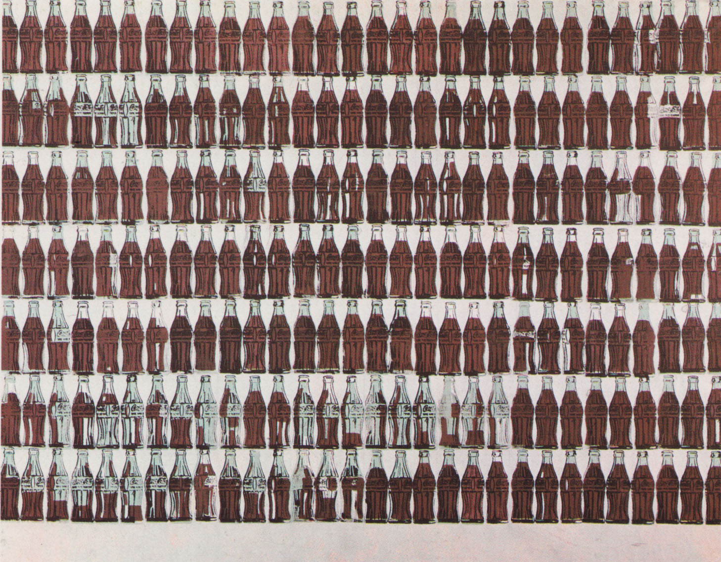
Andy Warhol Coke
Andy Warhol's use of multiple images is visually similar to Muybridge's. Warhol turned appropriated commercial images - a bottle of coke, a soap box and a promotional photographs of celebrities - and turned them into silk screens. This allowed him to reproduced them endlessly - mirroring how consumer products are made.
"What’s great about this country is that America started the tradition where the richest consumers buy essentially the same things as the poorest. You can be watching TV and see Coca Cola, and you know that the President drinks Coca Cola, Liz Taylor drinks Coca Cola, and just think, you can drink Coca Cola, too. A coke is a coke and no amount of money can get you a better coke than the one the bum on the corner is drinking. All the cokes are the same and all the cokes are good. Liz Taylor knows it, the President knows it, the bum knows it, and you know it."
--Andy Warhol
--Andy Warhol
Andy Warhol Super 8 Film
Warhol 'Triple Elvis' 1963. Acrylic and silkscreen ink on canvas
In 'Triple Elvis' a promotional photograph of Elvis is overlaid three times. This creates a visual Jump - creating movement in a static image. It also suggests that celebrity is shallow - that stars are turned into products to be consumed by the viewer. When you see a Warhol in the flesh you notice that each silkscreened image is slightly different to the next. Little imperfections give the initially mechanical image painterly qualities.
Motion studies by Etienne Jules Marey
Etienne-Jules Marey created similar images. Marey was a scientist who used art whereas Muybridge was an artist who created pseudo-scientific images. However, Marey's images were slow shutter speed shots and he used a strobe light. As the strobe flashed it created an image of the figure - therefore creating multiple figures showing the subject move though time and space.
Umberto Boccioni Unique Forms of Continuity in Space 1913
In this sculpture above the futurist artist Umberto Boccioni has captured in three dimensions a figure moving through time and space. Notice how the calf muscles are repeated - like a slow shutter speed photograph made solid. It is similar to Marcel Duchamp's 'Nude Descending a Staircase' where we see a figure repeated going down stairs.
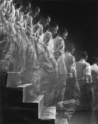
'Duchamp Descending a Staircase'
Photograph by Eliot Elisofon.
This image above was part of a 10-page spread in LIFE profiling Duchamp. ("Dada's Daddy," April 28, 1952). It would have been taken with the camera placed on a tripod on a bulb setting. Each time Duchamp took a step Elisdon set off a flash or strobe light - creating a faint impression of Duchamp on the negative.
Marcel Duchamp 'Nude Descending the staircase' 1912
This is a key painting by Marcel Duchamp. At first it looks abstract but on closer inspection you can see a figure walking down a star case. It is similar to a Muybridge than has been overlaid on itself.
Idris Khan rising series… after eadweard muybridge ‘human and animal locomotion’, (2005)
This image above is a muybridge overlaid on itself by th artist Idris Khan - we may come back to him. Duchamp painting looks like a cubist painting but where the cubists were interested it capturing the world from multiple viewpoints this shows a figure moving through time and space. It also wasn't a futurist painting - it was Duchamp's own idea.
Marcel Duchamp 'Nude Descending the staircase' (Detail) 1912
In this detailed section of Duchamp's 'Nude...' we can see it is made up of flat geometrical planes - triangles, lines and sections of circles. The browny yellowish hues allow the abstracted figure to stand out from the darker background. The whole image flickers with movement and jumps between a confusing abstract image to a figure 'decending a staircase'. Not anybody could paint like that.
Nobody liked the painting and Duchamp's own brother asked him to remove it from an exhibition. This experience would encourage Duchamp to follow his own ideas and turn his back on the traditional art world. Five years later he would sign a gentleman's toilet R Mutt and place it in a gallery. The art world was not ready for his 'Nude descending the staircase' (1912). However, his 'Fountain' (1917) would revolutionise twentieth century art.
Sam Taylor Wood - 'A Little Death' 2002
Jan Lievens (Dutch, 1607–1674), 'Still Life with Books', ca. 1627–1628.
Sam Taylor Wood 'Still Life' 2001
Sam Taylor Wood is an artist, photographer and film maker. Her 2001 Film/animation ‘Still Life’ has the visual look of a 17th Century Dutch still life. Sequences of still photographs are taken over a period of time to show the fruit slowly decaying. This is shown as a piece of video art in a gallery space - it is almost displayed like a painting on the wall. It is similar to time lapse photography used to capture the growth of a plant - who move at a completely different pace to ourselves.
Nicholas Nixon 'The Brown Sisters 1975-2007' 2/16/09
Nicholas Nixon 'The Brown Sisters 1975-2007'
Time has a natural effect on the world around us. Time is a central element of Photography - at it purest form it can be the length of time a shutter is left open for. On another level it can record time - freezing it forever. We cannot see time - we invented clocks to give form to this abstract concept. However, we can see the effects of time - the sun moving over head, a worn step, a landscape eroding or the aging effect on humans. We notice people growing old mainly by looking back at old photographs. The Photographer Nicholas Nixon has Photographed his wife and her three sisters ever year since 1975. He created a Topograhic series. They are informal portraits but the women are always stood in the same order. If you look at the photographs chronologically the change is subtle. However, if you look at a photograph from the 1970's and compare it to a recent one the change is dramatic. Soft skin and features age and show the marks of a life's experience. Individuals faces can still be recognised but, at the same time, can change dramatically.
Rembrandt Self Portrait 1628
We take it for granted that we can document our lives. It is easy for us to create a photographic image of ourselves. Before the invention of photography all portraits had to be drawn by hand. If you couldn't draw you would have to pay an artist. This meant only the rich and successful were immortalised in an image. Rembrandt made self portraits from an early age and left one of the few pre-photographic documents of a person growng old.
Rembrandt, “Self-Portrait in Painter's Costume.” 1660-62
Over thirty years separate these two images by Rembrandt and show him transform from a young ambitious artist to an old master. He made a unusually large amount of self portraits that show him in various guises from a mischievous clown, respectable member of society to a lone artist. You can see these varied portraits here and here.
Claude Monet’s haystack.
A group of Monet's Haystacks
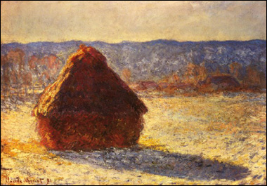
Claude Monet was a impressionist painter who was fascinated by light. The warmth of the early morning light, the strong constrast of midday, the golden hour when the sun begins to set, twilight or the diffused light on a cloudy day. When he visited London he didn't see dullness, instead he was amazed by all the different shades of grey and white. During the harvest season of 1890 -91 he returned to the same hay stacks and painted them on site. The same ordinary subject is transformed by observing how the light changes at different times of day and year. Although technically a series of images there is a sense of time passing and the images seem to follow a natural sequence.
This above image is a sequence of images, designed to be seen one after the other. If seen in any other order they would not work. The photographs should be read from left to right - the same way we would read a book.
Image 1 - we see a simple bathroom, with a picture above the sink.
Image 2 - A large foot has appeared making the scene surreal.
Image 3 - It makes sense, it wasn't a giant just a normal man in a tiny bathroom in a shop window.
Image 4 - Our perspective is altered again. We zoom out. It was actually a photograph in a book.
Image 5 - We zoom out further. The man reading the book is silhouetted against a doorway.
Image 6 - This was a Photograph itself, in a frame on the wall.
Image 7 - The photograph hangs above a sink.
Image 8 - We see a simple bathroom, with a picture above the sink. This is where we started.
This is the work of Duane Michals and he has been playing a game with us. It is a picture in a picture in a picture. This is a digital reproduction on your screen - adding another layer.
He is doing it again. He takes a photograph of glasses next to a chair (playing with scale). He prints that photo and put it on what appears to be a radio and photographs it again. He continues this game of photographing and re-photographing.
'It is no accident that you are reading this. I am making black marks on white paper. These marks are my thoughts, and although I do not know who you are reading this now, in some way the lines of our lives have intersected... For the length of these few sentences, we meet here.
It is no accident that you are reading this. This moment has been waiting for you, I have been waiting for you. Remember me."
- Duane Michals
It is no accident that you are reading this. This moment has been waiting for you, I have been waiting for you. Remember me."
- Duane Michals
Michals often combines text with images. He is interested in how we see images, text and narratives. His work is ideas based and he seems more like a conceptual artist than simply a photographer.
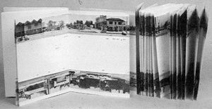
example of Orell Füssli's "schaubücher"
Ed Ruscha - 'Every building on sunset strip' 1966
Presenting Photographs in a sequence is common. You are guided around a gallery in a certain direction, coming across certain images first. A website or slide show on a computer screen is often designed to guide us through the images in order. Arguably the most natural and intimate was to experience photography is in a book. A book designed by photographers to be read in a certain way is know as a Photobook.
Robert Frank 'U.S. 285, New Mexico'1956.
One of the most famous photo books is by Robert Frank. We travel to see the world, we wouldn't think about going on holiday in your own town. This is because we are used to our surroundings. However, a good artist can see the most mundane things with fresh eyes. It took a Photographer from Switzerland to create the definitive images of America. From 1955 to 1956, with a fellowship from the Guggenheim to assist him financially, Robert Frank set out on a tour of the United States. There was no apparent plan - just to compile a photographic record of his travels. It was the 1950's Jazz, Abstract Expressionism, Beatniks and Jack Kerouac's "On the Road".
Robert Frank 'The Americans' 1955 to 1956
These images were released as 'The Americans' (1959). Some people have argued that the photo book is the ideal way to view photographs not the gallery wall. This is because it is more intimate and can guide you through in a certain order with subtle juxtapositions. 'The Americans' was Frank's silent journey through America. His images seemed like snap shots, poorly cropped, shot from the hip - like the visual equivilant of a beat poet or Jazz music. Like the rhythm of music certain motifs reappeared.
The motif of a Jukebox helps makes the silence of photography feel like a sudden loss of hearing.
Robert Frank 'The Americans'
Another Motif is the grid like pattern of the flag. However, it is always shown as an object amongst objects.
Shelby Lee Adams from 'Salt and Earth'
The Photo Book tells a story through a sequence of images - like the Photo Essay. Frank's 'The American's' is a photo essay as well as a photo-book. Shelby Lee Adams has created a photo essay that you can view here.
"'Salt & Truth' is the fourth book from American photographer Shelby Lee Adams [1950-present]. This collection of 80 new photographs, taken over the past eight years, continues a project the artist has been working on now for over 30 years. Together these powerful images of the hollow dwellers of eastern Kentucky, represent a singular access to a world that is historically not very trusting of outsiders, by a photographer who is widely recognized as a master of the medium."

A recent Photo Essay appeared in the New York Times created purely using an iPhone and the Hipstatic app
Magnum have created 'Magnum in Motion online' that showcases modern photo essays. This use of technology adds a new dimension to the traditional photographic narrative, using a combination of photos, audio, video, graphics, and interactivity.
Tom Jamieson's 'Crystal Sea Trawling' here
Still of the Kuleshov effect
Film, television and adverts are ultimately short snipets of film edited together to tell a story or influence our mood. Like the juxtaposition used in Surrealism, editing film together creates new meaning. When the director Lev Kuleshov demonstrated the psychology of cinema by splicing the same shot of an actor's face with, alternately, a dead woman, a child and a bowl of soup, audiences interpreted the actor's unchanging expression as a reaction to the three contextualising shots. This is known as The Kuleshov Effect.
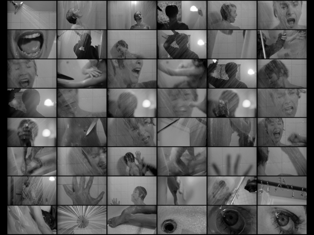
A Poster, Story board and close up from Alfred Hitchcock's 'Psycho' 1960
The shower scene from Hitchcock's Psycho is wonderful example of editing. The scene, where Janet Lee is attacked in the shower, shocked audience's on the films initial release. However, the scene is pieced together from relatively innocent shots; a screaming mouth, a knife, music, a silhouetted figure and blood spiraling down the drain. For further information watch 'The Magic of Movie Editing'.
Stills from Le Jetee 1962 directed by Chris Marker
Le Jetee is a science fiction film made up entirely from black and white still images and a voice over. These simple element are all that he uses to tell the story. The film influenced the Terry Gilliam film '12 Monkeys' and is an example of Markers simple approach to film making. You can watch the film here.


