William Eggelston - from his 'Los Alomos' series
Patterns are found everywhere – Nature, Literature, Music and Art.
Try this yourself - follow this link to use the Tone Matrix. By adding white squares to the grid you can make a pattern that will loop - creating a delicate sound like a music box. See what loop you can create and see if it changes your mood (you could also try the FM3 Buddha Machine) - then come back!
This image is called ‘Ancient Sound’ by the 20th century artist Paul Klee. He was a member of the Bauhaus and also wrote about art.
'Art does not reproduce the visible but makes visible' - Paul Klee
This image reflects Klee’s interest in Colour and Music. The squares seem to have a rhythmic quality like the notes in a song. The colours complement, contrast and work with one another. There is a flicker effect and movement in this image.
The GSW Headquaters in Berlin was designed by Sauerbruch Hutton (1999). This architecture shares similar characteristic to Klee's. Like a Klee painting (or a repeated sound) the building has a visual rhythm with the various hues of red reacting with one another and contrasting with the blue sky.
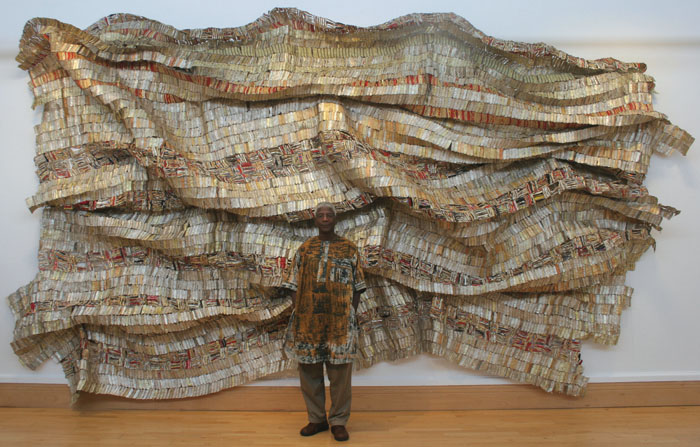
El Anatsui creates shimmering large scale artworks made from discarded bottle caps. They are simultaneously sculptures, paintings, collage and installation and have a genuine visual zeal. Like Klee's work and the GSW Headquarters the smaller visual elements come together to make a greater whole.
Lance Letscher is a contemporary artist who collects old books, paper and materials and pieces them together to give them new life. The manufactured colour's that are all around us are combined and contrasted using different structures. Letscher's work, like Anatsui's work, seems to have its roots in craft and folk art.
VE Day Celebrations, Hoyland Street, Wincobank
Bunting is little triangles cut out of various left over material, attached to string and hung up for decoration. The 'make do and mend' aesthetic and the combination of different materials make bunting an interesting artifact. It was often used in street parties - for example the VE day celebrations. Notice in this photograph above how it hangs above the street blowing in the wind. As our sense of community has changed there are less street parties that take place - bunting seems to belong to this bygone era.
This is Log Cabin Quilt circa 1900 from North America shows the characteristic design of the American frontier home. They adapted an economic way of using up even the smallest fragment of material achieving a surprising variety of designs. The design was influenced by the width of the strips and the placements of the various colours.
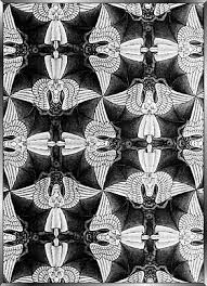
This image by M C Escher juxtaposes Bats and angels to create a continuous pattern. There is an element of playfulness to Escher's work.
Owen Jones 'Designs for tiles' Watercolour' 1849
These Victorian tile designs are influenced by Islamic tile design. Owen Jones soon realised the debt that Islamic design had to geometry, mathematics and astronomy. He was a strong influence in the contemporary development of tile designs, seeing the patterns of tessellation as a key to rationalising the beauty of Islamic ornament.

The merging of sound and vision was also being explored in avant garde films of the 1920's. Moholy-Nagy's 'Light Prop for an Electric Stage' is a development of his earlier work with photography, photograms and painting. It is a sculpture, a piece of Kinetic Art and a device he used to make an early abstract experimental films.
Film was still evolving at this time and artists who experimented with film were leading the way for title sequences, animation, music videos and computer animation. During the 1920's pioneering abstract films were being made by Hans Richter and Viking Eggeling (for example Filmstudie).
Also see Fernand Leger.
Also during the 1920's Marcel Duchamp created a series of kinetic works that he conceived as optical toys. Making apparent the deceptions that visual perceptions play on our minds fascinated Duchamp.
Beginning as a series of lithographs, The Rotoreliefs work as a series of gyrating discs that the artist dubbed an 'Anemic Cinema'. When the discs are spun on a turntable, they appear as three-dimensional objects, making visual symphonies that also parody traditional art.
Kandinsky's urge to give visual form to the ephemeral qualities of music is basic human nature. Traditionally live music was often part of a greater performance - colour, dance and light were all used with music.
Mary Ellen Bute made a series of films called 'Seeing Sounds Films'. Her first colour film 'Synchromy No.4:Escape' (1937) tells the story in abstraction of an orange/red triangle set to the music of Bach -'Toccata in D Minor'. (see Also Norman Mclaren - Spook Sport 1940).
Ultimately avant garde art filters down into the mainstream - A Mondrian bag, A Bridget Riley dress to modern surreal adverts. This Advert for Total Oil (1958) by Andre Sarrut shows sound being merged with abstract images.
Jeremy Deller (Turner prize winner 2004) has claimed the internet could be the next evolution of art - once we know how to use it. The internet is still in its infancy and could be to the 21st Century what Cinema was to the 20th Century. Most websites can look fairly familiar but the best employ a combination of sound, moving images and an interactive element.
You could follow the Apollo 11 mission to the moon, influence an abstract pop video, reinvent colour at the MOMA, conduct your own doo wop group, contribute to a Johnny Cash video, edit a pop song, draw with type (like John Cage), make drawings out of fonts or take a line for a walk.
Cage worked closely with Robert Rauschenberg at the Black Mountain College.
This is Matisse's 'The Snail' in Tate Modern. The works seems simple but it is perfectly composed and has a visual rhythm. This is a collage made from pieces of paper painted different colours (this part was done by Matisse’s assistant’s). It's 1953, Matisse has cancer, he's very ill. Between him and the assistants the work somehow gets done: the sheets are torn, their edges changed, and the resulting shapes are stuck onto a white ground. He makes a natural, organic form: a spiral. But the shapes themselves are not particularly natural. As well as torn edges there are plenty of hard straight lines. There aren't any straight lines in nature. So Matisse makes you re-see nature by creating it in an unexpected way.
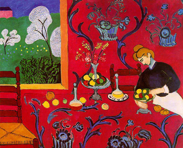
This is an early Matisse 'The Dessert: Harmony in Red' (1908). Matisse's early work show a huge move away from the traditions of western art. He was a key member of the Fauves ('The Wild Beasts') who used colour and brush marks in a unseen expressive way. However, Matisse once said he wanted his work to have the same effect as a comfortable chair on a tired business man. This seems at odds with his contemporaries, for example Picasso and his delight in challenging the viewer.
'Harmony in Red' doesn't have traditional perspective and instead has flat bold areas of colour against areas of pattern. During the 19th century Japanese art was imported into Europe after trade was reopened after 300 years. Photography had taken over the role of the artist and painters started to look for new ways of making images. Western artists combined this new aesthetic with other cultures to create the Modernist Aesthetic.
This Woodcut Print by Toyokuni III/Kunisada (1786 - 1864) shows areas and planes of pattern contrasted with flat blocks of colour. The image is closer to abstract art and the eye moves with the rhythm of the composition.
This print by Kuniyoshi (1798-1861): 'Miyamoto Musashi and the big whale' has a graphic quality that seems to predict the stylised 'Manga' art.
This painting is by Emma Biggs and Matthew Collings – it is a collaborative act where Biggs designs the painting (shape, colours and combinations) and Collings paints them. The simple geometric shapes and subtle colour combinations shimmer and create a sense of movement. Collings is also a critic who has his own theory on Beauty.

These are antique board games. The circles, lines and colour are mainly there because of the rules of the game. The worn paint wearing off the wood gives them a feel of a Russian Icon or evan a later work by Frank Stella.
Frank Stella used house hold paint out of the tin with painter and decorators brushes. The bands in his paintings are determined by simple things - the width of his brush or the width of the wooden frame. His painting were about themselves and completely self contained. Like the Log Cabin quilt the image has a direct relationship to the materials used. Stella came to prominence in the 1960s and is considered one of the fathers of Minimalism - seeing his paintings as objects not signs to something else. Stella's later work broke out of the square frame and became more colourful and vibrant. Whether you look at his monochrome early work or his bold later work there is a sense of movement and pattern in his paintings. There are visual effects that happen when you look at these paintings.
Bridget Riley came to prominence in the 1960's during the Op Art movement. Riley counts Paul Klee amongst her influences and recently arranged a show at the Hayward Gallery. Her images create a dizzying optical effect and create the illusion of movement. All an image is, is pigment on a surface and these images by Riley a flat black lines on canvas. However, they seem to move, rotate and can not be look at too long. Riley used Rhythm and Repetition to create her work and knew that a simple line is transformed when repeated.
Barbara Brown 'Spiral' fabric design
Chrissie Shrimpton and Ossie Clark, 1965 by David Bailey
A modern Op Art influenced fashion shoot by Solve Sundsbo
Op Art bold use of stark black and white led to it be incorporated in 1960's popular culture. Op Arts influence can be seen in the work of fashion designers, advertising, magazine layouts and still has an influence today. Go here to find an Op Art Adobe illustrator tutorial.
Peter Keetman was a key member of fotoform (see the section on Otto Steinert here). These images show he use of pattern - whether he is photographing pipes or creating experimental abtract images.
As of 1948, Keetman experimented with abstract rhythmic images which he produced by swinging a flashlight over a camera with an open shutter placed on a rotating record player. The images recorded two dynamic movements yet produced a very harmonious pattern.
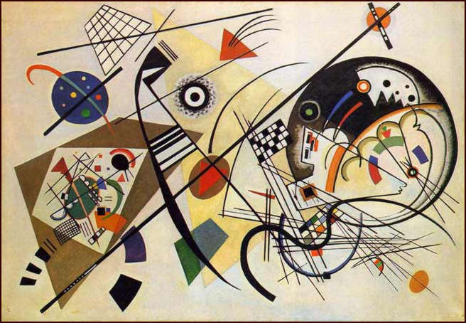
The painting above is by Wassily Kandinsky (1866-1944) 'Transverse Line' 1923.
Like Klee, Wassily Kandinsky taught at the Bauhaus and his ideas influenced modernist art. He is credited with making the first purly abstract painting.
Kandinsky used music to influence his compositions –
‘Hearing tones and chords as he painted, Kandinsky theorized that, for examples, yellow is the colour of middle-C on a piano, a brassy trumpet blast; black is the colour of closure and the ends of things; and that combinations and associations of colours produce vibrational frequencies akin to chords played on a piano. Kandinsky also developed an intricate theory of geometric figures and their relationships, claiming, for example, that the circle is the most peaceful shape and represents the human soul. These theories are set forth in 'Point and Line to Plane’.
The merging of sound and vision was also being explored in avant garde films of the 1920's. Moholy-Nagy's 'Light Prop for an Electric Stage' is a development of his earlier work with photography, photograms and painting. It is a sculpture, a piece of Kinetic Art and a device he used to make an early abstract experimental films.
Also see Fernand Leger.
Also during the 1920's Marcel Duchamp created a series of kinetic works that he conceived as optical toys. Making apparent the deceptions that visual perceptions play on our minds fascinated Duchamp.
Beginning as a series of lithographs, The Rotoreliefs work as a series of gyrating discs that the artist dubbed an 'Anemic Cinema'. When the discs are spun on a turntable, they appear as three-dimensional objects, making visual symphonies that also parody traditional art.
Kandinsky's urge to give visual form to the ephemeral qualities of music is basic human nature. Traditionally live music was often part of a greater performance - colour, dance and light were all used with music.
Mary Ellen Bute made a series of films called 'Seeing Sounds Films'. Her first colour film 'Synchromy No.4:Escape' (1937) tells the story in abstraction of an orange/red triangle set to the music of Bach -'Toccata in D Minor'. (see Also Norman Mclaren - Spook Sport 1940).
Ultimately avant garde art filters down into the mainstream - A Mondrian bag, A Bridget Riley dress to modern surreal adverts. This Advert for Total Oil (1958) by Andre Sarrut shows sound being merged with abstract images.
These early experiments have filtered down to popular culture and influenced the next generation.
You could follow the Apollo 11 mission to the moon, influence an abstract pop video, reinvent colour at the MOMA, conduct your own doo wop group, contribute to a Johnny Cash video, edit a pop song, draw with type (like John Cage), make drawings out of fonts or take a line for a walk.
John Cage was primary known as a musician – his most famous musical composition is called 4'33". It consists of the pianist going to the piano, and not hitting any keys for four minutes and 33 seconds (see also Rauschenberg’s and Robert Rymans White paintings). In the silence the audience is encouraged to listen to all the sounds that take place during silent moments.
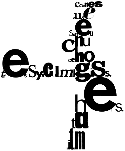
Cage also created poetry and art using elements sutch as chance. His images often have the fluidity of a piece of music – giving visual form to sound. Cage’s ‘Mesostics’ are his chance experiments with writing creating visually striking graphic texts.Cage worked closely with Robert Rauschenberg at the Black Mountain College.
This is Matisse's 'The Snail' in Tate Modern. The works seems simple but it is perfectly composed and has a visual rhythm. This is a collage made from pieces of paper painted different colours (this part was done by Matisse’s assistant’s). It's 1953, Matisse has cancer, he's very ill. Between him and the assistants the work somehow gets done: the sheets are torn, their edges changed, and the resulting shapes are stuck onto a white ground. He makes a natural, organic form: a spiral. But the shapes themselves are not particularly natural. As well as torn edges there are plenty of hard straight lines. There aren't any straight lines in nature. So Matisse makes you re-see nature by creating it in an unexpected way.
This is an early Matisse 'The Dessert: Harmony in Red' (1908). Matisse's early work show a huge move away from the traditions of western art. He was a key member of the Fauves ('The Wild Beasts') who used colour and brush marks in a unseen expressive way. However, Matisse once said he wanted his work to have the same effect as a comfortable chair on a tired business man. This seems at odds with his contemporaries, for example Picasso and his delight in challenging the viewer.
'Harmony in Red' doesn't have traditional perspective and instead has flat bold areas of colour against areas of pattern. During the 19th century Japanese art was imported into Europe after trade was reopened after 300 years. Photography had taken over the role of the artist and painters started to look for new ways of making images. Western artists combined this new aesthetic with other cultures to create the Modernist Aesthetic.
This Woodcut Print by Toyokuni III/Kunisada (1786 - 1864) shows areas and planes of pattern contrasted with flat blocks of colour. The image is closer to abstract art and the eye moves with the rhythm of the composition.
This print by Kuniyoshi (1798-1861): 'Miyamoto Musashi and the big whale' has a graphic quality that seems to predict the stylised 'Manga' art.
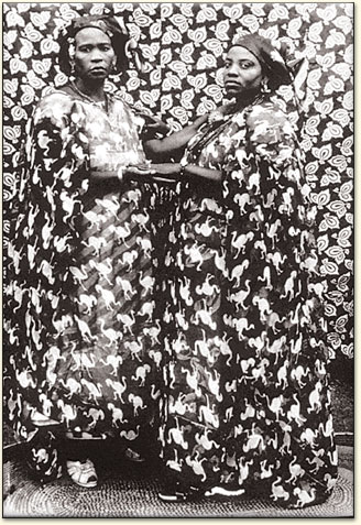
Untitled (Sisters, Two Great Ladies), Seydou Keita, 1958.
This photograph is by Seydou Keita. People would go to Keita for a portrait and they would dress for the occasion. They would take their most prized possessions, as with all portraits, peolpe want to show a specific view to the world. In this portrait the subjects and their surroundings are interrelated, which creates a lively atmosphere with a sense of movement.
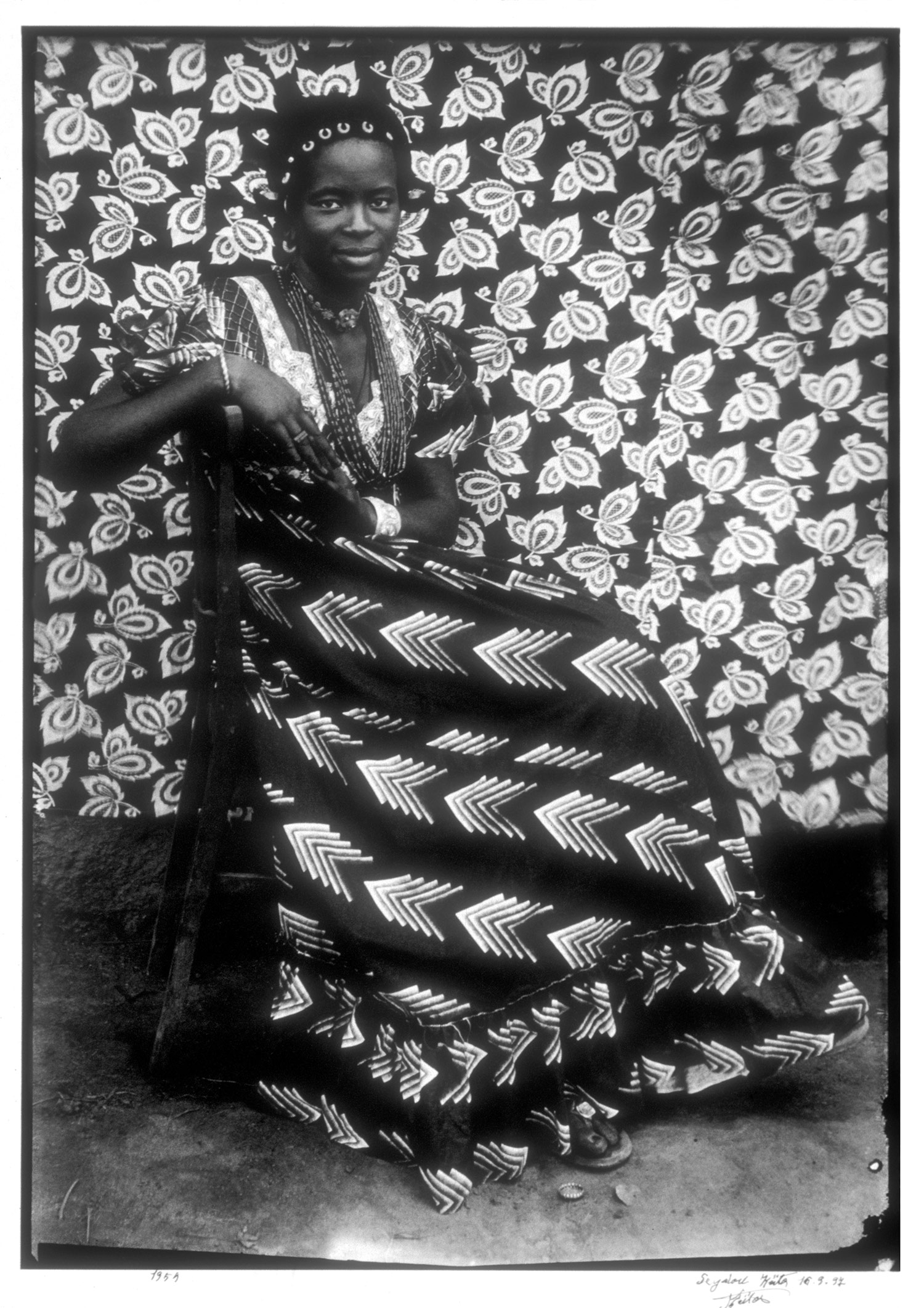
This is another untitled portrait by Keita from 1959 - 60. Like Matisse we see a visual clash of patterns between the sitters dress and the back drop. The black and white emphasises this juxtaposition and subtle vignetting blurs areas of pattern.
Simple net sails of a boat overlap to create a delicate pattern.
Paul Caponigro 'Frost Window No.2' 1961
A picture of frost crystals on a bedroom window makes a tapestry out of a mixture of pattern and texture. Positioning his view camera about 30cm from the glass, the photographer stopped the lens all the way down to f32 so as not to loose the dark trees in the background.
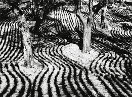
Mario Giacomelli
Mario Giacomelli
The patterns created by the grooves in the earth have been captured by Mario Giacomelli. Giacomelli was a true local, tied to his region, town, and its rhythms and traditions. He was self taught and even in his artistic expression he was influenced by his homeland. We can see this in his landscapes showing signs of man’s labour, with folds like wrinkles on a person’s hands, landscapes that speak of faces and things living in the soul. The story goes that Giacomelli would borrow his neighbors tractor to make the tracks go in another direction to create the perfect graphic, semi abstract photograph. He printed all his work in a trade mark high contrast style. For Giacomelli, photography was above all love, the image telling a poem of the heart which continues to surprise and move us (he originally trained as a poet and a painter).
Ernst Haas
Irvin Penn
Droplets of water have been caught in the delicate stems of a dandelion clock. The flower has been backlit to create a simple silhouette. There is a contrast between the sharp translucent circular water droplets and the soft tonal quality of the silhouetted stems.
Adam Fuss 'Untitled' Photogram 2007
Adam Fuss has made a photogram by getting a snake to more through water. The patterns created by the creature moving through the water has been captured directly onto the photographic paper.
M.C. Escher 'Rippled Surface' 1950
M.C. Esher has created the illusion of the rippling surface of water. He has carved into a surface, inked it up and taken a print from it. The raised areas of the surface have left a mark - creating the black ripple effect. There our elements of science and mathematics to Escher art and a fascination in optical illusions.
'Hand with Reflecting Sphere' M. C. Escher 1935
M C Escher
M C Escher
Still from Alfred Hitchcock's - 'Champagne' 1928 - shot through the bottom of a wine glass.
This is a strange still from an early silent Alfred Hitchcock film. It is taken from his 1928 film 'Champagne' were he experimented with a camera lens placed inside a giant champagne glass. The glass fills with liquid and is tipped as if we, the viewer, are drinking from it and seeing through it. We can just make out a crowd and couple dancing.
Still from Hitchcock's 'The Ring' 1927 - a moving reflection in a stream
During the filming of Hitchcock's early silent film The Ring (1927) he experimented with trick photography. In the above still we see a reflection of a couple in a stream. When the water ripples the image itself ripples and the figure go in and out of abstraction.
Stills from Hitchcock's 'The Ring' 1927 - seen from the viewpoint of a drunk man
In these two scenes we see what a drunk sees and the world appears distorted. This could emulate the effect of drink but also be a metaphore for viewingt he world through the bottom of a glass. Dancers distort until they are unrecognizable. Hitchcock uses blurring and mirrors to distort the image and create a sense of disorientation. The keys of a piano appear elongated as if seen through a fairground mirror. This visual experimentation is a key aspect of Hitchcock's Cinematic style.
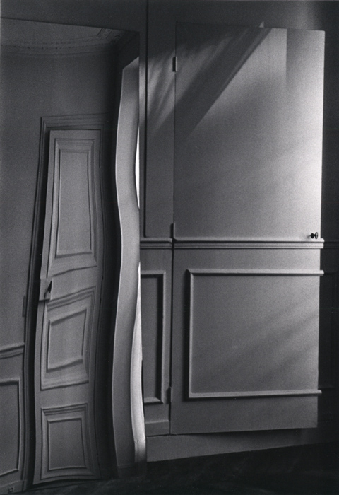
Andre Kertesz - Paris, Door Distortion, July 29, 1984
Andre Kertesz ‘Distortion 144, Paris’ 1933
Andre Kertesz ‘Distortion 147, Paris' 1933
These strange distorted images are by André Kertesz. ‘Distortions’ (1933) is a series of photographs of women reflected in distorting carnival mirrors that transform them into dreamlike creatures.
Salvador Dali 'Soft Construction With Boiled Beans (Premonition of Civil War)',1936, oil on canvas.
The deformed melting figures of Dali's painting mirrors the distortions that appear in Kertesz's photographs. This painting is one of only a handful in which Dalí turned his attention to the tragedy that beset his homeland on July 17, 1936, when General Francisco Franco led a military coup d'état against the democratically elected Popular Front government. The artist's savage vision of his country as a decomposing figure tearing itself apart preceded the outbreak of the Spanish Civil War and thus prophetically foretold the atrocities committed during this bloody conflict. Other artists who have focused on the Spanish Civil War are Picasso (Guernica), Guillermo del Toro (Pan's Labyrinth) and, during the earlier civil war, Goya (Disasters of War). Dada Photomontage distorted the human form immediately after the first world war. As well as having surreal qualities these images, like the Dada Photomontages could be a reaction to the human horrors of the first world war and the rise of 1930's fascism.
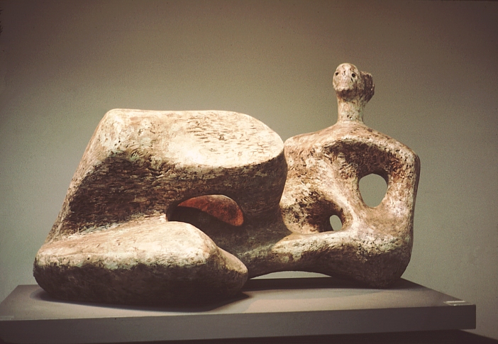
Henry Moore. Working Model for Reclining Figure, 1957. Bronze.
Henry Moore emerged in the 1920s as a radical, experimental and avant-garde figure and was rapidly established as the leading British sculptor of his generation. His principal and enduring subject was the human body, through which he believed ‘one can express more completely one’s feelings about the world than in any other way’. Moore also reflected in his work his reaction to two world wars. The smooth quality of these images are similar to the effect of melting ice and how is distorts as it transforms back into liquid.


